User Menu
The User Menu is a card for signing in and out. Depending on its type it
shows a sign-in form, a password prompt for a known user, a progress bar, or the
signed-in user with a list of actions. It is found in the Input - OpenBridge
section of the Perspective Component Palette as User Menu.
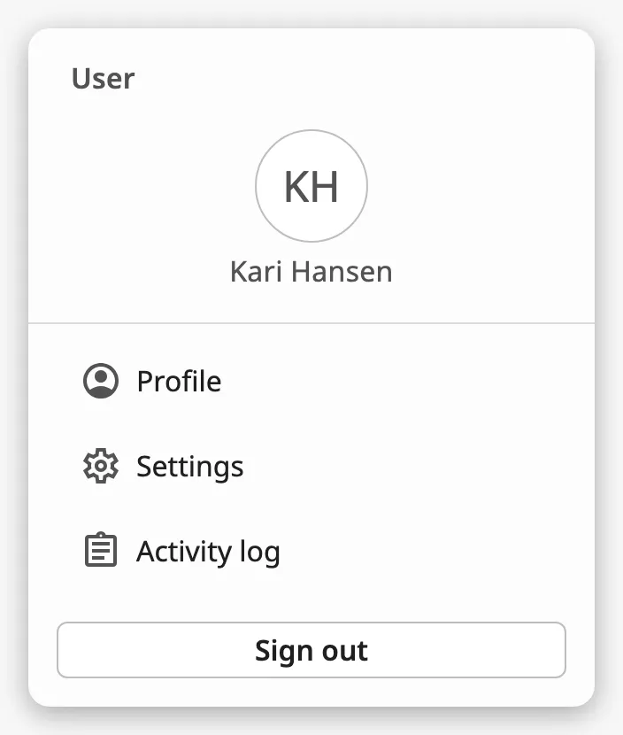
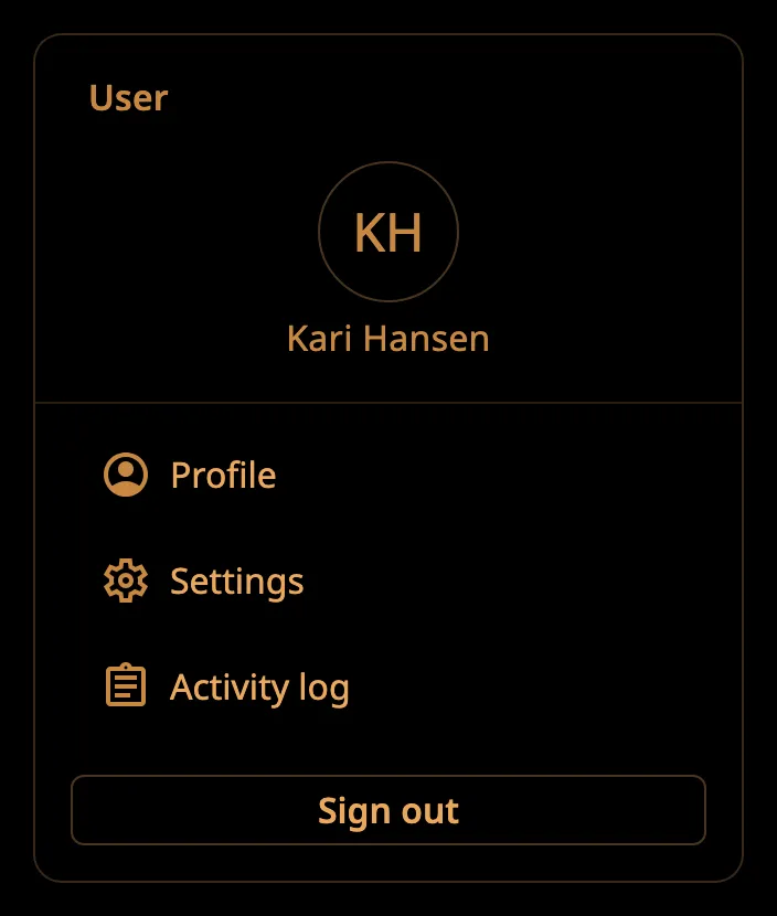
The signed-in menu, from top to bottom:
- User — initials and name. See User.
- Actions — a list of your own menu items. See Actions.
- Sign out button. See Signing Out.
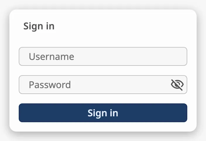
A User Menu dropped from the palette shows the sign-in form:
The User Menu is only the user interface. It does not sign anyone in or out by itself and does not know who the user of the session is: it fires events, and you decide in scripts what they do.
User Menu or Top Bar?
Section titled “User Menu or Top Bar?”The Top Bar has a user menu of its own, opened with its user button.
- Use the menu of the Top Bar when the operator signs in with the identity
provider of the project. It can sign in and out by itself
(
bindUserButtonToAuth) and needs no script. - Use the User Menu component when you need more than that: a list of actions for the signed-in user, a list of recent users, or a form for a user name and a password that your own script checks. Place it in a popup or a docked view and open that from a button.
The card is always 320 px wide and as tall as its content needs. It is drawn at the top of the component’s box (the blue frame in the image), centred between its sides:
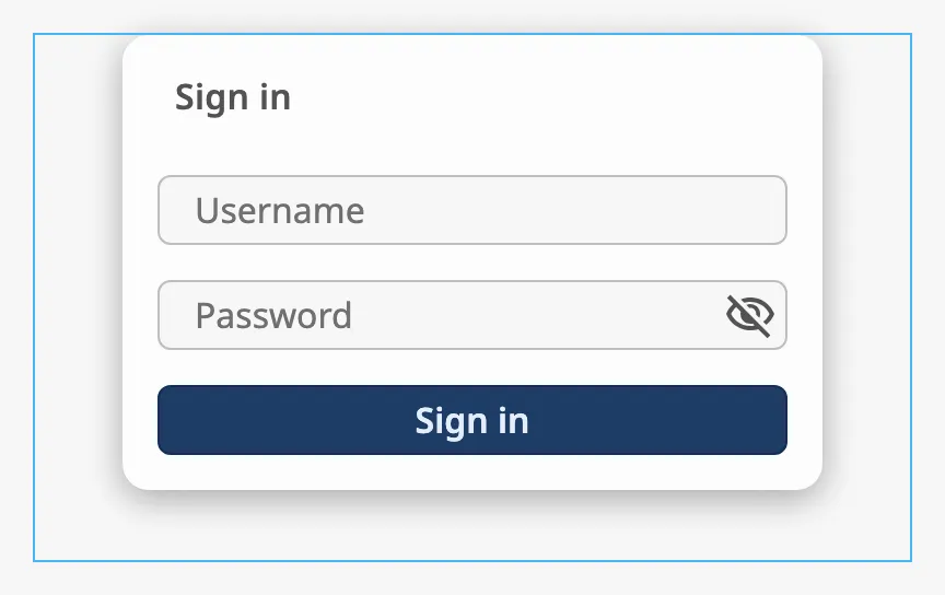
Make the component at least 320 px wide and as tall as the tallest card you show. The sign-in form is about 210 px high, and the signed-in menu about 220 px plus 40 px for each action.
type selects what the card shows. Bind it to the state of your sign-in, for
example to session.props.auth.authenticated (see
Example 1).
| type | Shows | |
|---|---|---|
sign-in (default) |
A form with a user name and a password. | |
user-sign-in |
The user and a password field only: for signing in again as a user that is known. | 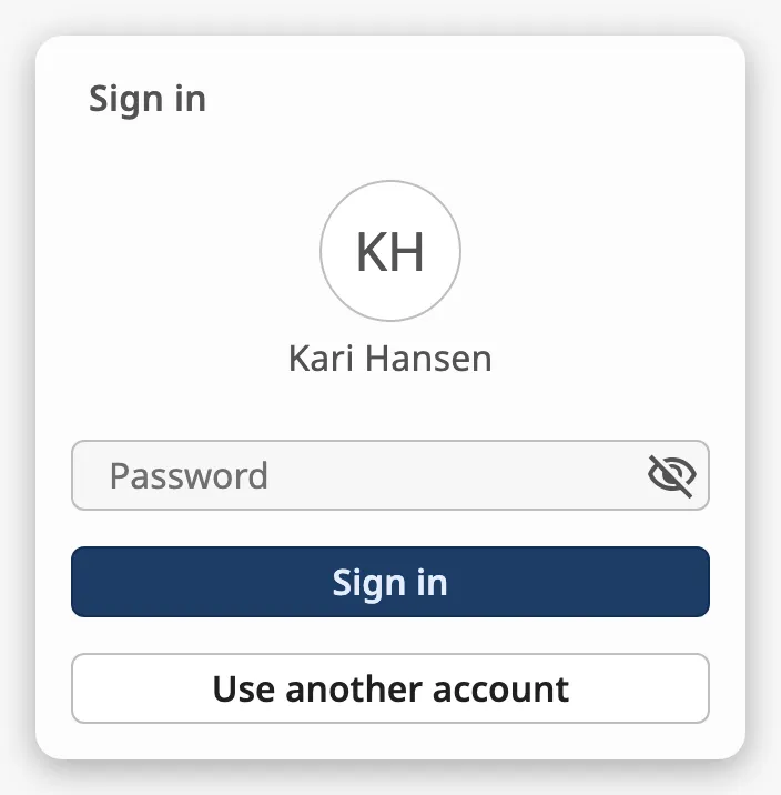 |
loading-sign-in |
The user and a progress bar, while the sign-in is being checked. | 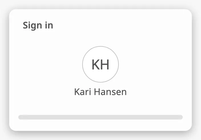 |
signed-in |
The user, the actions and a Sign out button. | |
The User Menu never changes type itself.
Properties
Section titled “Properties”| Name | Description | Property Type |
|---|---|---|
| type | sign-in, user-sign-in, loading-sign-in or signed-in. Default sign-in. |
value |
Signing In
Section titled “Signing In”In the sign-in and user-sign-in types the operator types in the fields and
clicks Sign in. The User Menu then fires onSignedInClick with what was
typed:
| Name | Description | Property Type |
|---|---|---|
| username | The text of the user name field. In the user-sign-in type, which has no such field, the value of the username property. |
value |
| password | The text of the password field. | value |
What the operator types is not written to the username and password
properties; it is only passed in the event. The two properties are the texts the
fields start with.
A field that is empty when the operator clicks Sign in is marked as required, and the event is not fired:
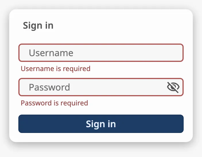
Enter in a field does not sign in; the operator has to click the button.
Note: The password is sent to the gateway as plain text in the event object. Perspective sessions normally sign in through an identity provider with
system.perspective.login(), which shows the provider’s own form. Use the form of the User Menu only when you check the user name and password in your own script.
Error Messages
Section titled “Error Messages”Set usernameError or passwordError to show a message under a field and mark
it, for example when your script rejects the password:
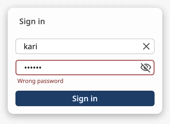
The message disappears when the operator types in the field again. The property keeps its text, so set it to an empty text before the next attempt.
Use Another Account
Section titled “Use Another Account”The user-sign-in type has a Use another account button.
Note: The button has no event, so a click on it does nothing at present.
Properties
Section titled “Properties”| Name | Description | Property Type |
|---|---|---|
| username | Text the user name field starts with. Not written when the operator types. Empty by default. | value |
| password | Text the password field starts with. Not written when the operator types. Empty by default. | value |
| usernameError | Error message under the user name field. Empty, and no error, by default. | value |
| passwordError | Error message under the password field. Empty, and no error, by default. | value |
userInitials and userLabel are the initials and the name of the user shown
in the user-sign-in, loading-sign-in and signed-in types. When both are
empty, no user is shown.
The User Menu does not make the initials from the name: set both.
Properties
Section titled “Properties”| Name | Description | Property Type |
|---|---|---|
| userInitials | Initials in the circle, for example KH. Empty by default. |
value |
| userLabel | Name of the user. Empty by default. | value |
Recent Users
Section titled “Recent Users”The sign-in and user-sign-in types can show a list of users who signed in
recently. Set hasRecentlySignedIn to true and list the users in
recentUsers. Each user is an object:
| Name | Description | Property Type |
|---|---|---|
| initials | Initials in the circle. | value |
| label | Name of the user. | value |
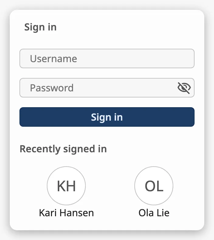
A click on a user fires onRecentUserClick with the initials and label of
that user. The card does not change: to ask for the password of that user, set
userInitials, userLabel and username in the event script and change type
to user-sign-in (see Example 2).
Properties
Section titled “Properties”| Name | Description | Property Type |
|---|---|---|
| hasRecentlySignedIn | Show the list of recent users. Default false. |
value |
| recentUsers | The recent users. Empty by default. | array |
Actions
Section titled “Actions”signedInActions is a list of menu items shown in the signed-in type, between
the user and the Sign out button. Each action is an object:
| Name | Description | Property Type |
|---|---|---|
| id | A name of your choice that identifies the action in the event. Give each action its own. | value |
| label | Text of the menu item. | value |
| hasIcon | Show the icon chosen in icon. Default false. |
value |
| icon | Icon of the menu item, chosen with the icon picker. Only shown when hasIcon is true. |
object |
A click on an action fires onSignedInActionClick with its id and label.
An action whose hasIcon is false normally has no icon. Four ids have an icon
built in, which is used when none is chosen: calendar, log, preferences
and user-account. In the image at the top of the page, Activity log has
the id log and no icon of its own.
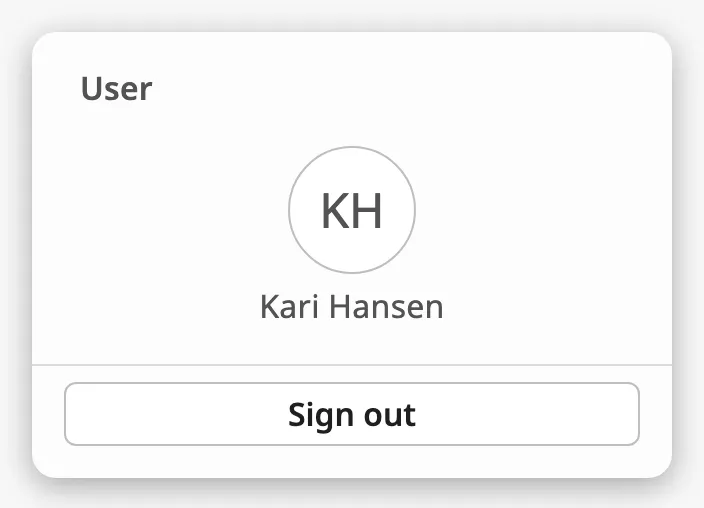
Without actions the menu shows only the user and the button:
Note: Keep the
iconproperty on every action, also whenhasIconisfalse. An action without it, for example one written by a script as onlyidandlabel, makes the component fail to draw.
Properties
Section titled “Properties”| Name | Description | Property Type |
|---|---|---|
| signedInActions | Menu items of the signed-in type. Empty by default. |
array |
Signing Out
Section titled “Signing Out”A click on Sign out fires onSignedOutClick. Sign the user out in the event
script, for example with system.perspective.logout().
Size of the Content
Section titled “Size of the Content”size selects between a spacious and a compact layout:
| size | |
|---|---|
regular (default) |
The user is shown large, with the name under the initials. |
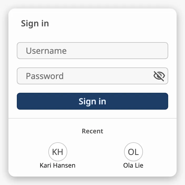
small |
The user is shown on one line, and the recent users are smaller. |
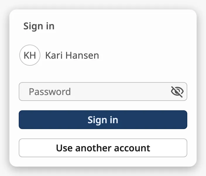
Recent users in the small size:
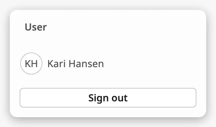
Note: The
smallsize of thesigned-intype does not show the actions, only the user and the Sign out button:
Properties
Section titled “Properties”| Name | Description | Property Type |
|---|---|---|
| size | regular or small. Default regular. |
value |
Appearance
Section titled “Appearance”The colours follow the OpenBridge palette of the session:
The User Menu has no style and no disabled property. In the Designer it
reacts to the mouse and keyboard only in Preview Mode.
Component Events
Section titled “Component Events”| Event | Description | Event Object |
|---|---|---|
| onSignedInClick | Fired when the operator clicks Sign in with the fields filled in. The user is not signed in yet. | username, password |
| onSignedOutClick | Fired when the operator clicks Sign out. | — |
| onRecentUserClick | Fired when the operator clicks a recent user. | initials, label |
| onSignedInActionClick | Fired when the operator clicks an action of the signed-in menu. | id, label |
The values of the event objects are described in Signing In, Recent Users and Actions.
Examples
Section titled “Examples”Example 1 — Menu for the Signed-In User
Section titled “Example 1 — Menu for the Signed-In User”-
Drop a User Menu into a view that is shown as a popup or in a dock.
-
Bind
typeto the expressionif({session.props.auth.authenticated}, 'signed-in', 'sign-in'). -
Bind
userLabeltosession.props.auth.user.userName, anduserInitialsto the expressionupper(substring({session.props.auth.user.userName}, 0, 2)). -
Set
signedInActions:[{"id": "settings","label": "Settings","hasIcon": true,"icon": {"path": "openbridge/settings-iec"}},{"id": "log","label": "Activity log","hasIcon": false,"icon": {"path": "openbridge/placeholder"}}] -
Configure the
onSignedInActionClickevent with a script action:def runAction(self, event):system.perspective.navigate(page='/' + event.id) -
Configure the
onSignedOutClickevent with a script action:def runAction(self, event):system.perspective.logout()
Example 2 — Sign In as a Recent User
Section titled “Example 2 — Sign In as a Recent User”-
Set
hasRecentlySignedIntotrueandrecentUsersto[{"initials": "KH", "label": "Kari Hansen"},{"initials": "OL", "label": "Ola Lie"}] -
Configure the
onRecentUserClickevent with a script action:def runAction(self, event):self.props.userInitials = event.initialsself.props.userLabel = event.labelself.props.username = event.labelself.props.type = 'user-sign-in' -
Configure the
onSignedInClickevent with a script that checksevent.usernameandevent.password, setsself.props.typetosigned-inwhen they are accepted, and setsself.props.passwordErrortoWrong passwordwhen they are not.
Found an error or something unclear?
Tell us what is wrong, confusing or missing on this page.
Built on the OpenBridge Design System