App Button
The App Button is a large, rounded icon button with a label under it, of the kind used in an application menu to open an application or a page. It is found in the Input - OpenBridge section of the Perspective Component Palette as App Button.
- Icon — see Icon and Label.
- Label — see Icon and Label.
The App Button is one of the input components. Events, disabling, icons and the behavior in the Designer are shared by all of them and are described in Input Components — Common Features. This page covers what is specific to the App Button.
An App Button with default properties:
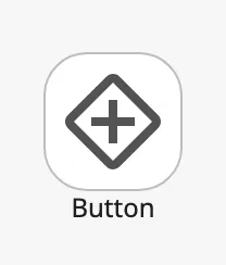
A new App Button already has the label Button and the placeholder icon.
Action
Section titled “Action”The App Button has no value. When the operator clicks it, it fires the
onActionPerformed event once. Configure the event with the action to perform,
for example a navigation action (see Example 1).
Clicking does not change checked. The button is not a toggle; checked
only changes how it is drawn (see Checked).
A disabled App Button does not fire the event.
Icon and Label
Section titled “Icon and Label”icon is an icon picker: choose the icon in the property editor, which sets
icon.path, for example openbridge/chart. See Icons.
label is the text under the icon. Set showLabel to false to hide it:
showLabel = true |
showLabel = false |
|---|---|
|
 |
Properties
Section titled “Properties”| Name | Description | Property Type |
|---|---|---|
| icon | The icon on the button. An icon picker; see icon.path. |
object |
| icon.path | Path of the icon. Default openbridge/placeholder. |
value |
| label | Text under the icon. Default Button. |
value |
| showLabel | Show the label. Default true. |
value |
size selects one of two sizes. The blue frame in the images is the
component’s box, here at the size of a new App Button (72 × 90):
| size | Image | |
|---|---|---|
normal (default) |
The standard size: 72 × 96 px with the label. | 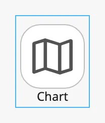 |
small |
A smaller button for dense layouts: 48 × 60 px. | 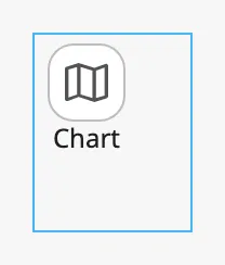 |
The button is drawn at its own size in the top left corner of the component’s
box; it does not stretch with the box. Make the box at least as large as the
button. A normal button with a label is 6 px taller than the box of a new
component, so increase the height to 96.
Properties
Section titled “Properties”| Name | Description | Property Type |
|---|---|---|
| size | normal or small. Default normal. |
value |
Checked
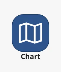
Section titled “Checked”Set checked to true to draw the button as selected, for example to mark the
application or page that is open:
checked |
Enabled | Disabled |
|---|---|---|
false |
|
 |
true |
 |
 |
The component never changes checked itself. Bind it, for example to an
expression that compares the current page with the page the button opens.
Properties
Section titled “Properties”| Name | Description | Property Type |
|---|---|---|
| checked | Draw the button as selected. Default false. |
value |
Integration Style
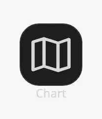
Section titled “Integration Style”Set integration to true when the button is placed on an integration bar. It
is then drawn in the colours of that bar, and is hard to read on an ordinary
background, as in these images:
| Unchecked | Checked |
|---|---|
 |
 |
Properties
Section titled “Properties”| Name | Description | Property Type |
|---|---|---|
| integration | Draw the button for use on an integration bar. Default false. |
value |
Common Properties
Section titled “Common Properties”These work in the same way on every input component, and are described in Input Components — Common Features:
- Disabled —
disabled.
Component Events
Section titled “Component Events”| Event | Description | Event Object |
|---|---|---|
| onActionPerformed | Fired when the operator clicks the button. | — |
See Events.
Examples
Section titled “Examples”Example 1 — Open a Page
Section titled “Example 1 — Open a Page”-
Drop an App Button into the view and set its height to 96.
-
Set
labeltoChartand choose the iconopenbridge/chartforicon. -
Configure the
onActionPerformedevent with a Navigation action that opens the page/chart. -
Bind
checkedto an expression that istruewhen that page is open:{page.props.path} = '/chart'
Found an error or something unclear?
Tell us what is wrong, confusing or missing on this page.
Built on the OpenBridge Design System