Maritime Instruments — Common Features
The maritime instruments show the navigation and propulsion state of a vessel: heading, rudder angle, thrust, speed, motion, wind and so on. They are found in the Maritime - OpenBridge section of the Perspective Component Palette. Each instrument has its own page; this page describes what they have in common.
| Kind | Components |
|---|---|
| Heading and course | Compass |
| Steering | Rudder |
| Gauges | Gauge Vertical |
| Indicators | Rudder Indicator |
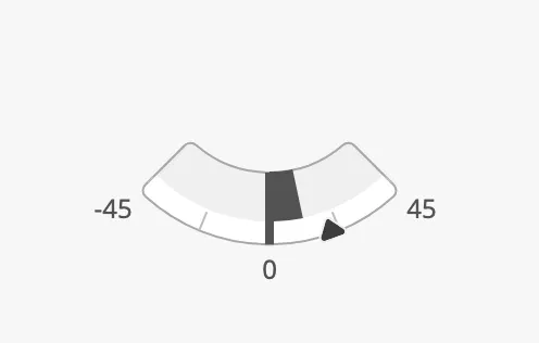
The images on this page show a Rudder. The features look and work the same on the other instruments, though not every instrument has all of them.
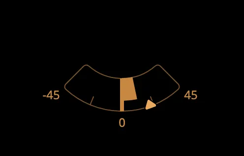
An instrument shows the values it is given. It does not read tags itself, and it takes no input from the operator: bind its properties to the tags of the sensor or the control system. The colours follow the OpenBridge palette of the session:
Instruments and Indicators
Section titled “Instruments and Indicators”Most instruments come in two forms:
- The instrument (Rudder, Compass, Gauge Vertical, …) is the full presentation, with a scale, labels, setpoint and advice zones. It fills the component’s box, so you decide its size. Everything on this page applies to the instruments.
- The indicator (Rudder Indicator, Heading Indicator, …) is a small,
simplified symbol of the same quantity, for overviews and for places where
the exact value is shown elsewhere. It has only a few properties, and its
statehas other values: see the page of each indicator.
state tells whether the value shown can be trusted:
| state | ||
|---|---|---|
active (default) |
The instrument shows a live value. | |
loading |
The value is not available yet. The instrument is dimmed. | 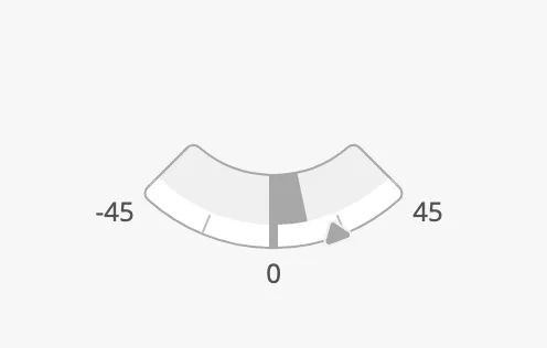 |
off |
The equipment is off or has no signal. The instrument is dimmed and the face is empty. | 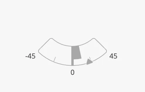 |
Bind state to the quality of the signal, so the operator is never shown an old
value as if it were live.
Properties
Section titled “Properties”| Name | Description | Property Type |
|---|---|---|
| state | active, loading or off. Default active. |
value |
Priority
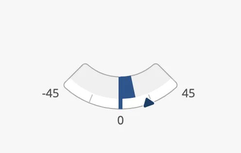
Section titled “Priority”priority selects the colours of the value and the setpoint. Use enhanced for
the instruments the operator is steering by at the moment, and regular for the
rest, so that the important instruments stand out.
regular (default) |
enhanced |
|---|---|
|
 |
Properties
Section titled “Properties”| Name | Description | Property Type |
|---|---|---|
| priority | regular or enhanced. Default regular. |
value |
Setpoint
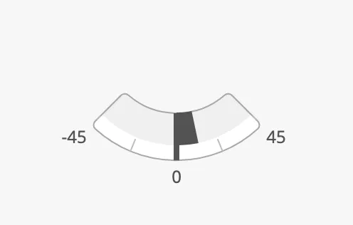
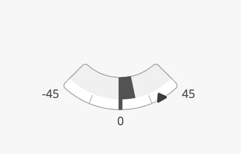
Section titled “Setpoint”An instrument for something that is controlled — a rudder, a thruster, a heading — can show the setpoint: the value that has been ordered, next to the value that has been reached.
Set hasSetpoint to true and bind setpoint to the ordered value. A marker
is drawn on the scale:
| Without setpoint | With setpoint |
|---|---|
 |
 |
On instruments with more than one controlled value, each has its own set of
these properties with the name of the value in it: headingSetpoint on a
Compass, angleSetpoint and thrustSetpoint on an Azimuth Thruster. They work
in the same way.
At Setpoint
Section titled “At Setpoint”When the value has reached the setpoint, the marker is drawn in its “at setpoint” form, docked to the value:
| Not at setpoint | At setpoint |
|---|---|
|
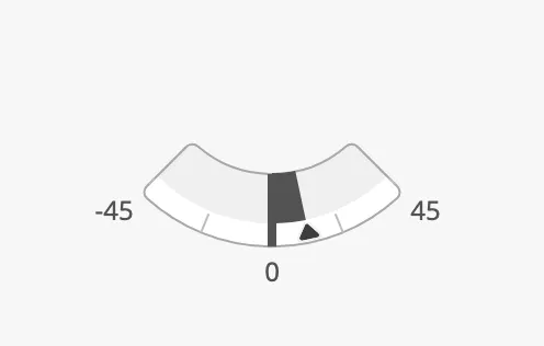 |
There are two ways to decide when the setpoint is reached:
- Automatically — set
autoAtSetpointtotrue. The instrument compares the value with the setpoint itself, and treats them as equal when they differ by no more thanautoAtSetpointDeadband. - From the control system — leave
autoAtSetpointatfalseand bindatSetpointto the signal that says the setpoint is reached.
Changing the Setpoint
Section titled “Changing the Setpoint”Two properties support a control the operator uses to change the setpoint:
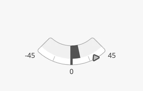
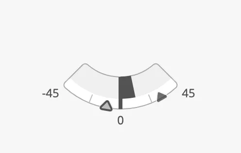
touching— set it totruewhile the operator has a hand on the lever or is dragging the control. The marker is drawn in its focus form, and “at setpoint” is not shown while it lasts.newSetpoint— for a control where the new value must be confirmed. SethasNewSetpointtotrueandnewSetpointto the value being chosen: the current setpoint is dimmed and a second marker shows the new one. When the operator confirms, write the value tosetpointand sethasNewSetpointtofalse. WithanimateSetpointthe marker slides to its new place.
touching |
newSetpoint |
|---|---|
 |
 |
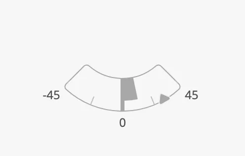
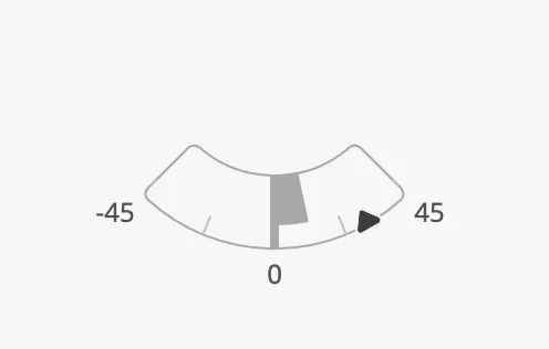
Setpoint in the Loading and Off States
Section titled “Setpoint in the Loading and Off States”The setpoint is dimmed together with the rest of the instrument when state is
loading or off. Set setpointOverride to true to keep the setpoint in its
normal colour — for a control whose order is still valid although the feedback
is missing.
setpointOverride = false |
setpointOverride = true |
|---|---|
 |
 |
Properties
Section titled “Properties”| Name | Description | Property Type |
|---|---|---|
| hasSetpoint | Show the setpoint. Default false. |
value |
| setpoint | The ordered value. Only shown when hasSetpoint is true. |
value |
| autoAtSetpoint | Let the instrument decide when the setpoint is reached. Default false. |
value |
| autoAtSetpointDeadband | How far the value may be from the setpoint and still count as reached, with autoAtSetpoint. |
value |
| atSetpoint | Whether the setpoint is reached. Used when autoAtSetpoint is false. Default false. |
value |
| touching | The operator is operating the control. Default false. |
value |
| hasNewSetpoint | Show a second marker for a setpoint that is being chosen. Default false. |
value |
| newSetpoint | The setpoint being chosen. Only shown when hasNewSetpoint is true. |
value |
| animateSetpoint | Animate the marker when a new setpoint is confirmed. Default false. |
value |
| setpointAtZeroDeadband | How close to zero the setpoint must be to be drawn in its “zero” form. | value |
| setpointOverride | Keep the setpoint in its normal colour in the loading and off states. Default false. |
value |
Advice Zones
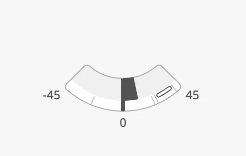
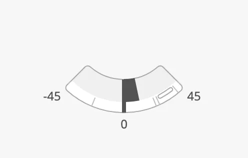
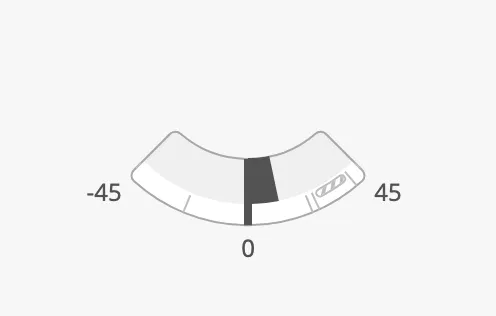
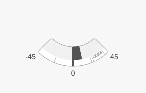
Section titled “Advice Zones”An advice marks a part of the scale: a range that is recommended, or one to
be careful with. advices is a list of zones, each an object:
| Name | Description | Property Type |
|---|---|---|
| minAngle | Start of the zone, in the unit of the scale. Called min on the linear gauges. |
value |
| maxAngle | End of the zone. Called max on the linear gauges. |
value |
| type | advice for a recommended range, caution for one to be careful with. |
value |
| hinted | Draw the zone dimmed, as a hint that is less prominent. | value |
| type | hinted = false |
hinted = true |
|---|---|---|
advice |
 |
 |
caution |
 |
 |
A zone is triggered, and drawn in its alert colour, when the setpoint is inside it. The value alone being inside the zone does not trigger it:
| Value inside the zone | Setpoint inside the zone |
|---|---|
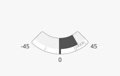 |
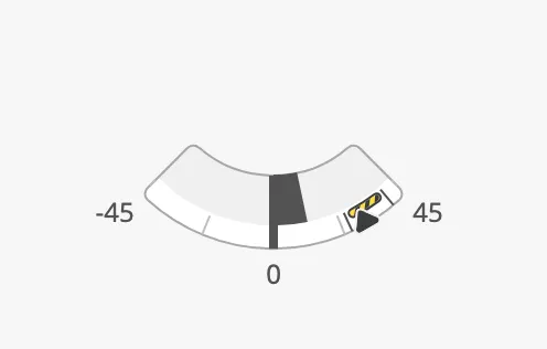 |
| Name | Description | |
|---|---|---|
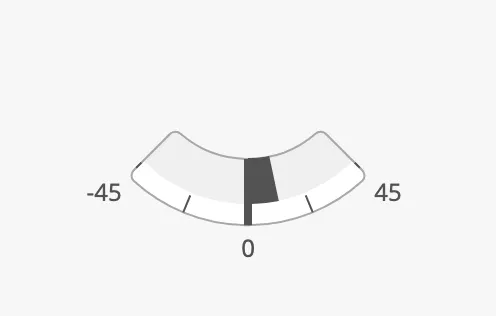
| showLabels | Show the numbers of the scale. | |
| tickmarksInside | Draw the tickmarks and labels inside the ring instead of outside it, which makes the ring larger in the same box. | 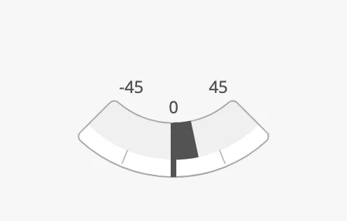 |
| tickmarkStyle | regular, or enhanced for darker, more prominent tickmarks. |
 |
Instruments with a free scale also have primaryTickmarkInterval,
secondaryTickmarkInterval and tertiaryTickmarkInterval: the distance between
the long, labelled tickmarks, the medium ones and the short ones. Each is turned
on with its has… property.
An instrument fills the component’s box and is centred in it: make the component larger and the instrument grows. The blue frame in the images is the component’s box:
| Small box | Large box |
|---|---|
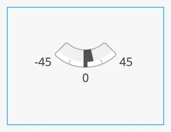 |
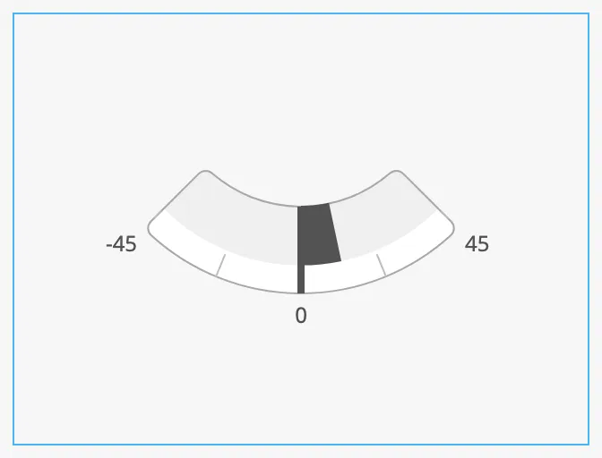 |
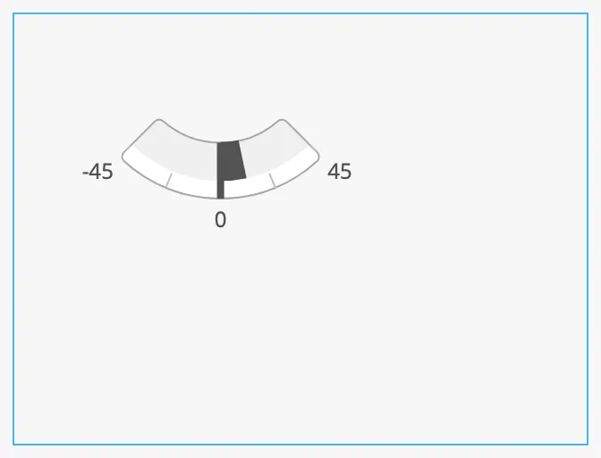
The labels need room inside the box, so two instruments in boxes of the same
size can end up with rings of different size if their labels differ. To make the
rings of several instruments exactly equal, set hasFaceDiameter to true and
give them the same faceDiameter, the diameter of the ring in pixels. The
instrument then has that size whatever the box, and is placed at the top left of
it:
Properties
Section titled “Properties”| Name | Description | Property Type |
|---|---|---|
| hasFaceDiameter | Give the ring a fixed diameter instead of filling the box. Default false. |
value |
| faceDiameter | Diameter of the ring in pixels. Only shown when hasFaceDiameter is true. |
value |
Style and Events
Section titled “Style and Events”| Name | Description | Property Type |
|---|---|---|
| style | Standard Perspective style object. | object |
The instruments have no component events of their own. The standard Perspective
events, such as onClick, are available in the component’s event configuration.
Examples
Section titled “Examples”Example 1 — Setpoint from the Control System
Section titled “Example 1 — Setpoint from the Control System”On a Rudder:
- Bind
angleto the rudder feedback, for example[default]Steering/RudderAngle. - Set
hasSetpointtotrueand bindsetpointto[default]Steering/RudderOrder. - Set
autoAtSetpointtotrueandautoAtSetpointDeadbandto1, so the marker shows “at setpoint” when the rudder is within 1° of the order. - Bind
stateto an expression that givesoffwhen the feedback has bad quality, for exampleif(isGood({[default]Steering/RudderAngle}), 'active', 'off').
Found an error or something unclear?
Tell us what is wrong, confusing or missing on this page.
Built on the OpenBridge Design System