Automation Tank
The Automation Tank is a tile for a tank, or for a battery, that shows how full it is. It is found in the Automation - OpenBridge section of the Perspective Component Palette as Automation Tank (Beta).
Note: This component is in beta: its properties may change in a later version.
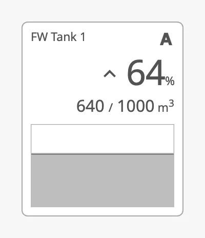
- Tag — the name of the tank. See Tag.
- Badges — small icons in the top right corner. See Badges.
- Percent and trend — how full the tank is, with a symbol for whether the level is rising or falling. See Level and Trend.
- Value and capacity — the content and the capacity, with a unit.
- Chart — a bar, or a graph of the level over time. See Chart.
The tank shows the values it is given; it does not read tags or alarms itself, and clicking it does nothing unless you configure an event.
An Automation Tank dropped from the palette with default properties:
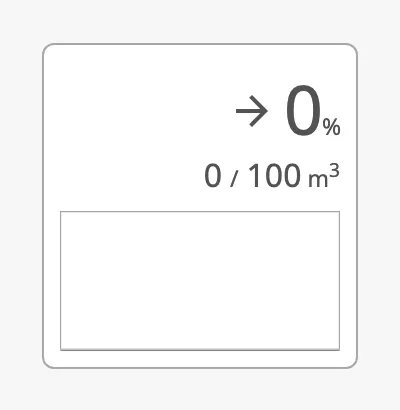
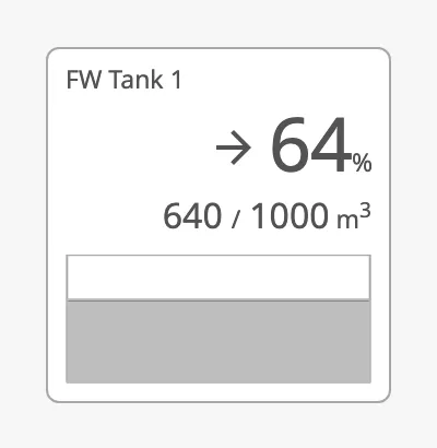
Bind value to the content of the tank and set max to its capacity, in the
same unit. The tank shows both numbers, the percentage value is of max, and
a bar filled to that percentage. A value above max is shown as 100 %.
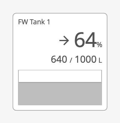
The unit is m³. For another unit, set hasCustomUnit to true and write
the unit in unitText.
value = 640, max = 1000 |
unitText = L |
|---|---|
 |
 |
Decimals
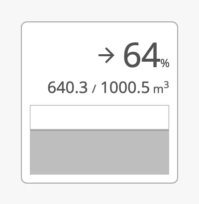
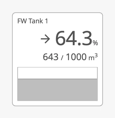
Section titled “Decimals”The numbers are shown without decimals. valueFractionDigits and
maxFractionDigits set the number of decimals of the content and the capacity,
and percentFractionDigits that of the percentage.
valueFractionDigits = 1, maxFractionDigits = 1 |
percentFractionDigits = 1 |
|---|---|
 |
 |
value and max can also be texts. A text is shown exactly as it is written,
which lets you format the number yourself, for example with a decimal comma.
The bar and the percentage are then calculated from the number the text
starts with: 640,3 counts as 640, and 1 000 counts as 1. Use a text only
when the number in it is written without spaces.
Properties
Section titled “Properties”| Name | Description | Property Type |
|---|---|---|
| value | Content of the tank: a number, or a text that is shown as written. Default 0. |
value |
| max | Capacity of the tank: a number, or a text that is shown as written. Default 100. |
value |
| valueFractionDigits | Number of decimals of the content. Applies when value is a number. Default 0. |
value |
| maxFractionDigits | Number of decimals of the capacity. Applies when max is a number. Default 0. |
value |
| percentFractionDigits | Number of decimals of the percentage. Not used by the compact layout. Default 0. |
value |
| hasCustomUnit | Use unitText as the unit instead of m³. Default false. |
value |
| unitText | The unit. Default m³. Only shown when hasCustomUnit is true. |
value |
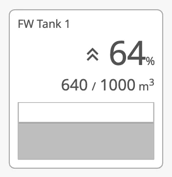
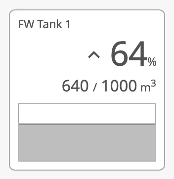
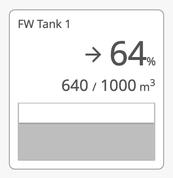
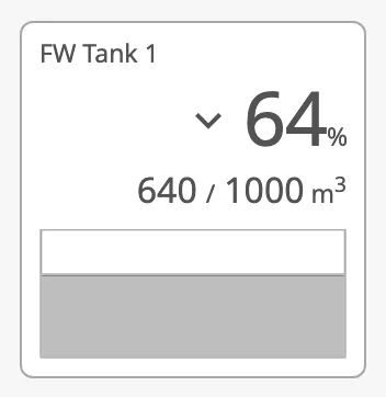
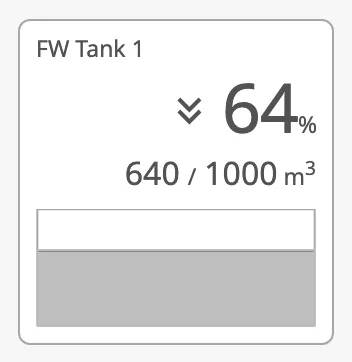
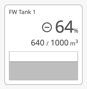
trend selects the symbol in front of the percentage. The tank does not work
out the trend itself: bind trend to an expression that compares the level
with an earlier one. Set showTrendSymbol to false to hide the symbol.
| trend | |
|---|---|
fast-rising |
 |
rising |
 |
stable (default) |
 |
falling |
 |
fast-falling |
 |
closed |
 |
Properties
Section titled “Properties”| Name | Description | Property Type |
|---|---|---|
| trend | fast-rising, rising, stable, falling, fast-falling or closed. Default stable. |
value |
| showTrendSymbol | Show the trend symbol. Default true. |
value |
tag is the name of the tank, shown in the top left corner. It is empty by
default, as in the image of the default properties above.
Properties
Section titled “Properties”| Name | Description | Property Type |
|---|---|---|
| tag | Name of the tank, for example FW Tank 1. Empty by default. |
value |
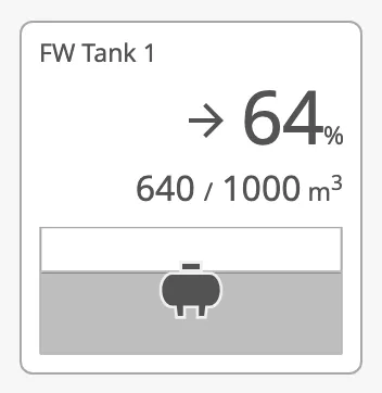
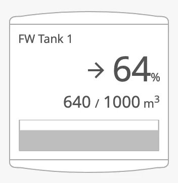
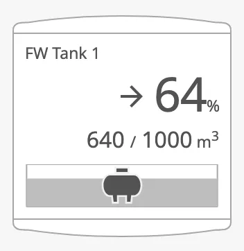
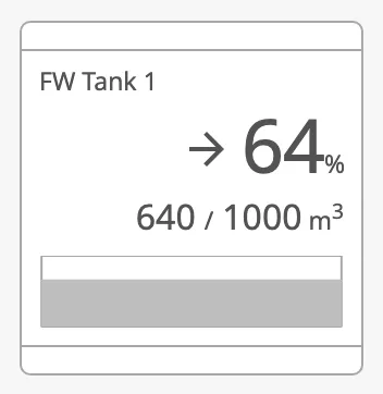
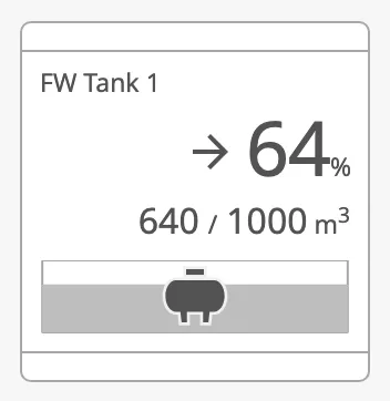
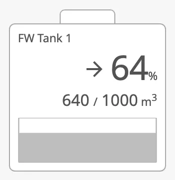
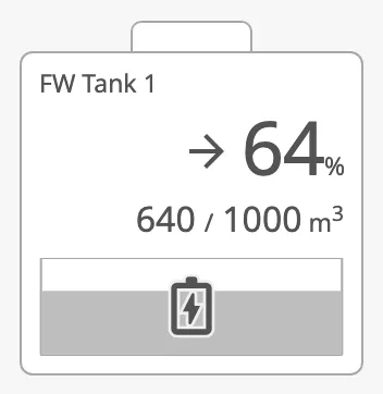
type selects the outline of the tile, which tells what kind of tank it is.
Set hasGraphIcon to true to also draw an icon on the chart: a battery for
the battery type, a tank for the others.
| type | hasGraphIcon = false |
hasGraphIcon = true |
|---|---|---|
generic (default) |
|
 |
atmospheric |
 |
 |
pressurized |
 |
 |
battery |
 |
 |
Properties
Section titled “Properties”| Name | Description | Property Type |
|---|---|---|
| type | generic, atmospheric, pressurized or battery. Default generic. |
value |
| hasGraphIcon | Draw a tank or battery icon on the chart. Default false. |
value |
| medium | normal, empty, water or air. Default water. Has no visible effect. |
value |
Layout
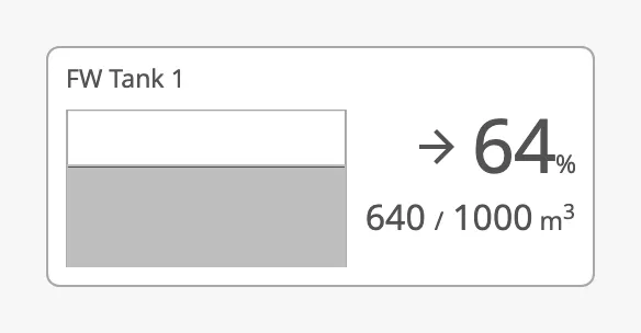
Section titled “Layout”orientation places the chart below the numbers (vertical) or beside them
(horizontal):
vertical (default) |
horizontal |
|---|---|
|
 |
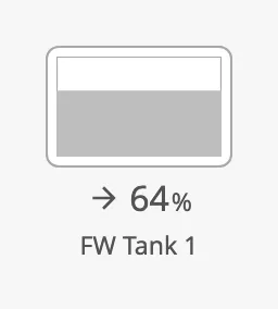
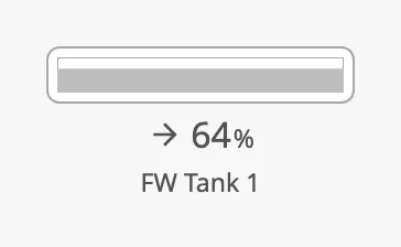
Set compact to true for a small tile with only the chart, the percentage
and the tag. The content, the capacity and the detail rows are
not shown.
| Compact | Compact, horizontal |
|---|---|
 |
 |
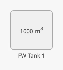
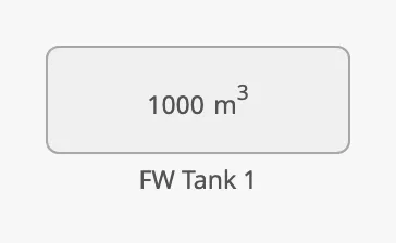
Set static to true for a tank whose level is not known: the tile is grey
and shows only the capacity and the tag. static takes precedence over
compact.
| Static | Static, horizontal |
|---|---|
 |
 |
Properties
Section titled “Properties”| Name | Description | Property Type |
|---|---|---|
| orientation | vertical or horizontal. Default vertical. |
value |
| compact | Small tile with chart, percentage and tag only. Default false. |
value |
| static | Grey tile that shows only the capacity and the tag. Default false. |
value |
Positioning
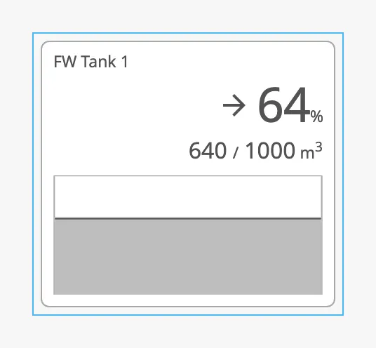
Section titled “Positioning”positioning decides how the tank is placed in the component’s box. The blue
frame in the images is the component’s box, as the Designer shows it when the
component is selected:
| positioning | |
|---|---|
button (default) |
 |
point |
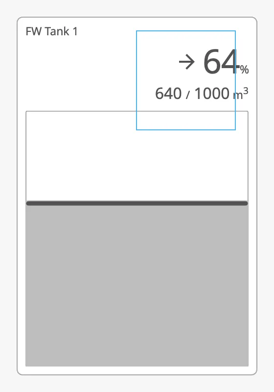 |
button— the tank fills the box. Resize the component to resize the tank. The text keeps its size, so a small box leaves little room for the chart; a new component is 168 × 173.point— the tank has a fixed size and ignores the size of the box: 256 × 376 (170 × 282 when compact or static, 420 × 256 when horizontal, 244 × 208 when both). The middle of its top edge is placed on the top left corner of the box, 20 px above it in the layouts that are not compact. Use it when the tank must hang from a fixed point in a diagram.
Note:
pointworks differently here than on the automation buttons, where the point is the top centre of the box.
Properties
Section titled “Properties”| Name | Description | Property Type |
|---|---|---|
| positioning | button fills the component’s box; point hangs a tank of fixed size from the top left corner of the box. Default button. |
value |
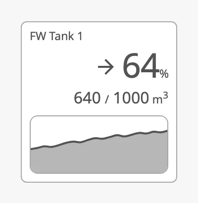
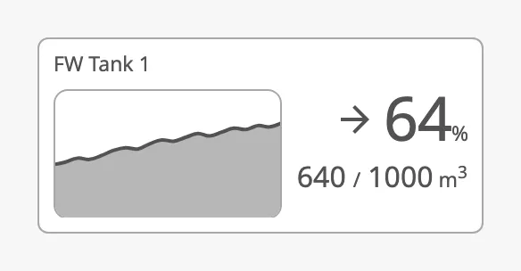
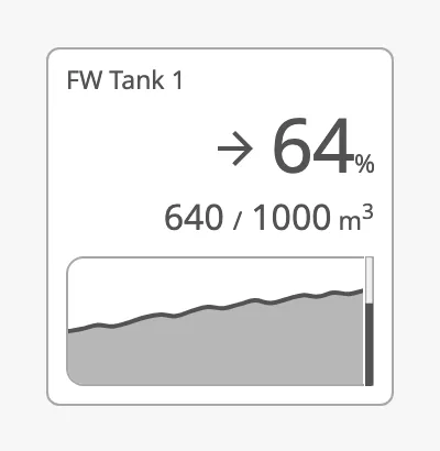
chartMode selects what the chart shows:
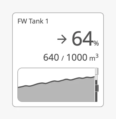
bar(default) — a bar filled to the level.graph— a graph of the level over time, fromchartData.graph-and-bar— the graph, with a narrow bar for the current level at its right edge.
| chartMode | vertical |
horizontal |
|---|---|---|
bar |
|
|
graph |
 |
 |
graph-and-bar |
 |
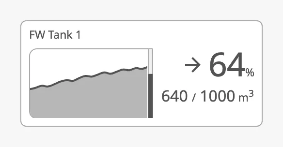 |
chartData holds the points of the graph, on the same scale as value and
max. It can be:
- a dataset, for example from a tag history binding. The first date column (or else the first column) is the time, and the first other column that is not a date is the level;
- an object with two lists of equal length,
xValuesandyValues; - a list of objects with a
valueeach.
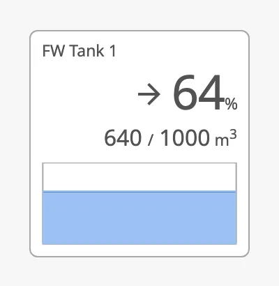
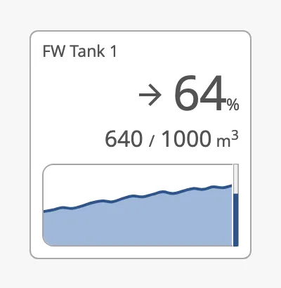
priority selects the colour of the bar and the graph. Use enhanced for the
tank the operator is working with:
regular (default) |
enhanced |
enhanced, graph-and-bar |
|---|---|---|
|
 |
 |
Advice
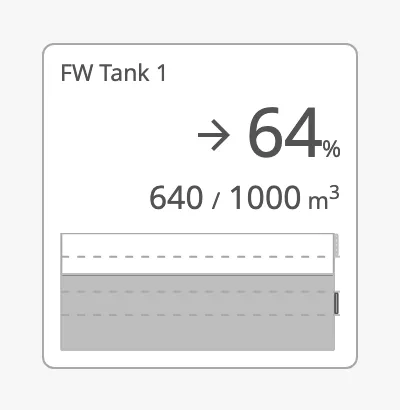
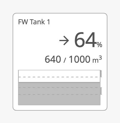
Section titled “Advice”Advice zones mark ranges of the level on the chart, for example the range the
tank should be kept in, or a range to stay out of. Set hasAdvice to true
and add one item to advice for each zone, with its limits on the same scale
as value. The limits are drawn as dashed lines across the bar, and the zone
as a mark on its right edge.
advice and caution zones |
The same zones, hinted |
With graph-and-bar |
|---|---|---|
 |
 |
 |
Properties
Section titled “Properties”| Name | Description | Property Type |
|---|---|---|
| chartMode | bar, graph or graph-and-bar. Default bar. |
value |
| chartData | The points of the graph: a dataset, an object with xValues and yValues, or a list. Empty by default. |
object |
| priority | Colour of the bar and the graph: regular or enhanced. Default regular. |
value |
| hasAdvice | Show the advice zones. Default false. |
value |
| advice | The advice zones. Empty by default. | array |
| advice[].min | Lower limit of the zone. Default 0. |
value |
| advice[].max | Upper limit of the zone. Default 10. |
value |
| advice[].type | advice or caution. Default advice. |
value |
| advice[].hinted | Draw the zone mark as an outline instead of filled. Default false. |
value |
Detail Rows
Section titled “Detail Rows”readout is a list of extra measurements of the tank, such as temperature and
pressure. Each item gives one row between the numbers and the chart, with a
label, a value and a unit. The rows are shown in the regular layout only, not
when the tank is compact or static, and they need a taller box: the image
is 168 × 230.
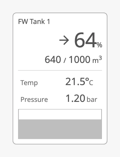
numberFormat of a row is a Java
DecimalFormat
pattern. Only the digits after the decimal point are used; they set the number
of decimals: 0.0 shows 21.5, 0.00 shows 1.20, and both #,##0.## and
0.00 show 1234.567 as 1234.57. No thousands separator is added.
Properties
Section titled “Properties”| Name | Description | Property Type |
|---|---|---|
| readout | The detail rows. Empty by default. | array |
| readout[].label | Text in front of the value. Default Label. |
value |
| readout[].value | The number. Default 0. |
value |
| readout[].unit | Text after the number. Empty by default. | value |
| readout[].hasDegree | Show a degree sign between the number and the unit. Default false. |
value |
| readout[].numberFormat | DecimalFormat pattern that sets the number of decimals. Default #,##0. |
value |
Clickable and Activated
Section titled “Clickable and Activated”With clickable set to true, the tank is a button: it is highlighted while
the pointer is over it, and it can be reached with the keyboard. Set it to
false for a tank that only shows data. Nothing happens on a click in either
case until you configure an onClick event.
Set activated to true to show a highlighted background behind the tank. Use
it to mark the tank as selected, for example while its faceplate is open. It
works only while clickable is true.
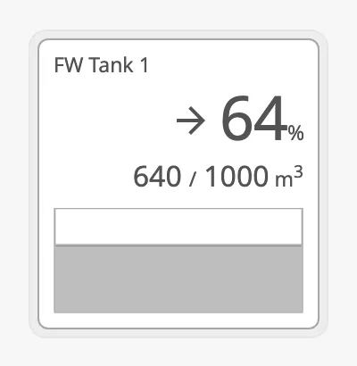
Properties
Section titled “Properties”| Name | Description | Property Type |
|---|---|---|
| clickable | Draw the tank as a button, with a hover state. Default true. |
value |
| activated | Show the activated (selected) background. Needs clickable. Default false. |
value |
Badges
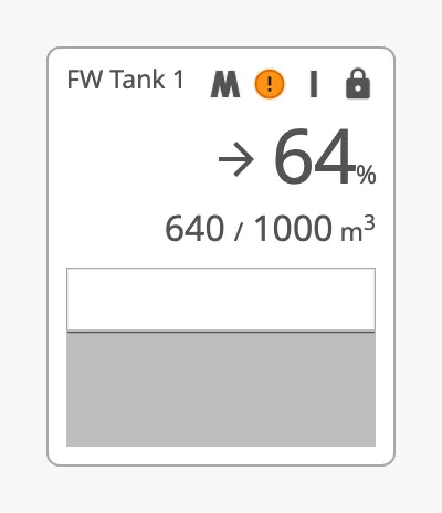
Section titled “Badges”The tank has the same four badges as the automation buttons, with the same
properties and values: badgeControl, badgeAlert, badgeInterlock and
badgeCommandLocked. They are described in
Badges. On the tank they are drawn in a row in
the top right corner, in that order:
Alert Frame
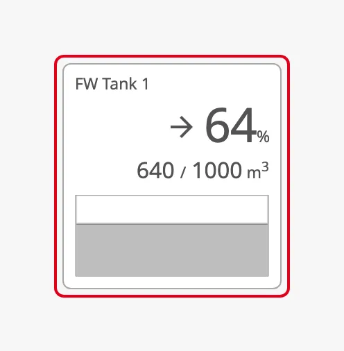
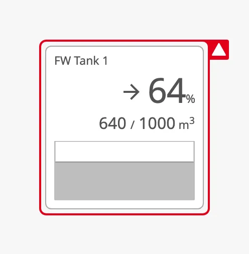
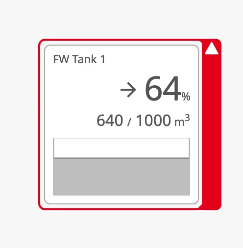
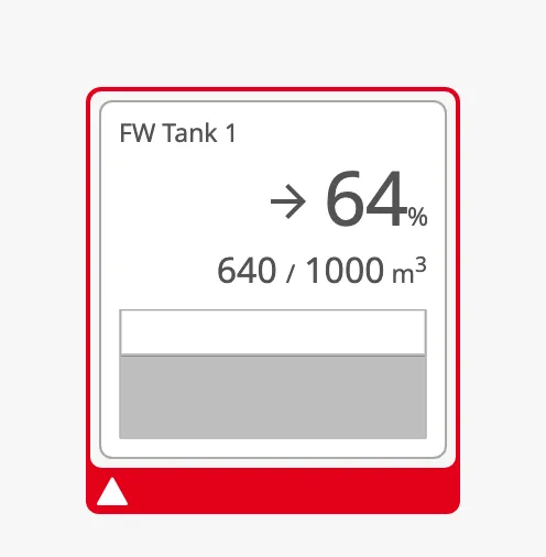
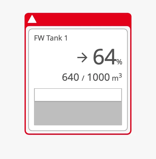
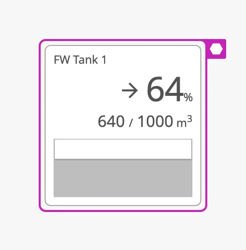
Section titled “Alert Frame”Set alert to true to draw an alert frame around the tank. The properties
are those of the automation buttons, described in
Alert Frame, with these differences:
- There is no
alertFrameMode: the frame is always steady and does not flash. showAlertIconhas no effect, as the tank has no property for an icon of your own.- The properties are shown in the property editor also while
alertisfalse.
| alertFrameType | |
|---|---|
regular |
 |
small-side-flip (default) |
 |
large-side-flip |
 |
bottom-flip |
 |
top-flip |
 |
| alertFrameStatus | |
|---|---|
level-critical |
 |
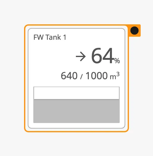
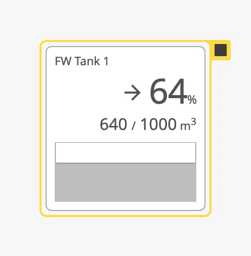
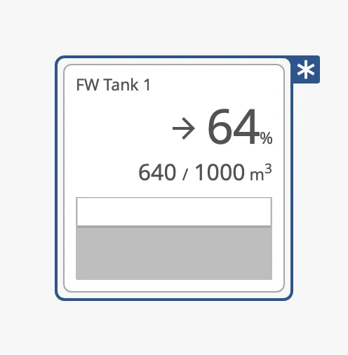
level-high |
|
level-medium |
 |
level-low |
 |
level-diagnostic |
 |
alarm (default) |
|
warning |
|
caution |
|
Properties
Section titled “Properties”| Name | Description | Property Type |
|---|---|---|
| alert | Show the alert frame. Default false. |
value |
| alertFrameType | Shape of the frame: regular, small-side-flip, large-side-flip, bottom-flip or top-flip. Default small-side-flip. |
value |
| alertFrameStatus | Colour and icon: a level-* value, alarm, warning or caution. Default alarm. |
value |
| alertFrameThickness | small or large. Default small. |
value |
| showAlertCategoryIcon | Show the icon of the alert status in the flap. Default true. |
value |
| showAlertIcon | No effect. Default false. |
value |
Properties
Section titled “Properties”| Name | Description | Property Type |
|---|---|---|
| style | Standard Perspective style object. | object |
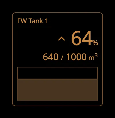
The colours follow the OpenBridge palette of the session:
Component Events
Section titled “Component Events”The Automation Tank has no component events of its own. The standard
Perspective events, such as onClick, are available in the component’s event
configuration.
Examples
Section titled “Examples”Example 1 — Fresh Water Tank with Trend
Section titled “Example 1 — Fresh Water Tank with Trend”-
Drop an Automation Tank into the view.
-
Set
tagtoFW Tank 1andmaxto the capacity of the tank, for example1000. -
Bind
valueto the content of the tank, for example[default]Tanks/FW1/Volume. -
Bind
trendto an expression on the rate of change of the level, for example:if({[default]Tanks/FW1/Rate} > 0.5, 'rising', if({[default]Tanks/FW1/Rate} < -0.5, 'falling', 'stable'))
Example 2 — Level History as a Graph
Section titled “Example 2 — Level History as a Graph”- Set
chartModetograph-and-bar. - Add a Tag History binding to
chartDatafor the tag of the content, for example[default]Tanks/FW1/Volume, with the time range you want to show and the return format Dataset.
Example 3 — Battery
Section titled “Example 3 — Battery”- Set
typetobatteryandhasGraphIcontotrue. - Set
hasCustomUnittotrueandunitTexttokWh. - Set
maxto the capacity of the battery and bindvalueto its charge, both in kWh.
Found an error or something unclear?
Tell us what is wrong, confusing or missing on this page.
Built on the OpenBridge Design System