Heat Pump
The Heat Pump is a tile that represents a heat pump in an HVAC or automation view. It is found in the Automation - OpenBridge section of the Perspective Component Palette as Heat Pump (Beta).
Note: This component is in beta: its properties may change in a later version.
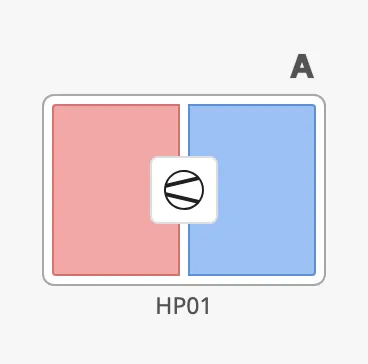
- Graphic area — the two halves of the tile, the hot side to the left and the cold side to the right. See Medium.
- Icon — the heat pump icon in the middle.
- Tag — the name of the device, below the graphic area. See Tag.
- Badges — a row of small icons above the tile. See Badges.
- Alert frame — a coloured frame around the tile. See Alert Frame.
The Heat Pump shows the state it is given; it does not read tags or alarms itself, and clicking it does nothing unless you configure an event.
A Heat Pump dropped from the palette with default properties. The blue frame is the component’s box, as the Designer shows it when the component is selected:
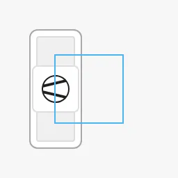
A new Heat Pump is squeezed into its 48 × 48 box and drawn beside it. Set
positioning to button and resize the component, for example to 152 × 96,
or 152 × 124 with a tag and 152 × 150 with a tag and badges. See
Positioning. The images on the rest of this page are taken that
way.
Medium
Section titled “Medium”medium selects what the graphic area shows:
regular (default) |
graphic |
medium |
|---|---|---|
 |
 |
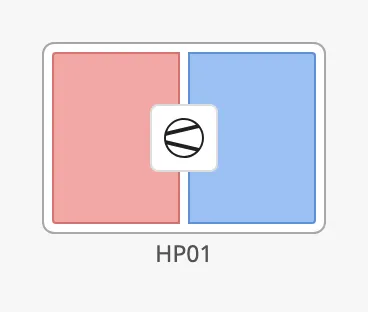 |
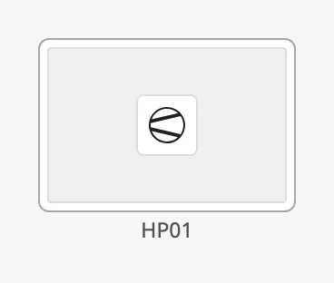
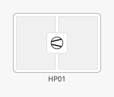
regular— one grey area.graphic— two grey halves.medium— the hot half and the cold half in their own colours.
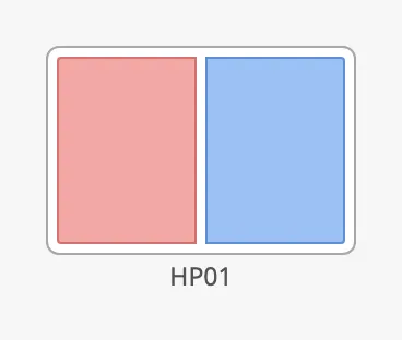
Set showIcon to false to hide the icon in the middle:
Static
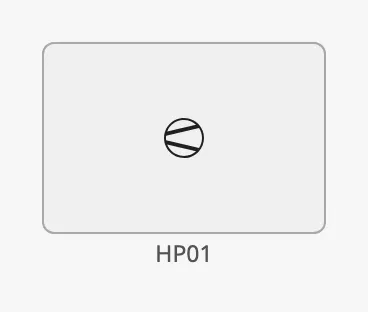
Section titled “Static”Set static to true for a heat pump that is only drawn, with no state to
show: the tile is flat and grey, the graphic area is hidden and only the icon
is left. medium has no effect then.
Properties
Section titled “Properties”| Name | Description | Property Type |
|---|---|---|
| medium | What the graphic area shows: regular, graphic or medium. Default regular. |
value |
| showIcon | Show the heat pump icon. Default true. |
value |
| static | Draw a flat, display-only tile without the graphic area. Default false. |
value |
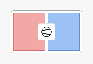
tag is the name of the device, shown below the graphic area. When it is
empty, the row is removed and the graphic area takes its place.
tag = HP01 |
tag empty |
|---|---|
|
 |
Properties
Section titled “Properties”| Name | Description | Property Type |
|---|---|---|
| tag | Name of the device, for example HP01. Empty by default. |
value |
Positioning
Section titled “Positioning”positioning decides how the tile is placed in the component’s box. The blue
frame in the images is the component’s box:
| positioning | |
|---|---|
button |
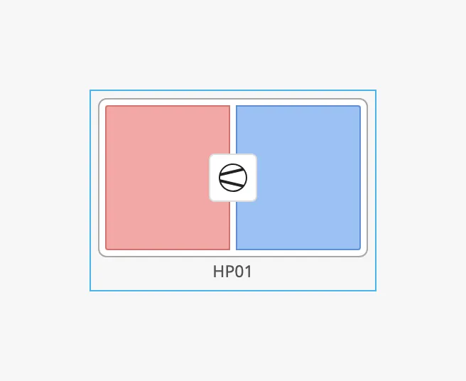 |
point |
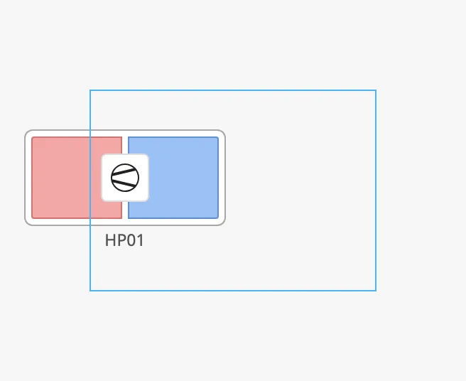 |
button— the tile fills the box, including the tag row and the badge row. The size of the component is the size of the tile. Use this value.point— the tile has a fixed size of 152 × 96 and ignores the size of the box. It is drawn 76 px (half its width) to the left of the centre of the box, so it does not line up with the box. When the box is narrower than 152 px, the tile is also squeezed.
Note: A new Heat Pump has
positioningset tosymbol, which is not one of the two options and works aspoint. Selectbuttonin the property editor.
Properties
Section titled “Properties”| Name | Description | Property Type |
|---|---|---|
| positioning | button fills the component’s box; point draws a tile of fixed size beside the centre of the box. |
value |
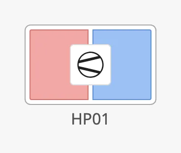
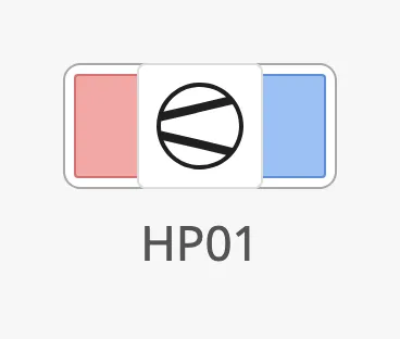
componentSize sets the size of the icon and of the tag text. It does not
change the size of the tile, which follows the box:
regular |
medium |
large |
|---|---|---|
|
 |
 |
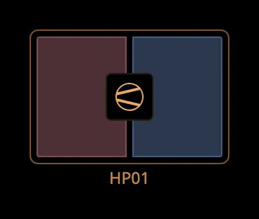
The colours follow the OpenBridge palette of the session:
Properties
Section titled “Properties”| Name | Description | Property Type |
|---|---|---|
| componentSize | Size of the icon and the tag text: regular, medium or large. Default regular. |
value |
Clickable and Activated
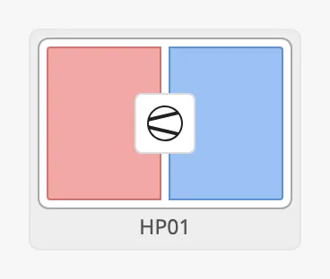
Section titled “Clickable and Activated”With clickable set to true, the tile is a button: it is highlighted when the
pointer is over it and when it is pressed, and it can be reached with the
keyboard. Set it to false for a tile that is only a picture. Nothing happens
on a click in either case until you configure an onClick event.
Set activated to true to show a highlighted background behind the tile. Use
it to mark the heat pump as selected, for example while its faceplate is open.
It works only while clickable is true.
Properties
Section titled “Properties”| Name | Description | Property Type |
|---|---|---|
| clickable | Draw the tile as a button, with hover and pressed states. Default true. |
value |
| activated | Show the activated (selected) background. Default false. Only shown when clickable is true. |
value |
Badges
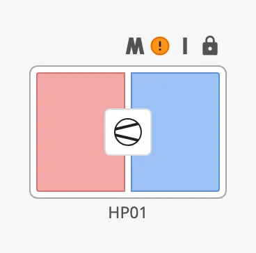
Section titled “Badges”The Heat Pump has the same four badges as the automation buttons, with the same values; see Badges for what each value looks like. On the Heat Pump they are drawn in a row above the tile, in the order control, alert, interlock, command lock. The row takes no room when there are no badges.
Properties
Section titled “Properties”| Name | Description | Property Type |
|---|---|---|
| badgeControl | Control mode badge: none, local, local-only, manual, manual-only or auto. Default none. |
value |
| badgeAlert | Alert badge: none, a level-* value, alarm, warning, caution or silence. Default none. |
value |
| badgeInterlock | Interlock badge: none, interlock or interlock-inhibit. Default none. |
value |
| badgeCommandLocked | Command lock badge: none or command-locked. Default none. |
value |
Alert Frame
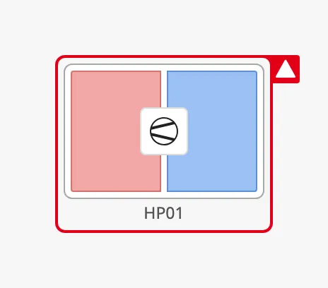
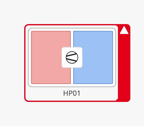
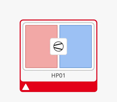
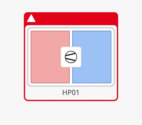
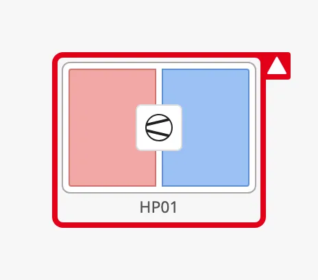
Section titled “Alert Frame”Set alert to true to draw an alert frame around the tile. The properties
are those of the automation buttons, described in
Alert Frame, with two differences:
- There is no
alertFrameMode: the frame is always steady and does not flash. - The Heat Pump can show an icon of your choice in the flap. See Alert Icon.
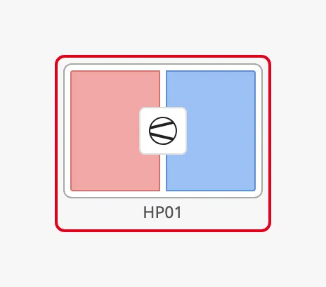
alertFrameType selects the shape of the frame:
| alertFrameType | |
|---|---|
regular |
 |
small-side-flip (default) |
 |
large-side-flip |
 |
bottom-flip |
 |
top-flip |
 |
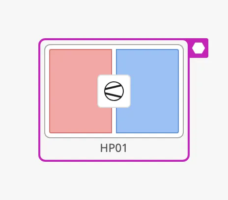
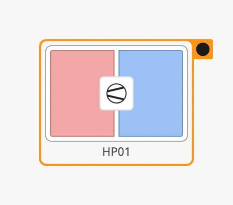
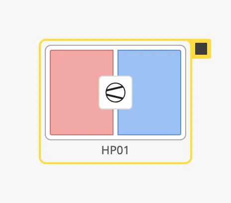
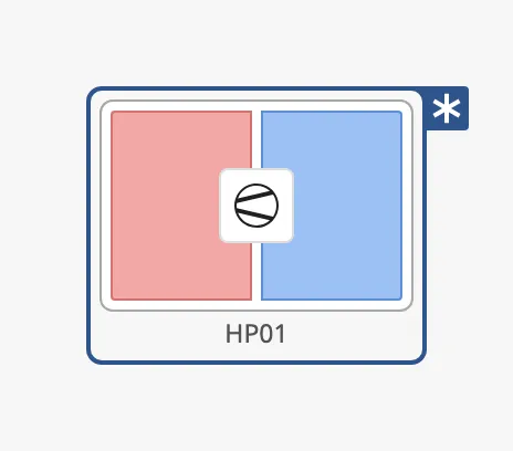
alertFrameStatus selects the colour and the icon:
| alertFrameStatus | |
|---|---|
level-critical |
 |
level-high |
|
level-medium |
 |
level-low |
 |
level-diagnostic |
 |
alarm (default) |
|
warning |
|
caution |
|
alertFrameThickness selects the thickness of the frame, and
showAlertCategoryIcon whether the icon of the alert status is shown:
alertFrameThickness = small |
|
alertFrameThickness = large |
 |
showAlertCategoryIcon = false |
|
Alert Icon
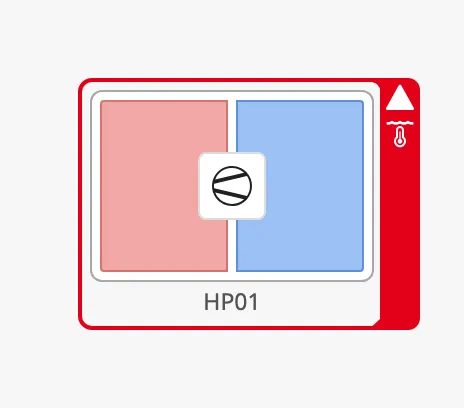
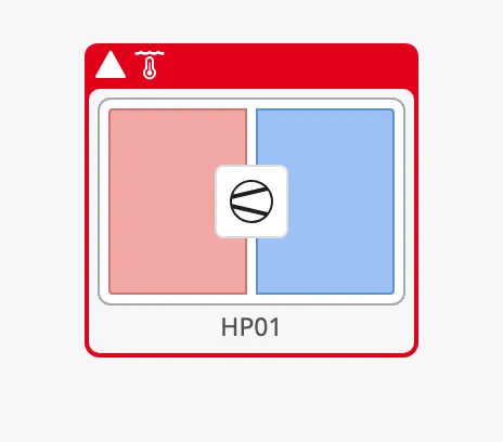
Section titled “Alert Icon”To show an icon of your own in the flap, next to the icon of the alert status,
set hasAlertIcon to true, select the icon with alertIcon.path, and set
showAlertIcon to true. The icon is shown in the large flaps only
(large-side-flip, top-flip and bottom-flip); the small flap has no room
for it.
large-side-flip |
top-flip |
|---|---|
 |
 |
Properties
Section titled “Properties”| Name | Description | Property Type |
|---|---|---|
| alert | Show the alert frame. Default false. |
value |
| alertFrameType | Shape of the frame: regular, small-side-flip, large-side-flip, bottom-flip or top-flip. Default small-side-flip. Only shown when alert is true. |
value |
| alertFrameStatus | Colour and icon: a level-* value, alarm, warning or caution. Default alarm. Only shown when alert is true. |
value |
| alertFrameThickness | small or large. Default small. Only shown when alert is true. |
value |
| showAlertCategoryIcon | Show the icon of the alert status in the flap. Default true. Only shown when alert is true. |
value |
| showAlertIcon | Show the icon selected with alertIcon in a large flap. Default false. Only shown when alert is true. |
value |
| hasAlertIcon | Use an icon of your own in the alert frame. Default false. |
value |
| alertIcon | The icon. Only shown when hasAlertIcon is true. |
object |
| alertIcon.path | Path of the icon, for example openbridge/temperature-water. Default openbridge/placeholder. |
value |
Properties
Section titled “Properties”| Name | Description | Property Type |
|---|---|---|
| style | Standard Perspective style object. | object |
Component Events
Section titled “Component Events”The Heat Pump has no component events of its own. The standard Perspective
events, such as onClick, are available in the component’s event
configuration.
Examples
Section titled “Examples”Example 1 — Heat Pump with an Alarm
Section titled “Example 1 — Heat Pump with an Alarm”- Drop a Heat Pump into the view. Set
positioningtobuttonand resize the component to 152 × 124. - Set
mediumtomediumandtagtoHP01. - Bind
alertto an expression that istruewhile the heat pump has an active alarm, and setalertFrameStatusto the severity of that alarm, for examplelevel-high. - Bind
badgeControlto the control mode of the heat pump, for example withif({[default]HP01/Auto}, 'auto', 'manual'). - Configure the
onClickevent to open the faceplate of the heat pump.
Found an error or something unclear?
Tell us what is wrong, confusing or missing on this page.
Built on the OpenBridge Design System