Card
The Card is a surface that groups related content on a page, with an optional title. It is a container: you place another component inside it. It is found in the App - OpenBridge section of the Perspective Component Palette as Card.
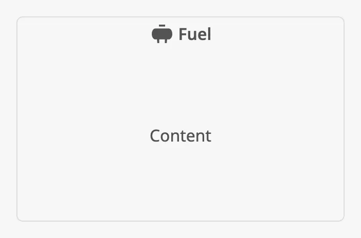
The parts of the card:
- Title — an optional header with a text and an icon. See Title.
- Content — the component you place in the card. See Content.
- Dialog — optionally, a click on the card opens a dialog with more detail. See Dialog.
See App Components — Overview for how the card fits in an application.
A Card dropped from the palette has no title and no content:
Content
Section titled “Content”Drop a component onto the card to place it inside. The card shows one child, stretched to fill the card below the title:
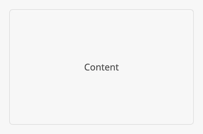
To show several components in a card, make the child a container — a Flex Container or a Coordinate Container — and place the components in that.
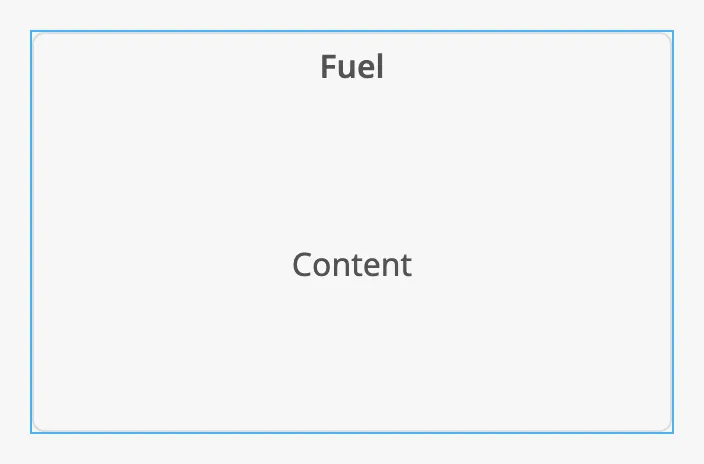
The card fills the component’s box (the blue frame):
Set hasTitle to true to show a header with the text in title. With
hasIcon an icon is shown before the text.
| Title | 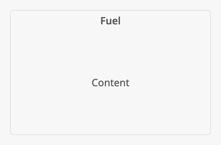 |
| Title with an icon | |
Properties
Section titled “Properties”| Name | Description | Property Type |
|---|---|---|
| hasTitle | Show the title. Default false. |
value |
| title | Text of the title. Only shown when hasTitle is true. |
value |
| hasIcon | Show an icon before the title. Default false. Only shown when hasTitle is true. |
value |
| icon | The icon, chosen with the icon picker. Only shown when hasIcon is true. |
object |
Dialog
Section titled “Dialog”Set hasDialog to true to make the card open a dialog. The title then gets an
arrow, and a click anywhere on the card opens the dialog on top of it:
| Closed | 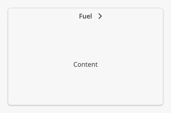 |
| Open | 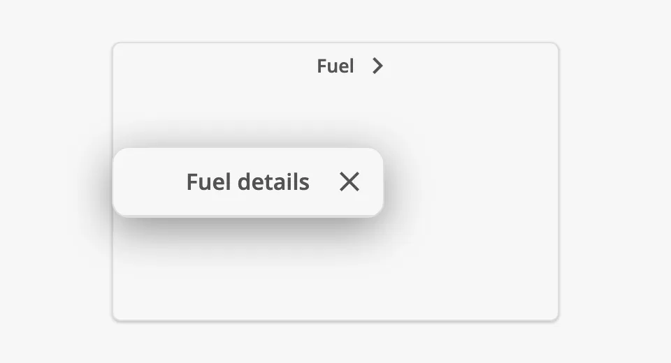 |
The dialog is configured in the dialog object:
- Title —
dialog.hasTitle,dialog.title,dialog.hasIconanddialog.iconwork as the title of the card. - Content —
dialog.viewPathis the view shown in the dialog, anddialog.viewParamsthe parameters passed to it. Design the content as an ordinary view. - Closing — the operator closes the dialog with the close button or
Escape. With
dialog.autoClosethe dialog also closes by itself afterdialog.timeOutSecondswithout activity from the operator; a countdown is shown for the lastdialog.visibleTimerSecondsseconds.
Use the dialog for detail that supplements the card. Because it can close by itself, do not put information there that the operator must not miss.
Note: Because a click on the card opens the dialog, controls placed in a card with a dialog cannot be relied on to receive the click themselves. Put controls in the dialog’s view instead.
Properties
Section titled “Properties”| Name | Description | Property Type |
|---|---|---|
| hasDialog | Open a dialog when the card is clicked. Default false. |
value |
| dialog | The dialog. Only shown when hasDialog is true. See below. |
object |
dialog sub-properties:
| Name | Description | Property Type |
|---|---|---|
| hasTitle | Show a title in the dialog. Default false. |
value |
| title | Text of the dialog title. Only shown when hasTitle is true. |
value |
| hasIcon | Show an icon before the dialog title. Default false. |
value |
| icon | The icon, chosen with the icon picker. Only shown when hasIcon is true. |
object |
| viewPath | View shown in the dialog. | value |
| viewParams | Parameters passed to the view. | object |
| autoClose | Close the dialog after a period without activity. Default false. |
value |
| timeOutSeconds | Seconds without activity before the dialog closes. Default 60. Only shown when autoClose is true. |
value |
| visibleTimerSeconds | Seconds before closing that the countdown is shown. Default 20. Only shown when autoClose is true. |
value |
Properties
Section titled “Properties”Properties not covered in the sections above:
| Name | Description | Property Type |
|---|---|---|
| style | Standard Perspective style object. | object |
Component Events
Section titled “Component Events”| Event | Description | Event Object |
|---|---|---|
| onDialogOpened | Fired when the dialog is opened. | — |
| onDialogClosed | Fired when the dialog is closed, by the operator or by the timeout. | — |
Examples
Section titled “Examples”Example 1 — Card with Several Components
Section titled “Example 1 — Card with Several Components”- Drop a Card into the view, set
hasTitletotrueandtitletoFuel. - Drop a Flex Container onto the card. It fills the card.
- Drop the components that belong to the card — readouts, a gauge — into the Flex Container.
Example 2 — Card with a Detail Dialog
Section titled “Example 2 — Card with a Detail Dialog”- Create a view
Fuel/Detailswith the detailed content. - On the card from Example 1, set
hasDialogtotrue. - In
dialog, sethasTitletotrue,titletoFuel detailsandviewPathtoFuel/Details. - To close the dialog when it is left open, set
dialog.autoClosetotrue.
Found an error or something unclear?
Tell us what is wrong, confusing or missing on this page.
Built on the OpenBridge Design System