OpenBridge for Ignition
Guides for the OpenBridge components in Ignition Perspective. Search, or select a card below to open its guide.
Getting StartedInstall the module on the Gateway, import the demo project, and use it as a template for your own project.
App - OpenBridge
Section titled “App - OpenBridge”App Components — OverviewHow the app components fit together: the frame of an application, the cards that hold its content, and the controls around them.
 App BarA row of app buttons that navigate between the applications of a project.
 BadgeA small coloured label with a number and an optional icon, for alert counts, notifications and status.
 CardA container with an optional title that groups the content of a page, and can open a dialog with more detail.
 Fleet ButtonA large button that summarises a fleet: name, status, readouts and alert counts.
 Integration BarThe header of a multi-vessel system: vessel selector, status fields, command indicator, buttons, menus and clock.
 Integration ButtonA button that stands for one vessel or system, with a status, icons, an info field and readouts.
 ModalA dialog window with a title, a close button and Cancel, Done and optional action buttons around your own content.
 Navigation BarThe navigation menu: a list of pages with icons, groups, a footer and five layout variants.
 PaginationA control for moving between the numbered pages of a list, a table or a set of views.
 Tabbed CardA card with up to five tabs, each with its own content.
 Top BarThe application header at the top of every page. It shows the page name and the most important active alert, and opens the navigation, alert, brilliance, user and apps menus.
Input - OpenBridge
Section titled “Input - OpenBridge” Input Components — Common FeaturesWhat all input components share: how values are written back to a tag or property, the onActionPerformed event, disabling, icons and behavior in the Designer.
 App ButtonA large rounded icon button with a label under it, for opening an application or a page.
 BreadcrumbA trail of the levels above the current page, each of which the operator can click.
 ButtonA push button the operator presses to trigger an action, with a label, optional leading and trailing icons and three visual variants.
 Chat MessageOne chat bubble with an optional sender name and time, aligned left or right.
 CheckboxA checkbox with a label for switching an option on or off, with checked, unchecked and mixed states.
 Checkbox ListA list of checkbox rows, flat or as a tree with collapsible groups.
 Double SliderA slider with two thumbs, for setting the low and high end of a range.
 Dropdown ButtonA button that shows the selected option and opens a list to choose another.
 Filter ChipA small toggle chip with a label and optional icon, for turning a filter on or off.
 Floating ItemA brief floating notification with an icon, text, a time, up to two actions and a dismiss button.
 IconA single icon from the OpenBridge icon library, scaled to the size of the component.
 Icon ButtonA compact push button that shows an icon, with an optional label and four variants.
 Icon Check ButtonAn icon toggle button the operator clicks to switch something on or off.
 Message Menu ItemOne expandable message row with icons, a title, a description, a time and action buttons.
 Number Input FieldA field for typing a number, with unit, number format, label, helper and error text.
 Pivot Item GroupA row or column of items with a line marking the selected one.
 Progress BarShows how far a task has come, as a horizontal bar or a ring.
 Radio Button GroupA group of radio buttons for choosing one of a few options.
 Sequence Loading SpinnerA small loading ring sized to sit beside the steps, tags and buttons of a sequence.
 Slide ButtonA slide-to-confirm button: drag the handle to the end to perform an action.
 SliderA horizontal slider for setting a number within a range by dragging, with optional step buttons.
 Status IndicatorA small colored lamp with a label, showing one of six statuses.
 Stepper BoxTwo buttons that raise and lower a number in fixed steps.
 Tab RowA row of tabs with icons, subtitles, badges, close buttons and an add button.
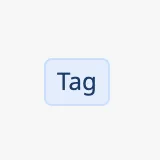 TagA small colored label with an optional icon, for marking or categorizing something.
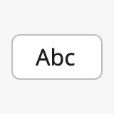 Text Input FieldA single-line text field with label, helper and error text and icons, in text, password, date and time types.
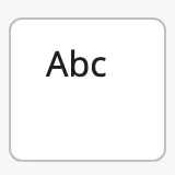 Textarea FieldA multi-line text field for notes and log entries, with label, error text and an optional toolbar.
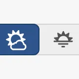 Toggle Button HorizontalA row of connected buttons of which the operator selects one.
 Toggle Button VerticalA column of connected buttons of which the operator selects one.
 Toggle SwitchAn on/off switch with a label.
 User ButtonA round button showing a user icon or initials, with a name under it.
 User MenuA card with a sign-in form, recent users, or the signed-in user with actions and sign out.
Automation - OpenBridge
Section titled “Automation - OpenBridge” Automation Buttons — Common FeaturesWhat all automation symbols share: the readout and its tag, positioning, size, alert frame, progress ring and badges.
 Analog ValveA valve that can be set to any opening between closed and fully open, such as a control or regulating valve. Shows the opening in percent.
 Automation BadgeA small icon for the control mode, lock or alert state of a device.
 Automation Button NEWA generic automation symbol in the new flat design: icon selected by property, with a tag and value rows.
 Automation ReadoutA value label with a number and unit, attached to a line by a leader line.
 Automation TankA tile for a tank or battery showing the fill level as percentage, bar or trend graph.
 Bipolar TransistorAn automation symbol for a bipolar junction transistor in an electrical diagram, with 6 alternative icons.
 CapacitorAn automation symbol for a capacitor in an electrical diagram, with 4 alternative icons.
 ConverterAn automation symbol for a power converter, such as a rectifier, inverter or DC/DC converter, with 4 alternative icons.
 DamperAn automation symbol for a damper in a duct, showing the state it is given by the properties you bind.
 Digital ValveA valve that is either open or closed, such as a shut-off valve, showing the state it is given by the properties you bind.
 DiodesAn automation symbol for a diode or a related semiconductor device, with 6 alternative icons.
 FanAn automation symbol for a fan, with a speed readout and a direction indicator.
 FilterAn automation symbol for an electrical filter in an electrical diagram, with 4 alternative icons.
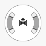 Gauge ValveA radial gauge for the opening of a two-way or three-way analog valve, with scale, setpoint and readout.
 GroundAn automation symbol for a connection to ground (earth) in an electrical diagram, with 3 alternative icons.
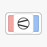 Heat PumpA tile for a heat pump with a hot and a cold side, tag, badges and alert frame.
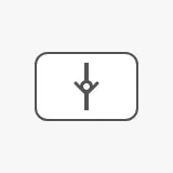 Hydraulic Check ValveA static symbol for a check valve in a hydraulic diagram.
 LogicAn automation symbol for a logic gate, with 6 alternative icons.
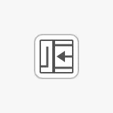 MosfetAn automation symbol for a MOSFET transistor in an electrical diagram, with 8 alternative icons.
 MotorAn automation symbol for an electric motor, with a speed readout and a direction indicator.
 PumpAn automation symbol for a pump, with a speed readout and a direction indicator.
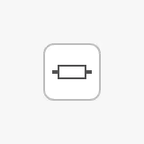 ResistorAn automation symbol for a resistor in an electrical diagram, with 5 alternative icons.
 RouterAn automation symbol for a network router, with 2 alternative icons.
 SourceAn automation symbol for an electrical source in an electrical diagram, with 5 alternative icons.
 SwitchA two-state electrical switching device, such as a switch, breaker or disconnector, with 4 alternative icons.
 TransformerAn automation symbol for a transformer in an electrical diagram, with 2 alternative icons.
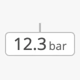 TransmitterA label for a measurement on a line, with value, unit, icon, advice, setpoint, trend graph and alarm frame.
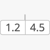 Transmitter StackSeveral readings side by side in one chip with a shared leader line.
Chart - OpenBridge
Section titled “Chart - OpenBridge”
Maritime - OpenBridge
Section titled “Maritime - OpenBridge” Maritime Instruments — Common FeaturesWhat all maritime instruments share: state, priority, setpoints, advice zones, scales and sizing.
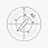 CompassHeading and course over ground on a compass rose, with setpoint, rate of turn, wind, current and a vessel symbol.
 Gauge VerticalA vertical bar gauge with a scale, fill modes, setpoint and advice zones.RudderThe rudder angle on a half-circle scale, as a bar or a needle, with setpoint and advice zones.
 Rudder IndicatorA small symbol of the rudder angle, for overviews and conning displays.
Found an error or something unclear?
Tell us what is wrong, confusing or missing on this page.
Built on the OpenBridge Design System