Text Input Field
The Text Input Field lets the operator type a single line of text. It is found in the Input - OpenBridge section of the Perspective Component Palette as Text Input Field.
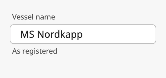
The parts of the field:
- Label — above the field. See Label and Helper Text.
- Field — the text, with an optional leading icon and clear button. See Value and Field.
- Helper text — below the field, replaced by the error text when the field is in error. See Label and Helper Text and Error.
The Text Input Field is one of the input components. How values are written back, events, disabling, icons and the behavior in the Designer are shared by all of them and are described in Input Components — Common Features. This page covers what is specific to the Text Input Field.
A Text Input Field dropped from the palette is empty and has no label:
The field is as wide as the component. The label and the helper text need height: make the component about 96 px tall when both are used.
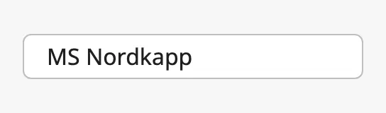
value is the text in the field. Bind it bidirectionally to a tag or property
to connect the field to it (see Values).
| Value | Placeholder |
|---|---|
 |
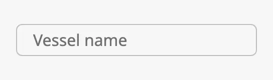 |
placeholder is a hint shown while the field is empty.
When the Value Is Written
Section titled “When the Value Is Written”deferUpdates decides when the field writes value and fires
onActionPerformed:
false(default) — for every keystroke. A binding onvaluesees each intermediate text.true— when the operator presses Enter or leaves the field. Use it when the value goes to a tag or starts an action, so that half-typed text is not written.
Updates While the Operator Types
Section titled “Updates While the Operator Types”When value is bound, the binding can write a new value while the operator is
typing, and replace what has been typed. Set rejectUpdatesWhileFocused to
true to ignore incoming values for as long as the field has focus.
Numbers and Booleans
Section titled “Numbers and Booleans”With convertToPrimitives set to true (default), text that looks like a
number, a boolean or null is converted before it is written: typing 123 writes
the number 123, true writes the boolean true, and null writes null. This
suits a field bound to a numeric tag.
Set it to false to always write the text as typed. This keeps leading zeros
and other formatting, for example 00123, identifiers and phone numbers.
Properties
Section titled “Properties”| Name | Description | Property Type |
|---|---|---|
| value | Text in the field. Written when the operator types. Empty by default. | value |
| placeholder | Hint shown while the field is empty. | value |
| deferUpdates | Write value on Enter or when the field is left, instead of for every keystroke. Default false. |
value |
| rejectUpdatesWhileFocused | Ignore values written from a binding while the field has focus. Default false. |
value |
| convertToPrimitives | Convert text that looks like a number, boolean or null before writing it. Default true. |
value |
type selects what kind of text the field holds:
| type | ||
|---|---|---|
text (default) |
Any text. | |
password |
The text is hidden. A button in the field shows it. | 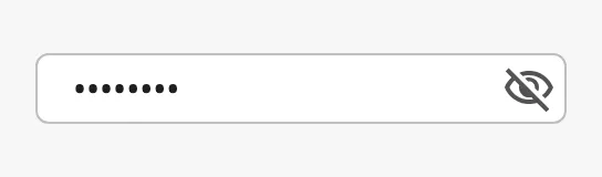 |
date |
A date, edited with the browser’s date editor. The value is written as YYYY-MM-DD. |
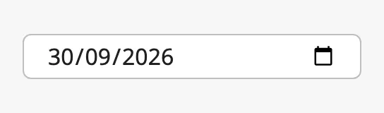 |
time |
A time, edited with the browser’s time editor. The value is written as HH:mm. |
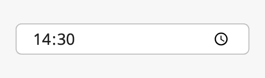 |
The date is displayed in the format of the browser’s language, so it can look different from the image.
Properties
Section titled “Properties”| Name | Description | Property Type |
|---|---|---|
| type | text, password, date or time. Default text. |
value |
Leading Icon and Clear Button
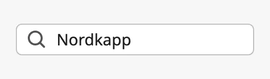
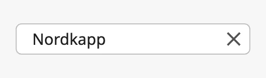
Section titled “Leading Icon and Clear Button”Set hasLeadingIcon to true to show an icon at the start of the field, and
hasClearButton to true to show a button that empties the field.
| Leading icon | Clear button |
|---|---|
 |
 |
Text Alignment
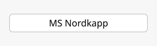
Section titled “Text Alignment”left (default) |
center |
|---|---|
|
 |
Read-only
Section titled “Read-only”Set readonly to true for a field whose text can be read and selected, but
not changed. Unlike a disabled field it is not dimmed.
Properties
Section titled “Properties”| Name | Description | Property Type |
|---|---|---|
| hasLeadingIcon | Show an icon at the start of the field. Default false. |
value |
| leadingIcon | The icon, chosen with the icon picker. Only shown when hasLeadingIcon is true. |
object |
| hasClearButton | Show a button that empties the field. Default false. |
value |
| textAlign | Alignment of the text: left or center. Default left. |
value |
| readonly | The operator cannot change the text. Default false. |
value |
Label and Helper Text
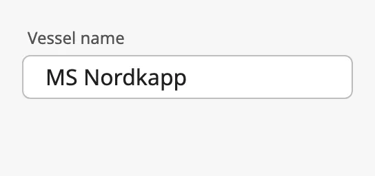
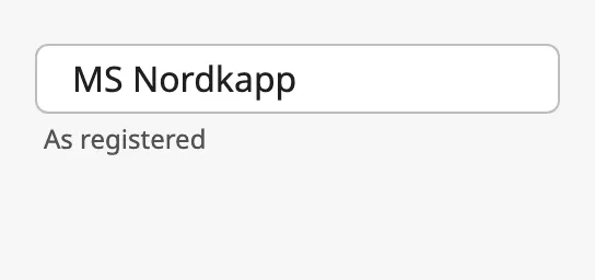
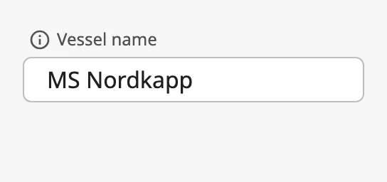
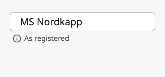
Section titled “Label and Helper Text”label is shown above the field and helperText below it. Each can be placed
to the left, centre or right, and each can have an icon in front of it.
| Placement | labelPlacement |
helperPlacement |
|---|---|---|
left (default) |
 |
 |
center |
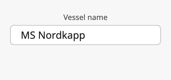 |
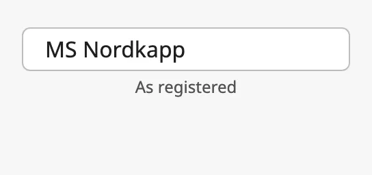 |
right |
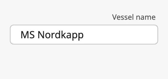 |
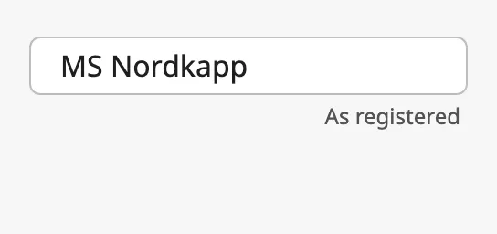 |
| Label icon | Helper icon |
|---|---|
 |
 |
Required
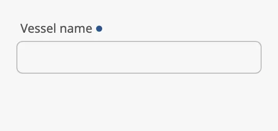
Section titled “Required”Set required to true to mark the field as one that must be filled in. A dot
is shown after the label. The mark is only a visual cue: the field does not
check the value itself.
Properties
Section titled “Properties”| Name | Description | Property Type |
|---|---|---|
| label | Text above the field. Empty by default. | value |
| labelPlacement | left, center or right. Default left. |
value |
| hasLabelIcon | Show an icon before the label. Default false. |
value |
| labelIcon | The icon, chosen with the icon picker. Only shown when hasLabelIcon is true. |
object |
| helperText | Text below the field. Empty by default. | value |
| helperPlacement | left, center or right. Default left. |
value |
| hasHelperIcon | Show an icon before the helper text. Default false. |
value |
| helperIcon | The icon, chosen with the icon picker. Only shown when hasHelperIcon is true. |
object |
| required | Mark the field as required. Default false. |
value |
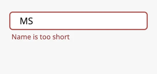
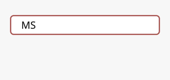
Set error to true to show the field as invalid, with a red border.
errorText is shown below the field.
With errorText |
Without |
|---|---|
 |
 |
The field does not validate the value itself. Bind error to an expression that
checks the value (see Example 2).
Properties
Section titled “Properties”| Name | Description | Property Type |
|---|---|---|
| error | Show the field as invalid. Default false. |
value |
| errorText | Text shown below the field. Only shown when error is true. |
value |
Disabled
Section titled “Disabled”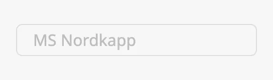
See Disabled.
Common Properties
Section titled “Common Properties”These work in the same way on every input component, and are described in Input Components — Common Features:
- Disabled —
disabled. - Icons — how to choose
leadingIcon,labelIconandhelperIcon. - Appearance —
style.
Component Events
Section titled “Component Events”| Event | Description | Event Object |
|---|---|---|
| onActionPerformed | Fired when value is written: for every keystroke, or on Enter or leaving the field when deferUpdates is true. |
— |
See Events.
Examples
Section titled “Examples”Example 1 — Setpoint Written on Enter
Section titled “Example 1 — Setpoint Written on Enter”- Drop a Text Input Field into the view and set
labeltoSetpoint. - Set
deferUpdatestotrue, so the value is written when the operator presses Enter, andrejectUpdatesWhileFocusedtotrue, so the tag does not overwrite what is being typed. - Bind
valueto the tag[default]Pump01/Setpointand enable Bidirectional.
Example 2 — Validate the Value
Section titled “Example 2 — Validate the Value”With the field from Example 1:
- Bind
errorto the expression{this.props.value} < 0 || {this.props.value} > 100. - Set
errorTexttoMust be between 0 and 100.
Found an error or something unclear?
Tell us what is wrong, confusing or missing on this page.
Built on the OpenBridge Design System