Badge
The Badge is a small coloured label with a number, an icon, or both. Use it to show a count — alerts, notifications, unread messages — or a status at a glance, typically on top of or beside another component. It is found in the App - OpenBridge section of the Perspective Component Palette as Badge (Beta).
Note: This component is in beta: its properties may change in a later version.
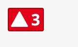
The parts of the badge:
The colour and the shape of the icon are set by the type.
See App Components — Overview for the other app components. The automation buttons have badges of their own, which are set on those components and are not this one.
A Badge dropped from the palette shows the number 0. Its type is empty,
which is drawn as a red badge with a dark number — not as the regular type.
Set type before using it. The blue frame is the component’s box:

type sets the colour of the badge. type is a text property without a list of
choices: type one of the values below.
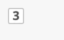
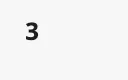
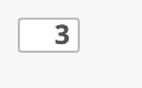
variant selects between the default variant, which has a filled background,
and flat, which has no background. The third column shows the badge with
showIcon set to true; see Icon.
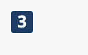
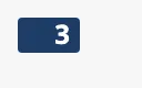
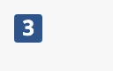
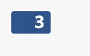
| type | default |
flat |
With icon |
|---|---|---|---|
regular |
 |
 |
 |
level-critical |
 |
|
 |
level-high |
 |
|
 |
level-medium |
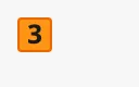 |
|
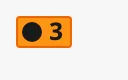 |
level-low |
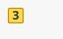 |
|
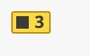 |
level-diagnostic |
 |
|
 |
alarm |
|
|
|
warning |
|
|
|
caution |
|
|
|
running |
 |
|
 |
notification |
 |
|
 |
enhance |
 |
|
 |
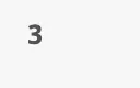
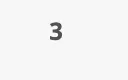
automation |
 |
|
 |
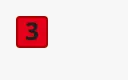
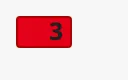
outline |
 |
|
 |
empty |
 |
 |
|
What the types are for:
regular— a neutral badge.level-critical,level-high,level-medium,level-low,level-diagnostic— the alert levels.alarm,warning,caution— the alert priorities.alarmlooks likelevel-high,warninglikelevel-mediumandcautionlikelevel-low.running— something that is active.notification,enhance— notifications and other counts.automation— has no background in either variant.outline— meant for theflatvariant.empty— an empty badge without number or icon.
The flat variant of the alert types shows the icon in the colour of the type
when showIcon is true, and only the number when it is false:
| variant | |
|---|---|
default (default) |
|
flat |
 |
Properties
Section titled “Properties”| Name | Description | Property Type |
|---|---|---|
| type | The type of badge, one of the values in the table above. Empty by default. | value |
| variant | default or flat. Default default. |
value |
size is regular or large. Like type it is a text property: type the
value. It is empty by default, which is drawn as regular.
| size | |
|---|---|
regular |
 |
large |
|
The badge has its own size — 16 px high when regular, 24 px when large, and as wide as its content — and is drawn at the top left of the component’s box (the blue frame). Making the component larger does not make the badge larger:
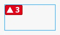
Properties
Section titled “Properties”| Name | Description | Property Type |
|---|---|---|
| size | regular or large. Empty, and regular, by default. |
value |
Number
Section titled “Number”number is the number shown. The badge grows with the number of digits and
shows 0 as any other number:
0 |
 |
3 |
|
128 |
 |
To hide the badge when there is nothing to count, bind meta.visible of the
component to the count.
Set showNumber to false for a badge with only an icon:
Properties
Section titled “Properties”| Name | Description | Property Type |
|---|---|---|
| showNumber | Show the number. Default true. |
value |
| number | The number. Default 0. Only shown when showNumber is true. |
value |
Set showIcon to true to show an icon before the number.
The alert types (level-*, alarm, warning, caution) and running have an
icon of their own, shown in the third column of the table of types. The
other types have none, and showIcon only leaves room for one. For those types,
also set hasBadgeIcon to true and choose the icon in badgeIcon:
showIcon only, on a type without its own icon |
|
showIcon and hasBadgeIcon |
 |
badgeIcon is only used together with showIcon, and is ignored on the types
that have an icon of their own.
Properties
Section titled “Properties”| Name | Description | Property Type |
|---|---|---|
| showIcon | Show an icon before the number. Default false. |
value |
| hasBadgeIcon | Use the icon in badgeIcon, for a type without an icon of its own. Default false. |
value |
| badgeIcon | The icon, chosen with the icon picker. Only shown when hasBadgeIcon is true. |
object |
Properties
Section titled “Properties”Properties not covered in the sections above:
| Name | Description | Property Type |
|---|---|---|
| style | Standard Perspective style object. | object |
Component Events
Section titled “Component Events”The Badge has no component events.
Examples
Section titled “Examples”Example 1 — Count of Unacknowledged Alarms
Section titled “Example 1 — Count of Unacknowledged Alarms”The view has a custom property unacked with the number of unacknowledged
alarms, for example from a binding on system.alarm.queryStatus.
- Drop a Badge into the view.
- Set
typetolevel-high,sizetolargeandshowIcontotrue. - Bind
numberto{view.custom.unacked}. - Bind
meta.visibleto the expression{view.custom.unacked} > 0, so the badge disappears when there are none.
Example 2 — Notification Count on a Button
Section titled “Example 2 — Notification Count on a Button”- Place the component to mark — an icon button — in a Coordinate Container.
- Drop a Badge into the same container, over the top right corner of the button.
- Set
typetonotificationand bindnumberto the count.
Found an error or something unclear?
Tell us what is wrong, confusing or missing on this page.
Built on the OpenBridge Design System