Automation Buttons — Common Features
The automation buttons are the symbols for devices in a mimic or diagram: pumps, valves, switches and so on. They are found in the Automation - OpenBridge section of the Perspective Component Palette. Each has its own icon and state properties, described on its own page, and all of them share the features on this page.
| Kind | Components |
|---|---|
| Motor-driven devices | Fan, Motor, Pump |
| Valves | Analog Valve, Digital Valve |
| Two-state devices | Bipolar Transistor, Capacitor, Converter, Damper, Diodes, Filter, Ground, Logic, Mosfet, Resistor, Router, Source, Switch, Transformer |
The Automation section of the palette also has components that are not automation buttons. They have pages of their own, and share only some of the features on this page:
| Kind | Components |
|---|---|
| Tiles | Automation Tank, Heat Pump |
| Labels on a line | Automation Readout, Transmitter, Transmitter Stack |
| Valves | Gauge Valve, Hydraulic Check Valve |
| Other | Automation Badge, Automation Button NEW |
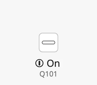
The images on this page show a Switch. The features look and work the same on the other components.
The parts of an automation button:
- Symbol — the icon of the device. What it shows is described on the page of each component.
- Readout — the status row and the tag name. See Readout.
- Alert frame — a coloured frame around the symbol. See Alert Frame.
- Progress ring — shown while a command is being carried out. See Progress.
- Badges — small icons in the corners of the symbol. See Badges.
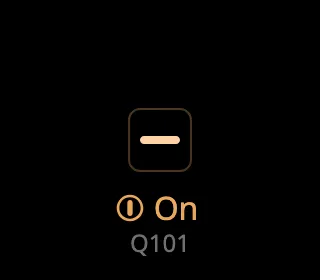
The colours follow the OpenBridge palette of the session:
An automation button shows the state it is given; it does not read tags or
alarms itself, and it does not change anything when it is clicked. Bind its
properties to the state of the device, and configure an onClick event to let
the operator operate it (see
Example 1).
Readout
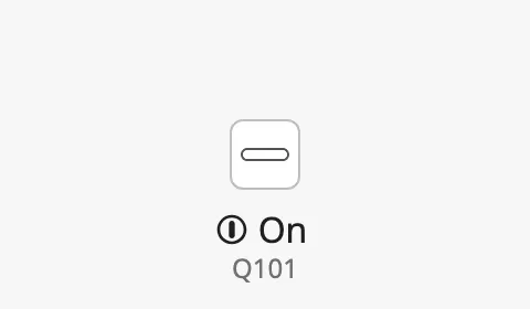
Section titled “Readout”The readout shows up to two rows next to the symbol:
- the status row — the state of the device. What it shows depends on the
component: On or Off for a two-state device, the speed for a pump, fan
or motor, the opening for an analog valve. Hide it with
showStatus. - the tag — the name of the device. It is shown only when
hasTagistrue; the text is taken fromtag.
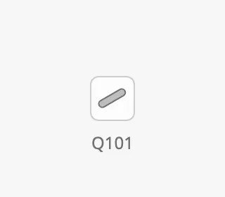
With showStatus set to false, only the tag is shown:
Set showReadoutStack to false to hide the readout altogether.
Readout Position
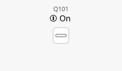
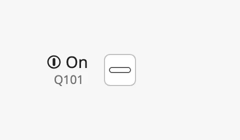
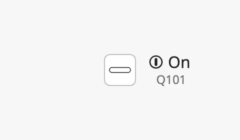
Section titled “Readout Position”readoutPosition places the readout on one of the four sides of the symbol:
| readoutPosition | |
|---|---|
top |
 |
bottom (default) |
|
left |
 |
right |
 |
Readout Size
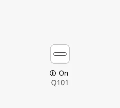
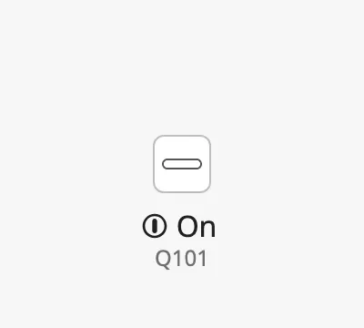
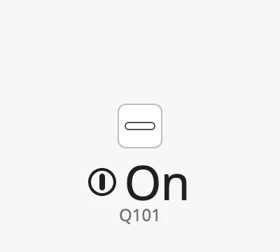
Section titled “Readout Size”readoutSize sets the text size of the status row:
small |
regular |
enhanced |
|---|---|---|
 |
 |
 |
Properties
Section titled “Properties”| Name | Description | Property Type |
|---|---|---|
| showReadoutStack | Show the readout. Default true. |
value |
| readoutPosition | Side of the symbol the readout is on: top, bottom, left or right. Default bottom. Only shown when showReadoutStack is true. |
value |
| showStatus | Show the status row. Default true. Only shown when showReadoutStack is true. |
value |
| readoutSize | Text size of the readout: small, regular or enhanced. Default regular. Only shown when showReadoutStack is true. |
value |
| hasTag | Show the tag. When false, tag is ignored. Default false. |
value |
| tag | Tag name of the device, for example Q101. Only shown when showReadoutStack is true. |
value |
Positioning
Section titled “Positioning”The readout is drawn outside the symbol, and its size depends on what it shows.
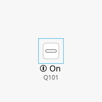
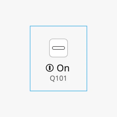
positioning decides which part of the button is aligned to the component’s
box. The blue frame in the images is the component’s box, as the Designer shows
it when the component is selected:
symbol (default) |
button |
point |
|---|---|---|
 |
 |
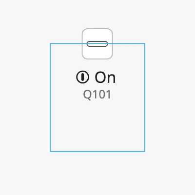 |
symbol— the component’s box wraps just the symbol, and the readout is drawn outside the box. The symbol stays on the line whatever the readout shows.button— the whole button, symbol and readout together, is centred in the box. Use it when the entire button must stay inside the component’s box, for example in a flex container or next to other components that must not be overlapped. Make the box large enough for the symbol and the readout.point— the centre of the symbol is placed on the top centre of the component’s box, and the button extends from that point. Use it when the size of the component changes, for example with the container or withcomponentSize, but the centre of the symbol must stay on a fixed point.
Properties
Section titled “Properties”| Name | Description | Property Type |
|---|---|---|
| positioning | What is aligned to the component’s box: symbol, button or point. Default symbol. |
value |
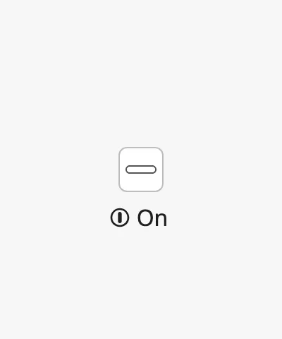
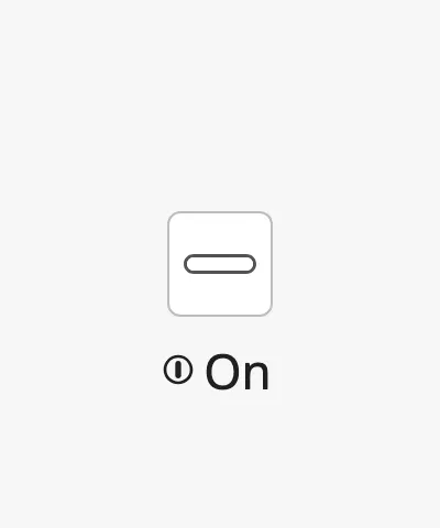
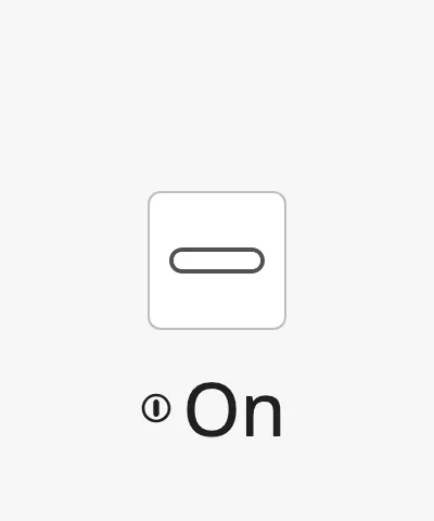
componentSize scales the whole component, the readout included.
regular |
medium |
large |
|---|---|---|
 |
 |
 |
Properties
Section titled “Properties”| Name | Description | Property Type |
|---|---|---|
| componentSize | Size of the component: regular, medium or large. Default regular. |
value |
Activated
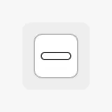
Section titled “Activated”Set activated to true to show a highlighted background behind the symbol. Use
it to mark the symbol as selected, for example while a faceplate or popup for
this device is open.
Properties
Section titled “Properties”| Name | Description | Property Type |
|---|---|---|
| activated | Show the activated (selected) background. Default false. |
value |
Alert Frame
Section titled “Alert Frame”Set alert to true to draw an alert frame around the symbol. The button does
not read alarms itself: bind alert, alertFrameStatus and alertFrameMode to
the alarm state of the device (see
Example 2).
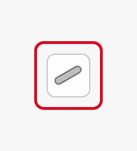
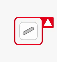
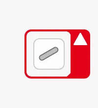
alertFrameType selects the shape of the frame and where the flap with the alert
icon is:
regular |
small-side-flip (default) |
large-side-flip |
bottom-flip |
top-flip |
|---|---|---|---|---|
 |
 |
 |
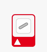 |
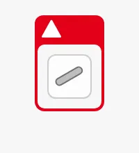 |
Status
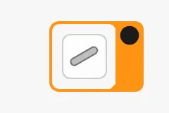
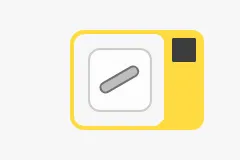
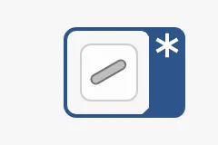
Section titled “Status”alertFrameStatus selects the colour and the icon. Use the level-* values in
a project that uses priority levels, or alarm, warning and caution in a
project that follows Bridge Alert Management.
| alertFrameStatus | |
|---|---|
level-critical |
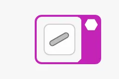 |
level-high |
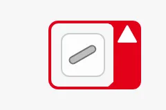 |
level-medium |
 |
level-low |
 |
level-diagnostic |
 |
alarm (default) |
|
warning |
|
caution |
|
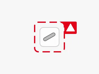
alertFrameMode shows where the alert is in its life cycle:
acked-active(default) — the alert is active and acknowledged. The frame is steady.unacked-active— the alert is active and not acknowledged. The frame flashes.unacked-rectified— the condition has cleared, but the alert is not acknowledged. The frame is dashed and flashes.
Thickness
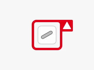
Section titled “Thickness”alertFrameThickness set to large draws a thicker frame for more emphasis:
Properties
Section titled “Properties”All properties except alert are only shown when alert is true.
| Name | Description | Property Type |
|---|---|---|
| alert | Show the alert frame. Default false. |
value |
| alertFrameType | Shape of the frame: regular, small-side-flip, large-side-flip, bottom-flip or top-flip. Default small-side-flip. |
value |
| alertFrameStatus | Severity, which selects colour and icon: a level-* value, or alarm, warning or caution. Default alarm. |
value |
| alertFrameMode | Life cycle state: acked-active, unacked-active or unacked-rectified. Default acked-active. |
value |
| alertFrameThickness | Thickness of the frame: small or large. Default small. |
value |
| showAlertCategoryIcon | Show the flap with the alert icon on large-side-flip, bottom-flip and top-flip. When false, only the frame is drawn. Default true. |
value |
| showAlertIcon | Reserves room in the flap for an extra icon. The automation buttons have no such icon, so this has no visible effect. Default false. |
value |
Progress
Section titled “Progress”Set progress to true to show a progress ring around the symbol, for example
from the moment the operator gives a command until the device reports the new
state.
indeterminate |
determinate, progressValue = 60 |
|---|---|
 |
 |
indeterminate(default) — a spinning arc, for when it is not known how long the operation takes.determinate— the arc is filled toprogressValuepercent.progressive-indeterminate— a spinning arc whose length followsprogressValue, for an operation that reports rough progress.
Properties
Section titled “Properties”| Name | Description | Property Type |
|---|---|---|
| progress | Show the progress ring. Default false. |
value |
| progressMode | determinate, indeterminate or progressive-indeterminate. Default indeterminate. Only shown when progress is true. |
value |
| progressValue | Progress in percent, 0–100. Not used in indeterminate mode. Default 0. Only shown when progress is true. |
value |
Badges
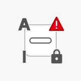
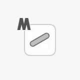
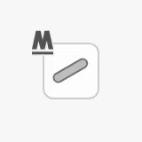
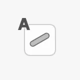
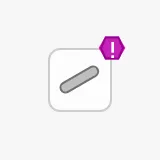
Section titled “Badges”Badges are small icons in the corners of the symbol that show how the device is controlled and whether something prevents it from being operated. Each of the four badge properties has its own corner, so they can be combined:
Control
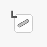
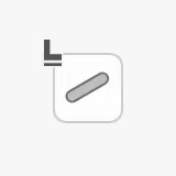
Section titled “Control”badgeControl is shown at the top left.
local |
local-only |
manual |
manual-only |
auto |
|---|---|---|---|---|
 |
 |
 |
 |
 |
badgeAlert is shown at the top right. It is a lighter alternative to the
Alert Frame.
| badgeAlert | |
|---|---|
level-critical |
 |
level-high |
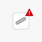 |
level-medium |
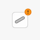 |
level-low |
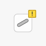 |
level-diagnostic |
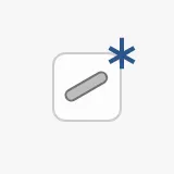 |
alarm |
|
warning |
|
caution |
|
silence |
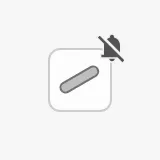 |
Interlock and Command Lock
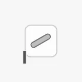
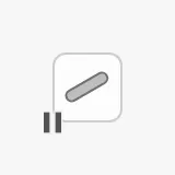
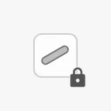
Section titled “Interlock and Command Lock”badgeInterlock is shown at the bottom left, badgeCommandLocked at the bottom
right.
badgeInterlock = interlock |
badgeInterlock = interlock-inhibit |
badgeCommandLocked = command-locked |
|---|---|---|
 |
 |
 |
Properties
Section titled “Properties”| Name | Description | Property Type |
|---|---|---|
| badgeControl | Control mode badge: none, local, local-only, manual, manual-only or auto. Default none. |
value |
| badgeAlert | Alert badge: none, a level-* value, alarm, warning, caution or silence. Default none. |
value |
| badgeInterlock | Interlock badge: none, interlock or interlock-inhibit. Default none. |
value |
| badgeCommandLocked | Command lock badge: none or command-locked. Default none. |
value |
| Name | Description | Property Type |
|---|---|---|
| style | Standard Perspective style object. | object |
Component Events
Section titled “Component Events”The automation buttons have no component events of their own. The standard
Perspective events, such as onClick, are available in the component’s event
configuration.
Examples
Section titled “Examples”The examples use a Switch, whose state property is on. For
another component, use its own state property, such as open on a valve.
Example 1 — Operate the Device on Click
Section titled “Example 1 — Operate the Device on Click”-
Bind
onto the feedback tag of the device, for example[default]Switchboard/Q101/Closed. -
Bind
progressto a tag or custom property that istruewhile a command is being carried out. -
Configure the
onClickevent of the component with a script action that writes the command:def runAction(self, event):command = '[default]Switchboard/Q101/CloseCommand'system.tag.writeBlocking([command], [not self.props.on])
The symbol changes when the feedback tag changes, not when the operator clicks, so it always shows the actual state of the device.
Example 2 — Show an Alarm on the Symbol
Section titled “Example 2 — Show an Alarm on the Symbol”- Bind
alertto an expression that istruewhile the device has an alarm that is active or not acknowledged. - Bind
alertFrameModeto the state of that alarm:unacked-active,acked-activeorunacked-rectified. - Set
alertFrameStatusto the severity of the alarm, for examplelevel-high.
Found an error or something unclear?
Tell us what is wrong, confusing or missing on this page.
Built on the OpenBridge Design System