Pagination
The Pagination lets the operator move between numbered pages: of a table, a list, or a set of views. It is found in the App - OpenBridge section of the Perspective Component Palette as Pagination.
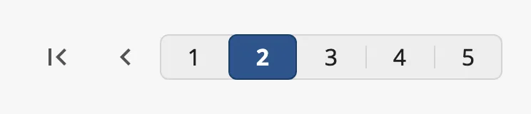
From left to right: first page, previous page, one button per page with the current page highlighted, next page and last page.
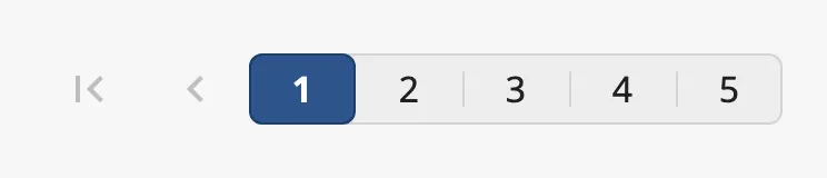
A Pagination dropped from the palette has three pages and is on the first. The buttons to the first and previous page are dimmed, because there is nowhere to go:

The Pagination only holds a page number. It does not show any content itself:
bind the content to currentPage (see
Example 1).
pages is the number of pages, and currentPage the page the operator is on,
counted from 1.
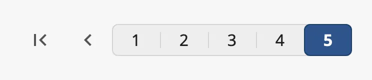
currentPage |
|
|---|---|
1 of 5 |
 |
2 of 5 |
|
5 of 5 |
 |
When the operator clicks a page or an arrow, the Pagination writes the new page
to currentPage and then fires onActionPerformed. Bind currentPage
bidirectionally to keep a tag or a view property in step with it; it can also be
set from a binding or a script to move to a page.
If currentPage is larger than pages, the last page is shown as current.
Properties
Section titled “Properties”| Name | Description | Property Type |
|---|---|---|
| pages | Number of pages, at least 1. Default 3. |
value |
| currentPage | Current page, from 1. Written when the operator changes page. Default 1. |
value |
Variant
Section titled “Variant”| variant | ||
|---|---|---|
regular (default) |
One numbered button per page, on a common background. | |
flat |
Numbered buttons without the background. |  |
condensed |
A dot per page instead of a numbered button. Takes little room. |  |
regular and flat need room for a button per page and do not shorten the row
of buttons. With many pages, use condensed:

Properties
Section titled “Properties”| Name | Description | Property Type |
|---|---|---|
| variant | regular, flat or condensed. Default regular. |
value |
The Pagination is as wide as its buttons need. Set
fullWidth to true to spread it over the width of the component, with the
arrows at the ends. The blue frame in the images is the component’s box:
| fullWidth | |
|---|---|
false (default) |
 |
true |
 |
Properties
Section titled “Properties”| Name | Description | Property Type |
|---|---|---|
| fullWidth | Spread the control over the width of the component. Default false. |
value |
Disabled
Section titled “Disabled”Set disabled to true to dim the control and ignore the operator’s clicks.
currentPage is then not written and the event does not fire.

Properties
Section titled “Properties”| Name | Description | Property Type |
|---|---|---|
| disabled | Disable input from the operator. Default false. |
value |
Properties
Section titled “Properties”Properties not covered in the sections above:
| Name | Description | Property Type |
|---|---|---|
| style | Standard Perspective style object. | object |
Component Events
Section titled “Component Events”| Event | Description | Event Object |
|---|---|---|
| onActionPerformed | Fired when the operator changes page, after currentPage is written. |
— |
The event object is empty; read the page from self.props.currentPage.
Examples
Section titled “Examples”Example 1 — Pages of a Table
Section titled “Example 1 — Pages of a Table”A table of alarms shows 20 rows at a time. The view has a custom property
rowCount with the number of rows in the data.
- Drop a Pagination below the table.
- Bind
pagesto the expressionmax(1, ceil({view.custom.rowCount} / 20.0)). - Bind the data of the table to a query or script that returns the rows of
page
{../Pagination.props.currentPage}: rows(currentPage - 1) * 20tocurrentPage * 20 - 1.
Found an error or something unclear?
Tell us what is wrong, confusing or missing on this page.
Built on the OpenBridge Design System