Filter Chip
The Filter Chip is a small toggle for turning a filter on or off, for instance which alerts a list shows. Several chips are usually placed side by side, and any number of them can be on. It is found in the Input - OpenBridge section of the Perspective Component Palette as Filter Chip.
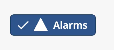
From left to right:
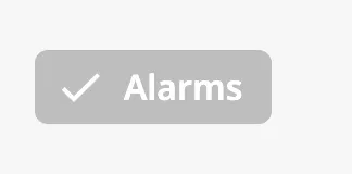
- Check mark — shown when the chip is checked. See State.
- Icon — optional. See Icon.
- Label — see Label.
The Filter Chip is one of the input components. How values are written back, disabling and the behavior in the Designer are shared by all of them and are described in Input Components — Common Features. This page covers what is specific to the Filter Chip.
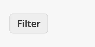
A Filter Chip with default properties:
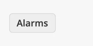
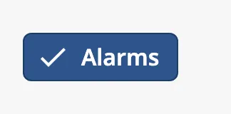
checked sets whether the chip is on:
| Unchecked | Checked |
|---|---|
 |
 |
When the operator clicks the chip, or presses Space or Enter while it
has focus, the new state is written to checked and then onChipToggle fires.
Bind checked bidirectionally to a tag or a custom property to use the state
elsewhere. See Values.
Properties
Section titled “Properties”| Name | Description | Property Type |
|---|---|---|
| checked | Whether the chip is checked. Written when the operator clicks. Default false. |
value |
label is the text of the chip. Keep it to one or two words: the chip is as
wide as its text, and the text does not wrap.
Properties
Section titled “Properties”| Name | Description | Property Type |
|---|---|---|
| label | Text of the chip. Default Filter. |
value |
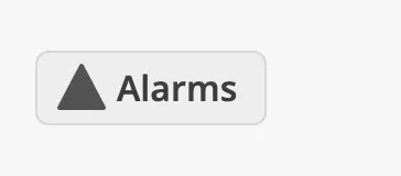
Set showIcon to true to show an icon in front of the label. The icon is
shown in both states; on a checked chip it comes after the check mark.
| Unchecked | Checked |
|---|---|
 |
|
icon is an icon picker: choose an icon from the openbridge library. Icons
from other libraries are not shown. See Icons.
Properties
Section titled “Properties”| Name | Description | Property Type |
|---|---|---|
| showIcon | Show an icon in front of the label. Default false. |
value |
| icon | The icon. Only shown when showIcon is true. |
object |
| icon.path | The icon, chosen with the icon picker from the openbridge library. Default openbridge/placeholder. |
value |
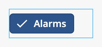
The chip is drawn at the left edge of the component’s box and is as wide as its content. It does not stretch with the box, and it becomes wider when it is checked, because the check mark is added.
The chip is drawn in the middle of a 48 px high area that reacts to a click. With a height of 48 px the chip is therefore centred vertically in the box. The blue frame is the component’s box:
| Box of 140 × 48 | Box of a new component (120 × 32) |
|---|---|
 |
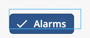 |
A new component is 120 × 32, which is too small: the chip extends below the box and, when checked, beyond its right edge. Set the height to 48 px, and the width to what the checked chip needs.
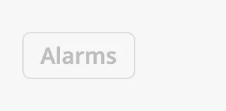
Disabled
Section titled “Disabled”| Unchecked | Checked |
|---|---|
 |
 |
See Disabled.
Common Properties
Section titled “Common Properties”These work in the same way on every input component, and are described in Input Components — Common Features:
- Disabled —
disabled. - Appearance —
style.
Component Events
Section titled “Component Events”The Filter Chip does not have the onActionPerformed event of the other input
components. It has an event of its own:
| Event | Description | Event Object |
|---|---|---|
| onChipToggle | Fired when the operator toggles the chip, after checked is written. |
See below |
| Name | Description | Property Type |
|---|---|---|
| label | label of the chip. |
value |
| checked | The new state of the chip. | value |
Examples
Section titled “Examples”Example 1 — Filter Chips for an Alert List
Section titled “Example 1 — Filter Chips for an Alert List”- Add three custom properties to the view:
showAlarms,showWarningsandshowCautions, alltrue. - Drop three Filter Chips side by side, each 48 px high, and set
labeltoAlarms,WarningsandCautions. - Bind
checkedof each chip to its custom property and enable Bidirectional.
The custom properties now follow the chips. Bind the filter of the list to them.
Example 2 — Reacting to a Toggle
Section titled “Example 2 — Reacting to a Toggle”Add this script to the onChipToggle event of the chip:
def runAction(self, event): system.perspective.print('%s: %s' % (event.label, event.checked))Found an error or something unclear?
Tell us what is wrong, confusing or missing on this page.
Built on the OpenBridge Design System