Integration Button
The Integration Button is a button that stands for one vessel, or one system, in an application that integrates several. It shows a name and a status, and in its largest form also an info field and a few readouts. It is found in the App - OpenBridge section of the Perspective Component Palette as Integration Button (Experimental).
Note: This component is experimental: its properties may change in a later version.
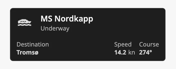
The parts of the button:
- Leading icon, label and status — see Label and Status and Icons.
- Info field — a label and a value at the bottom left, in the
richtype. See Info Field and Readouts. - Readouts — values at the bottom right, in the
richtype.
The Integration Button belongs with two other components:
- The Fleet Button stands for the fleet as a whole, where the Integration Button stands for one vessel.
- The Integration Bar is the header of such a system. It shows the fleet in its vessel selector as a button of this kind.
See App Components — Overview for the other app components.
An Integration Button dropped from the palette is of the rich type, with the
texts Label, Status, Info Label and Info Status:
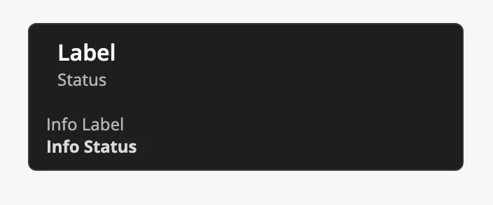
type selects the layout. The blue frame in the images is the component’s box,
320 px wide:
| type | |
|---|---|
rich (default) |
Label and status, and below them the info field and the readouts. Fills the width. |
regular |
Label and status only. Fills the width. |
hug |
Label and status only, as wide as its content. |
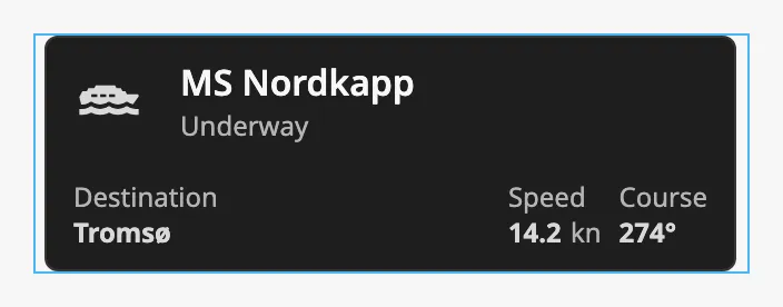
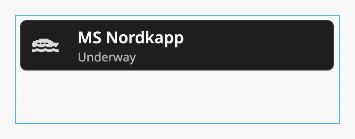
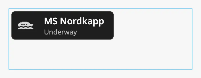
The button has its own height, from the top of the box: 106 px for rich and
58 px for the other two.
Properties
Section titled “Properties”| Name | Description | Property Type |
|---|---|---|
| type | rich, regular or hug. Default rich. |
value |
Label and Status
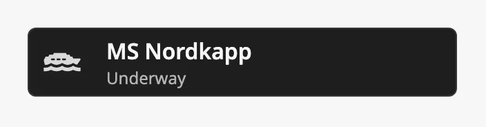
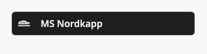
Section titled “Label and Status”label is the name on the button. With hasStatus the text in status is shown
under it; without it the button has one line, and a smaller leading icon.
| hasStatus | |
|---|---|
true (default) |
 |
false |
 |
Properties
Section titled “Properties”| Name | Description | Property Type |
|---|---|---|
| label | Text of the button. Default Label. |
value |
| hasStatus | Show the status under the label. Default true. |
value |
| status | Text of the status. Default Status. |
value |
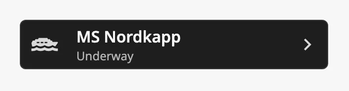
The button has room for an icon before the label and two after it. Each is
turned on with a has… property and chosen with the icon picker.
| No icon (default) | 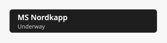 |
hasLeadingIcon |
|
hasTrailingIcon |
 |
| Both trailing icons | 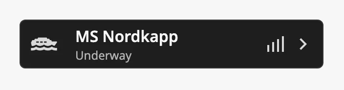 |
The second trailing icon is drawn before the first, and only when
hasTrailingIcon is also true.
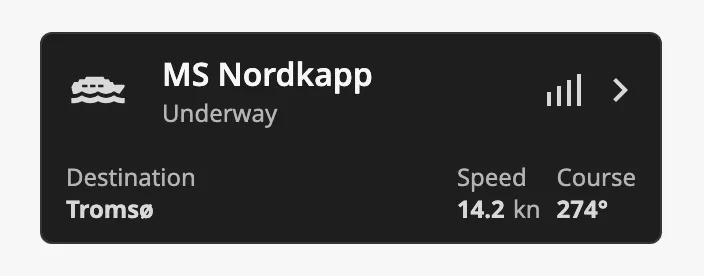
In the rich type the trailing icons are at the top right:
Properties
Section titled “Properties”| Name | Description | Property Type |
|---|---|---|
| hasLeadingIcon | Show an icon before the label. Default false. |
value |
| leadingIcon | The icon, chosen with the icon picker. Only shown when hasLeadingIcon is true. |
object |
| hasTrailingIcon | Show an icon after the label. Default false. |
value |
| trailingIcon | The icon, chosen with the icon picker. Only shown when hasTrailingIcon is true. |
object |
| hasTrailingIcon2 | Show a second icon after the label. Needs hasTrailingIcon. Default false. |
value |
| trailingIcon2 | The icon, chosen with the icon picker. Only shown when hasTrailingIcon2 is true. |
object |
Info Field and Readouts
Section titled “Info Field and Readouts”The rich type has a second row. The other types do not show it.
At the left is the info field: infoLabel with infoStatus in bold under
it. Clear both for a button without it.
| Info field | 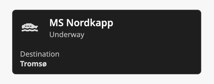 |
| Both texts empty | 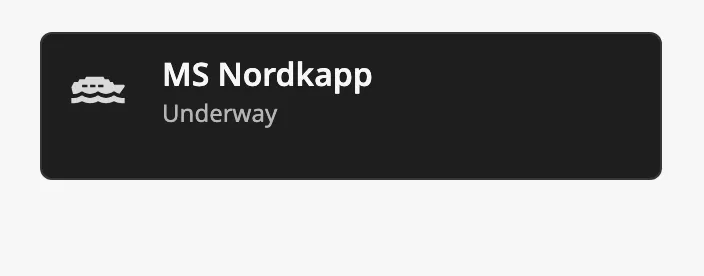 |
At the right are the readouts. readouts is a list, and each readout is an
object:
| Name | Description | Property Type |
|---|---|---|
| label | Text above the value. | value |
| value | The value: a number or a text. | value |
| unit | Unit shown after the value. | value |
| Readouts | |
|---|---|
| 1 | 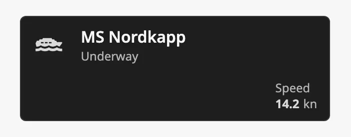 |
| 2 | 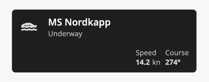 |
| 3 | 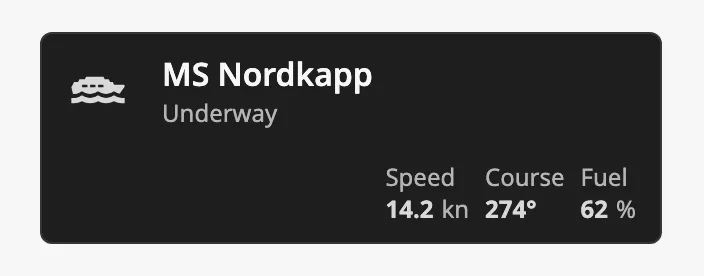 |
The button shows the value as it is. To control the number of decimals, format
the value in the binding, for example with the expression
numberFormat({[default]Nordkapp/Speed}, "0.0").
Properties
Section titled “Properties”| Name | Description | Property Type |
|---|---|---|
| infoLabel | Label of the info field. Default Info Label. |
value |
| infoStatus | Value of the info field. Default Info Status. |
value |
| readouts | The readouts. Empty by default. | array |
Selected
Section titled “Selected”Set selected to true to show the button as the chosen one:
| selected | |
|---|---|
false (default) |
|
true |
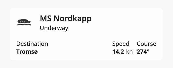 |
A click on the button does not change selected. It fires
onActionPerformed, and your script or binding decides what is selected. Bind
selected to the property that holds the choice, as in
Example 1.
Properties
Section titled “Properties”| Name | Description | Property Type |
|---|---|---|
| selected | Show the button as selected. Default false. |
value |
Disabled
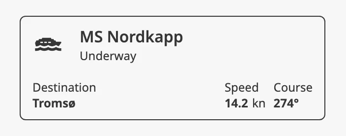
Section titled “Disabled”Set disabled to true to show the button as unavailable and ignore the
operator’s clicks. The event then does not fire.
Properties
Section titled “Properties”| Name | Description | Property Type |
|---|---|---|
| disabled | Disable input from the operator. Default false. |
value |
Properties
Section titled “Properties”Properties not covered in the sections above:
| Name | Description | Property Type |
|---|---|---|
| dividerBottom | Meant to draw a divider under the button, for buttons in a list. It currently has no visible effect when the button is used on its own. Default false. |
value |
The Integration Button has no style property.
Component Events
Section titled “Component Events”| Event | Description | Event Object |
|---|---|---|
| onActionPerformed | Fired when the operator clicks the button. Not fired when disabled is true. |
— |
Examples
Section titled “Examples”Example 1 — One Button per Vessel
Section titled “Example 1 — One Button per Vessel”The session has a custom property vessel that holds the chosen vessel, and
selectedVessel of the Integration Bar is bound
bidirectionally to it.
-
Drop an Integration Button into the view, 320 × 106.
-
Set
labeltoMS Nordkapp,hasLeadingIcontotrueandleadingIconto a ship icon. -
Bind
statusto[default]Nordkapp/Status, setinfoLabeltoDestinationand bindinfoStatusto[default]Nordkapp/Destination. -
Set
readouts, and bind eachvalueto a tag:[{"label": "Speed", "value": 14.2, "unit": "kn"},{"label": "Course", "value": "274°", "unit": ""}] -
Bind
selectedto the expression{session.custom.vessel} = "nordkapp". -
Add a script to
onActionPerformed:self.session.custom.vessel = 'nordkapp'
Repeat for each vessel, or place the button in a view with a vessel parameter
and show it in a Flex Repeater.
Found an error or something unclear?
Tell us what is wrong, confusing or missing on this page.
Built on the OpenBridge Design System