Gauge Valve
The Gauge Valve is a round gauge that shows how far an analog valve is open: one bar per port of the valve, around an icon of the actuator. It is found in the Automation - OpenBridge section of the Perspective Component Palette as Gauge Valve (Experimental).
Note: This component is experimental: its properties may change in a later version.
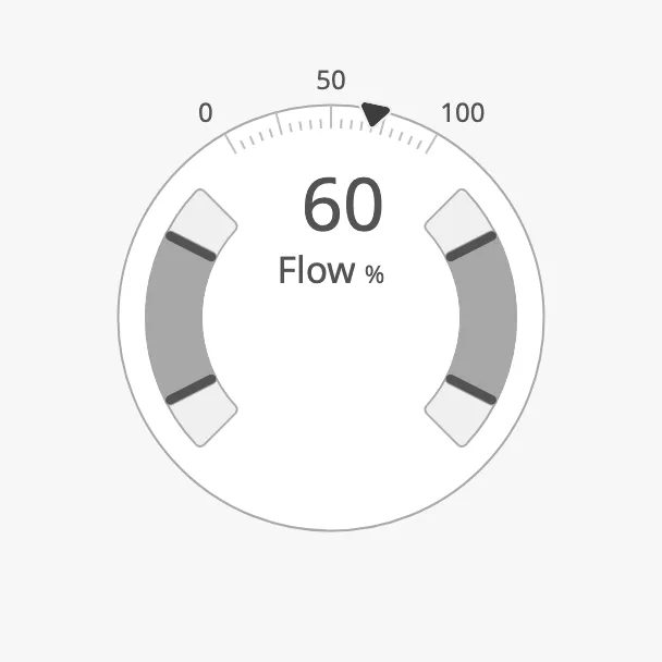
- Bars — one per port, showing the flow through that port. See Value.
- Scale and setpoint marker — in the large variant. See Compact and Large and Setpoint.
- Readout — the value in the centre of the large variant, or the rows below the compact one.
- Actuator icon — an icon of your choice in the centre. See Icon.
Use it on an overview display, where the opening of the valve should be readable at a glance. For a valve symbol in a mimic or pipe diagram, with alert frame and badges, use the Analog Valve instead.
The Gauge Valve shows the values it is given; it does not read tags itself and it cannot be operated.
A Gauge Valve dropped from the palette with default properties. The blue frame is the component’s box, as the Designer shows it when the component is selected:
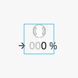
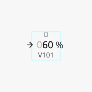
The default box of 48 × 48 is too small: the gauge shrinks to make room for the rows below it, and the rows do not fit. Resize the component after dropping it (see Size).
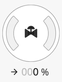
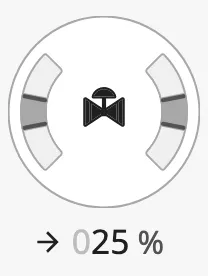
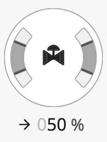
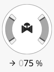
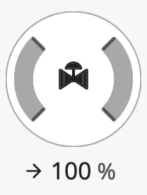
Bind value to the opening of the valve in percent, from 0 to 100. The
bars grow from the middle of each track towards its ends:
0 |
25 |
50 |
75 |
100 |
|---|---|---|---|---|
 |
 |
 |
 |
 |
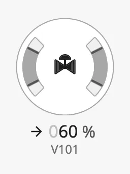
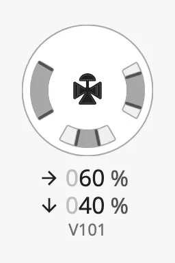
type selects the number of ports. A three-way valve has a third track at
the bottom, which shows bottomValue, the flow through the bottom outlet in
percent. The compact variant then shows a second row for the bottom outlet.
two-way (default) |
three-way |
|---|---|
 |
 |
Properties
Section titled “Properties”| Name | Description | Property Type |
|---|---|---|
| value | Flow through the valve (for a three-way valve: through the right outlet) in percent, 0–100. Default 0. |
value |
| type | two-way or three-way. Default two-way. |
value |
| bottomValue | Flow through the bottom outlet in percent, 0–100. Default 0. Only shown when type is three-way. |
value |
Compact and Large
Section titled “Compact and Large”large selects between two variants:
- Compact (
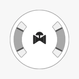
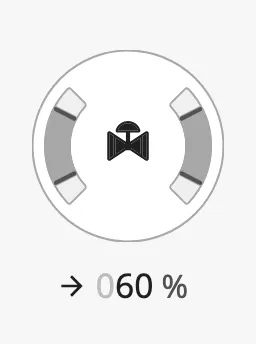
large=false, the default) — the gauge with rows of text below it: one row per outlet with the value in percent, and thetagof the valve. SethasLabelStacktofalseto hide the rows and show only the gauge. - Large (
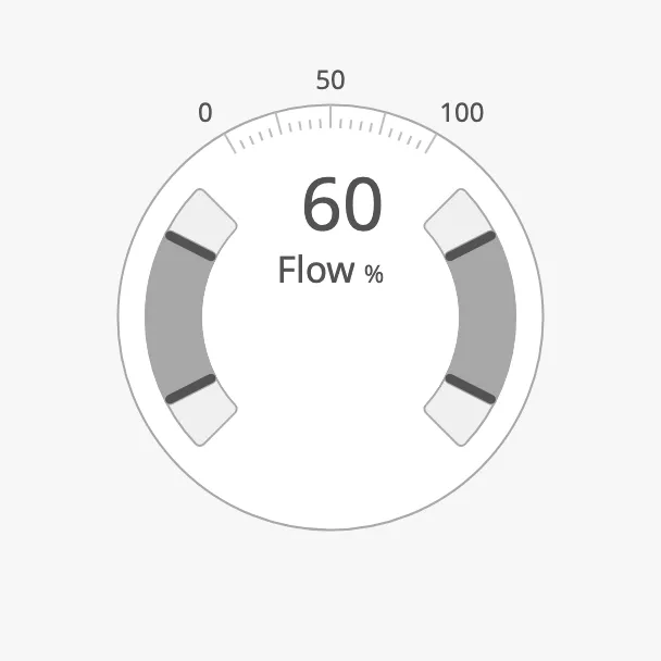
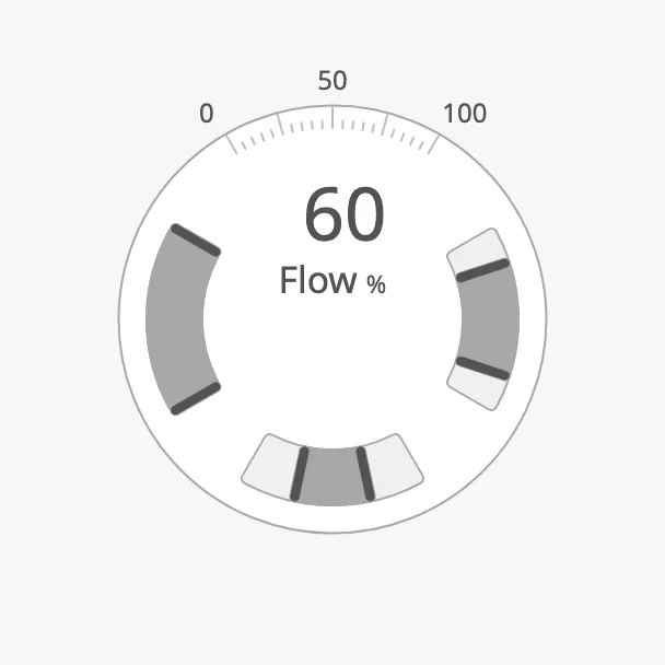
large=true) — the gauge with a scale from 0 to 100 around it and the setpoint as a marker on the scale. When the ring is at least 192 px wide, the value is also shown in the centre, withlabelandunitbelow it.
| Compact | Compact, hasLabelStack = false |
Compact, tag empty |
|---|---|---|
|
 |
 |
| Large, box of 272 × 272 | Large, three-way |
|---|---|
 |
 |
In a smaller box the large variant drops the readout in the centre and keeps the scale:
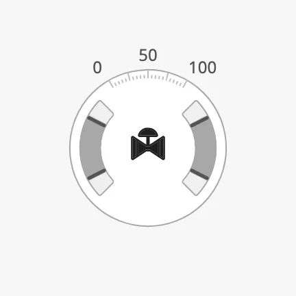
Note: The readout of the large variant is drawn in the centre, on top of the icon. Use the large variant either with an icon in a box smaller than about 270 px, or without an icon in a larger box.
Properties
Section titled “Properties”| Name | Description | Property Type |
|---|---|---|
| large | Show the scale, the setpoint marker and the readout in the centre. Default false. |
value |
| label | Text below the value in the centre. Empty by default. Only shown when large is true. |
value |
| unit | Unit after the label. Empty by default. Only shown when large is true. |
value |
| hasLabelStack | Show the rows below the gauge. Default true. Only shown when large is false. |
value |
| tag | Identifier below the value rows, for example V101. Empty by default. Only shown when large is false. |
value |
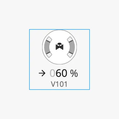
The gauge fills the component’s box: it is the largest circle that fits, after room is taken for the rows below it (compact) or the scale around it (large). The text keeps its size. The blue frame is the component’s box:
| Compact in 96 × 96 | Compact in 48 × 48 |
|---|---|
 |
 |
A compact Gauge Valve with its rows needs a box of about 96 × 140.
Set hasFaceDiameter to true to give the ring a fixed diameter instead, in
pixels, with faceDiameter. The size of the box then no longer matters. Use
the same diameter on gauges that are shown side by side:
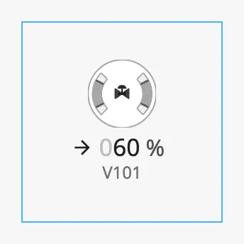
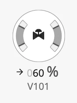
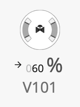
componentSize sets the size of the text of the rows. The gauge gets the room
that is left:
regular |
medium |
large |
|---|---|---|
|
 |
 |
Properties
Section titled “Properties”| Name | Description | Property Type |
|---|---|---|
| hasFaceDiameter | Use a fixed ring diameter instead of filling the box. Default false. |
value |
| faceDiameter | Diameter of the ring in pixels. Default 0. Only shown when hasFaceDiameter is true. |
value |
| componentSize | Size of the text below the gauge: regular, medium or large. Default regular. |
value |
Priority and Bar Style
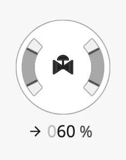
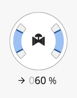
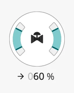
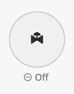
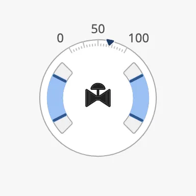
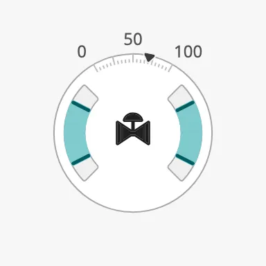
Section titled “Priority and Bar Style”priority selects the colour of the bars. Use enhanced for the valve the
operator is working with, and off for a valve that is switched off: the gauge
is then blank, and the rows are replaced by Off.
regular (default) |
enhanced |
medium |
off |
|---|---|---|---|
 |
 |
 |
 |
In the large variant:
enhanced |
medium |
off |
|---|---|---|
 |
 |
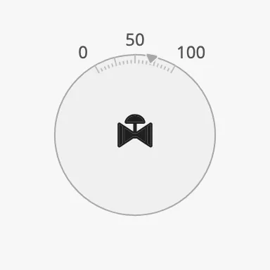 |
The icon in the centre does not change with priority. When you set priority
to off, also select the closed variant of the icon.
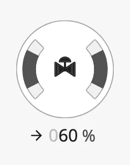
barStyle selects how the bars are drawn: tint is a light bar with a strong
line at each end, fill is a strong bar without the lines.
tint (default) |
fill |
|---|---|
|
 |
Properties
Section titled “Properties”| Name | Description | Property Type |
|---|---|---|
| priority | Colour of the bars: regular, enhanced, medium or off. Default regular. |
value |
| barStyle | tint or fill. Default tint. |
value |
Scale Position
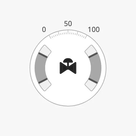
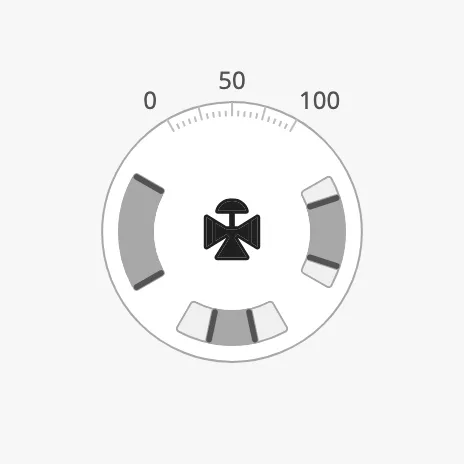
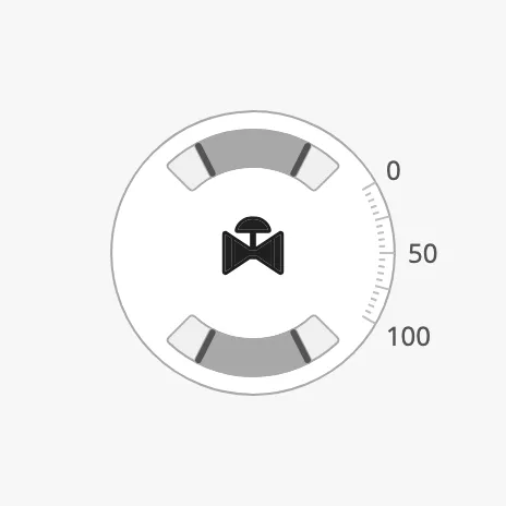
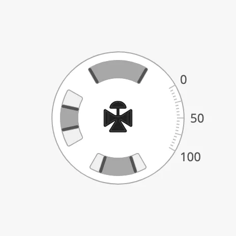
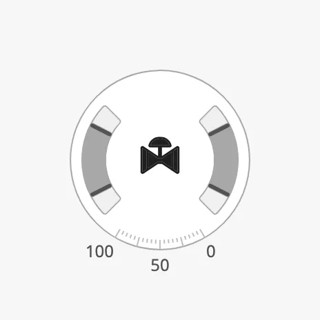
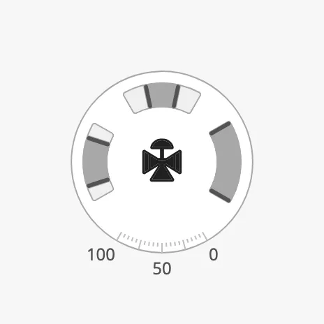
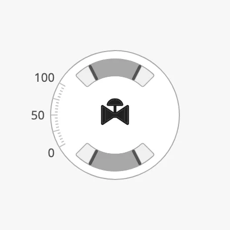
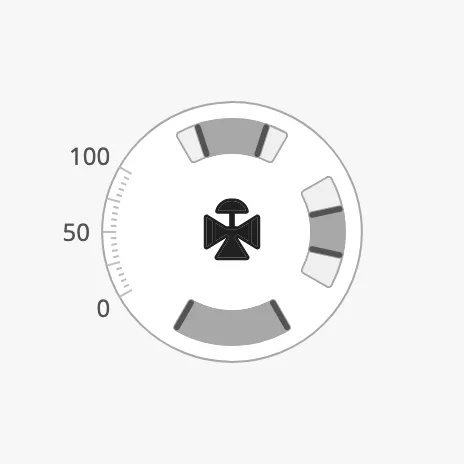
Section titled “Scale Position”scalePosition rotates the whole gauge in steps of 90°: the ports, the scale
and the setpoint marker. Use it to match the direction of the valve in the
plant. The icon is not rotated; select the icon that matches.
| scalePosition | two-way |
three-way |
|---|---|---|
top (default) |
 |
 |
right |
 |
 |
bottom |
 |
 |
left |
 |
 |
Properties
Section titled “Properties”| Name | Description | Property Type |
|---|---|---|
| scalePosition | Side the scale is on: top, right, bottom or left. Default top. |
value |
Setpoint
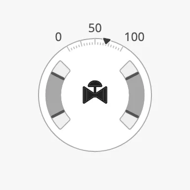
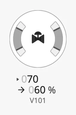
Section titled “Setpoint”Set hasSetpoint to true and bind setpoint to the commanded opening, in
percent. The large variant shows it as a marker on the scale; the compact
variant shows it as an extra row above the value.
| Large | Compact |
|---|---|
 |
 |
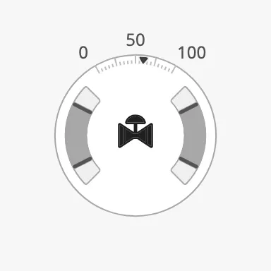
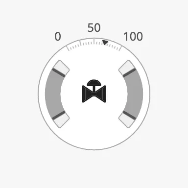
The marker changes when the valve has reached the setpoint. Either set
atSetpoint yourself, or set autoAtSetpoint to true to let the gauge
compare value with setpoint; autoAtSetpointDeadband is how far apart they
may be and still count as reached.
| Not at setpoint | atSetpoint = true |
autoAtSetpoint, value 69, setpoint 70, deadband 2 |
|---|---|---|
|
 |
 |
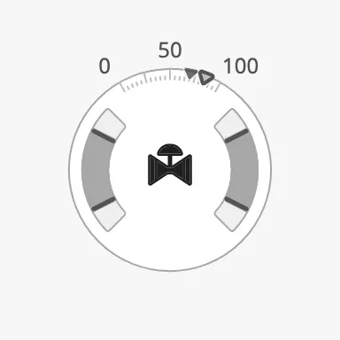
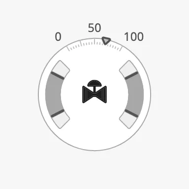
While the operator is choosing a new setpoint, set hasNewSetpoint to true
and newSetpoint to the value being chosen: the gauge shows both the current
and the new setpoint. touching marks the setpoint as being adjusted right
now.
newSetpoint = 85 |
touching = true |
|---|---|
 |
 |
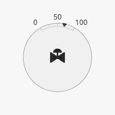
With priority set to off the marker is dimmed. Set setpointOverride to
true to keep it in its normal colour:
priority = off |
priority = off, setpointOverride = true |
|---|---|
|
 |
Properties
Section titled “Properties”| Name | Description | Property Type |
|---|---|---|
| hasSetpoint | Show a setpoint. Default false. |
value |
| setpoint | The setpoint in percent. Default 0. Only shown when hasSetpoint is true. |
value |
| hasNewSetpoint | Show a second setpoint, for a value that is being chosen. Default false. |
value |
| newSetpoint | The setpoint being chosen. Default 0. Only shown when hasNewSetpoint is true. |
value |
| atSetpoint | Draw the marker as reached. Ignored when autoAtSetpoint is true. Default false. |
value |
| autoAtSetpoint | Let the gauge decide whether the setpoint is reached, from value and setpoint. Default false. |
value |
| autoAtSetpointDeadband | Largest difference between value and setpoint that counts as reached. Default 0. |
value |
| touching | The setpoint is being adjusted right now. Draws the marker as in focus and never as reached. Default false. |
value |
| setpointOverride | Keep the normal colour of the marker when priority is off. Default false. |
value |
| setpointAtZeroDeadband | Tolerance for treating the setpoint as zero. Default 0. |
value |
| animateSetpoint | Animate the marker when a new setpoint is confirmed (newSetpoint is removed and setpoint takes its value). Default false. |
value |
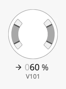
Set hasIcon to true and select the icon of the actuator with icon.path.
Without an icon the centre is empty:
hasIcon = false (default) |
hasIcon = true |
|---|---|
 |
|
The icon is a picture: it does not follow value, priority or
scalePosition. OpenBridge has a set of valve icons for the common openings
and directions. Their names start with twoway- and threeway-, for example
openbridge/twoway-acuator-general-50 and
openbridge/twoway-acuator-general-closed (the names are spelled acuator).
To make the icon follow the valve, bind icon.path to an expression that picks
the icon from the value.
Properties
Section titled “Properties”| Name | Description | Property Type |
|---|---|---|
| hasIcon | Show an icon in the centre. Default false. |
value |
| icon | The icon. Only shown when hasIcon is true. |
object |
| icon.path | Path of the icon, for example openbridge/twoway-acuator-general-50. Default openbridge/placeholder. |
value |
Properties
Section titled “Properties”| Name | Description | Property Type |
|---|---|---|
| style | Standard Perspective style object. | object |
Component Events
Section titled “Component Events”The Gauge Valve has no component events of its own. The standard Perspective
events, such as onClick, are available in the component’s event
configuration.
Examples
Section titled “Examples”Example 1 — Control Valve with Setpoint on an Overview
Section titled “Example 1 — Control Valve with Setpoint on an Overview”-
Drop a Gauge Valve into the view and resize it to 200 × 200.
-
Set:
Property Value large truehasSetpoint trueautoAtSetpoint trueautoAtSetpointDeadband 2hasIcon trueicon.path openbridge/twoway-acuator-general-50 -
Bind
valueto the position feedback of the valve, for example[default]Valve01/Position, andsetpointto its setpoint, for example[default]Valve01/Setpoint.
Example 2 — Compact Three-Way Valve
Section titled “Example 2 — Compact Three-Way Valve”- Drop a Gauge Valve and resize it to 96 × 160.
- Set
typetothree-wayandtagtoV101. - Bind
valueto the flow through the right outlet andbottomValueto the flow through the bottom outlet, both in percent.
Found an error or something unclear?
Tell us what is wrong, confusing or missing on this page.
Built on the OpenBridge Design System