Floating Item
The Floating Item is a short message that floats above the rest of the screen: a confirmation, a status update or a notification the operator can act on or dismiss. It is found in the Input - OpenBridge section of the Perspective Component Palette as Floating Item.

From left to right:
- Icon — what kind of message it is. See Type and Icons.
- Title and description. See Text.
- Day and time. See Time.
- Action buttons — up to two. See Actions.
- Dismiss button — the cross. See Dismiss.
A Floating Item with default properties and title set to Floating Item:

A Floating Item dropped from the palette has no title and no description. Set them first.
The Floating Item only draws the message and reports what the operator clicks. It does not appear or disappear by itself: you show and hide it, for example in a popup or by binding its visibility (see Example 1).
The Floating Item is always 640 px wide, whatever the width of the component, and as tall as its content needs. It is drawn from the top left corner of the component’s box, the blue frame in the image:

Make the component 640 px wide, and 74 px high for an item with the actions beside the text or 130 px for one with the actions below it.
title is shown in bold, with description below it.

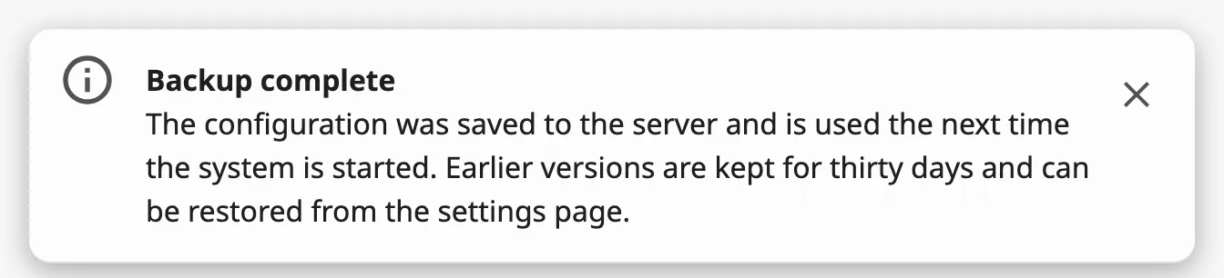
lineType decides what happens to text that does not fit on one line:
| lineType | |
|---|---|
single-line (default) |
The text is cut off with an ellipsis. |
multi-line |
The description wraps, over up to eight lines. |

Properties
Section titled “Properties”| Name | Description | Property Type |
|---|---|---|
| title | Title of the message. Empty by default. | value |
| description | Text below the title. Empty by default. | value |
| lineType | single-line or multi-line. Default single-line. |
value |
Type and Icons
Section titled “Type and Icons”type selects how the icon is drawn:
| type | |
|---|---|
regular (default) |
One icon, primaryIcon. |
application |
primaryIcon in a circle, with secondaryIcon as a small mark on it. Use it for a message from an application or a system, with the mark telling what kind of message it is. |

primaryIcon and secondaryIcon are icon pickers: choose an icon from the
openbridge library. See Icons. The primary icon is always
shown.
Properties
Section titled “Properties”| Name | Description | Property Type |
|---|---|---|
| type | regular or application. Default regular. |
value |
| primaryIcon | The icon of the message. Default openbridge/placeholder. |
object |
| secondaryIcon | The mark on the icon. Default openbridge/placeholder. Only shown when type is application. |
object |
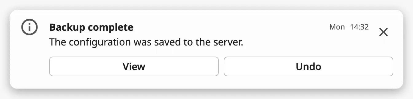
Set hasTimestamp to true to show time to the right of the title. Set
hasDay to true as well to show day before it.
With the time only:

With the day and the time:

time and day are texts, shown as they are: the Floating Item does not format
a date. Bind them to an expression such as dateFormat(now(), 'HH:mm').
The day is only shown together with the time: hasDay has no effect while
hasTimestamp is false.
Properties
Section titled “Properties”| Name | Description | Property Type |
|---|---|---|
| hasTimestamp | Show the time. Default false. |
value |
| time | Text of the time, for example 14:32. Only shown when hasTimestamp is true. |
value |
| hasDay | Show the day before the time. Default false. |
value |
| day | Text of the day, for example Mon. Only shown when hasDay is true. |
value |
Actions
Section titled “Actions”action is the label of the first action button. The button is shown when the
label is not empty. action2 is the label of a second button, which is only
shown when the first has a label too.
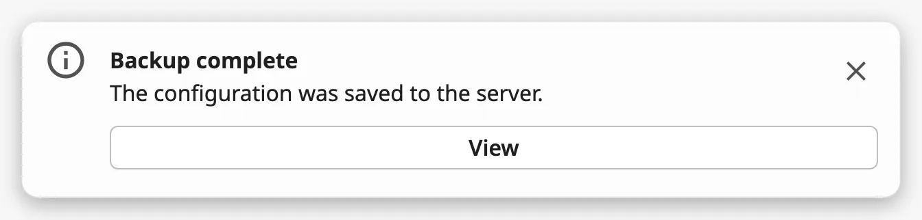
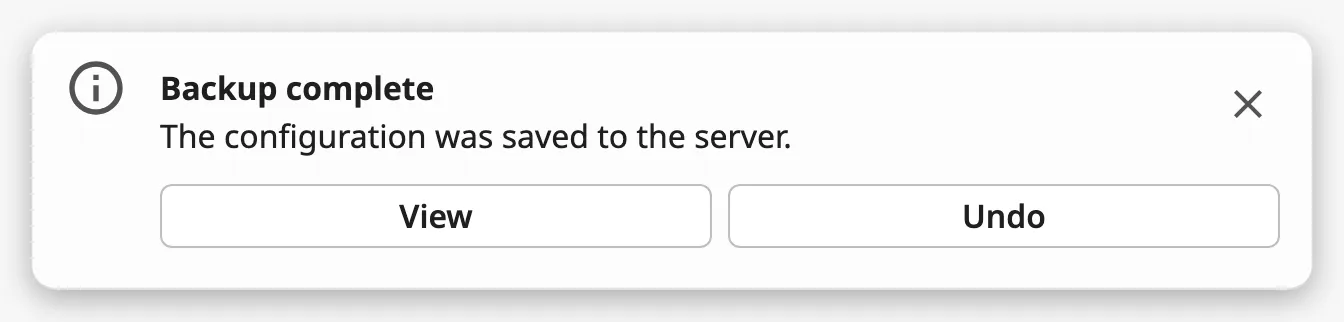
A click on the first button fires onActionClick, and on the second
onAction2Click. The buttons do nothing else: the item stays as it is.
direction decides where the buttons are placed:
| direction | |
|---|---|
horizontal (default) |
The buttons are in a row below the text and share the width. The item is taller. |
vertical |
The buttons are beside the text, as wide as their labels. The item stays one row high. |
direction makes no difference to an item without action buttons.
Properties
Section titled “Properties”| Name | Description | Property Type |
|---|---|---|
| action | Label of the first action button. Empty, and no button, by default. | value |
| action2 | Label of the second action button. Empty by default. Needs action to be set too. |
value |
| direction | Placement of the action buttons: horizontal or vertical. Default horizontal. |
value |
Dismiss
Section titled “Dismiss”The cross at the right is always shown. A click on it fires onDismissClick and
nothing more: the Floating Item does not hide itself. Hide it in the event,
as in Example 1.
Common Properties
Section titled “Common Properties”Described in Input Components — Common Features:
- In the Designer — the buttons react only in Preview Mode.
- Appearance —
style, and the palette:

The Floating Item has no disabled property.
Component Events
Section titled “Component Events”| Event | Description | Event Object |
|---|---|---|
| onActionClick | Fired when the operator clicks the first action button. | — |
| onAction2Click | Fired when the operator clicks the second action button. | — |
| onDismissClick | Fired when the operator clicks the cross. | — |
| onActionPerformed | Fired for a click on any of the three buttons, just before the event of that button. | — |
The event objects are empty. A click on the text or the icon fires nothing.
Use the event of the button you want to react to. onActionPerformed does not
tell which button was clicked.
Examples
Section titled “Examples”Example 1 — A Message the Operator Can Dismiss
Section titled “Example 1 — A Message the Operator Can Dismiss”The view has a custom property showBackupMessage.
-
Drop a Floating Item into the view, 640 px wide, and place it where the message should appear.
-
Set
titletoBackup complete,descriptiontoThe configuration was saved to the server.and chooseopenbridge/infoforprimaryIcon. -
Bind
meta.visibleof the component toview.custom.showBackupMessage. -
Configure the
onDismissClickevent with a script action:def runAction(self, event):self.view.custom.showBackupMessage = False -
Set
showBackupMessagetoTruefrom the script that makes the backup.
Example 2 — An Action
Section titled “Example 2 — An Action”-
On the item of Example 1, set
actiontoViewanddirectiontovertical. -
Configure the
onActionClickevent with a script action:def runAction(self, event):self.view.custom.showBackupMessage = Falsesystem.perspective.navigate(page='/settings/backup')
Found an error or something unclear?
Tell us what is wrong, confusing or missing on this page.
Built on the OpenBridge Design System