Dropdown Button
The Dropdown Button lets the operator choose one option from a list. The button shows the selected option; a click opens the list. It is found in the Input - OpenBridge section of the Perspective Component Palette as Dropdown Button.
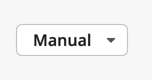
- Label of the selected option — see Options.
- Arrow that shows that the button opens a list.
The Dropdown Button is one of the input components. Values, events, disabling and the behavior in the Designer are shared by all of them and are described in Input Components — Common Features. This page covers what is specific to the Dropdown Button.
A Dropdown Button with default properties:
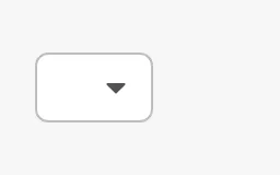
A new Dropdown Button has no options and shows only the arrow. Add the options first.
Note: The list does not open in the Designer, not even in Preview Mode: the Designer’s built-in browser cannot show this kind of list. Try the component in a session. To choose what it shows in the Designer, set
valuein the property editor.
Options
Section titled “Options”options is the list to choose from. Each option has a label, which is the
text the operator sees, and a value, which is what is written to the value
property when the option is chosen:
[ {"label": "Auto", "value": "auto"}, {"label": "Manual", "value": "manual"}, {"label": "Off", "value": "off"}]A click on the button opens the list:
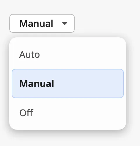
The list is drawn by the browser, so its look differs somewhat between browsers and devices; on a phone or a tablet it is the selection list of that device.
Give every option a different value. An option value can be a text, a number
or true/false.
Properties
Section titled “Properties”| Name | Description | Property Type |
|---|---|---|
| options | The options to choose from. Empty by default. | array |
| options[].label | Text shown for the option. | value |
| options[].value | Value written to value when the option is chosen. |
value |
value is the value of the selected option. The button shows the label of
that option.
When the operator chooses another option, the component writes the value of
that option to value and then fires onActionPerformed once. Bind value
bidirectionally to a tag to let the operator set the tag; see
Values.
The value is written with the type it looks like: choosing an option with the
value 2 writes the number 2, and true or false writes a boolean. Anything
else is written as text.
A Value That Is Not an Option
Section titled “A Value That Is Not an Option”When value does not match any option — for instance while it is empty — what
is shown depends on allowEmptySelection:
| allowEmptySelection | Shown | Image |
|---|---|---|
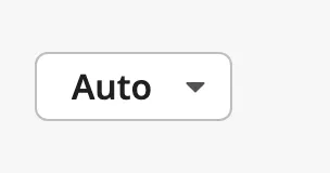
false (default) |
The first option. Here value is standby, which is not in the list. |
 |
true |
Nothing: the button is empty until the operator chooses an option. | |
Note: With
allowEmptySelectionatfalsethe first option is only shown. It is not written tovalue, which keeps the value it had until the operator chooses an option.
Properties
Section titled “Properties”| Name | Description | Property Type |
|---|---|---|
| value | Value of the selected option. Written when the operator chooses. Empty by default. | value |
| allowEmptySelection | Show an empty button instead of the first option when value is not an option. Default false. |
value |
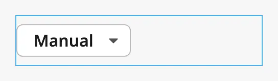
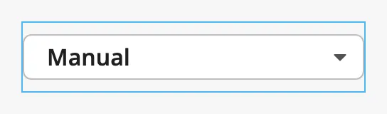
The button is as wide as the label of the selected option needs, so its width
changes with the selection. Set fullWidth to true to make it fill the width
of the component instead. The blue frame in the images is the component’s box:
fullWidth = false |
fullWidth = true |
|---|---|
 |
 |
Properties
Section titled “Properties”| Name | Description | Property Type |
|---|---|---|
| fullWidth | Make the button fill the width of the component. Default false. |
value |
Integration Style
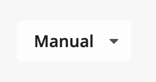
Section titled “Integration Style”Set integration to true when the button is placed on an integration bar. It
is then drawn without a border, in the colours of that bar:
Properties
Section titled “Properties”| Name | Description | Property Type |
|---|---|---|
| integration | Draw the button for use on an integration bar. Default false. |
value |
Disabled
Section titled “Disabled”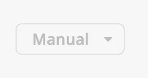
A disabled Dropdown Button does not open its list. See
Disabled for the disabled property, which works in the
same way on every input component.
Common Properties
Section titled “Common Properties”- Appearance —
style.
Component Events
Section titled “Component Events”| Event | Description | Event Object |
|---|---|---|
| onActionPerformed | Fired when the operator chooses another option, after value has been written. |
— |
See Events.
Examples
Section titled “Examples”Example 1 — Control Mode
Section titled “Example 1 — Control Mode”-
Drop a Dropdown Button into the view.
-
Set
optionsto:[{"label": "Auto", "value": "auto"},{"label": "Manual", "value": "manual"},{"label": "Off", "value": "off"}] -
Bind
valueto the tag[default]Pump01/Modeand enable Bidirectional. -
Set
fullWidthtotrueso that the button keeps its width when the selection changes.
Example 2 — Numeric Values
Section titled “Example 2 — Numeric Values”-
Set
optionsto a list with numbers as values:[{"label": "Low", "value": 1},{"label": "Medium", "value": 2},{"label": "High", "value": 3}] -
Bind
valuebidirectionally to an integer tag, for example[default]Fan01/SpeedStep. ChoosingMediumwrites the number 2 to the tag.
Found an error or something unclear?
Tell us what is wrong, confusing or missing on this page.
Built on the OpenBridge Design System