Sequence Loading Spinner
The Sequence Loading Spinner is a small ring that shows that a step of a sequence is being carried out. It comes in sizes that match the indicators, tags and buttons it is placed beside. It is found in the Input - OpenBridge section of the Perspective Component Palette as Sequence Loading Spinner (Experimental).
Note: This component is experimental: its properties may change in a later version.

The Sequence Loading Spinner only shows something: it takes no input from the operator, writes no property back and has no component events. For the progress of a task as a percentage, use the Progress Bar.
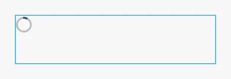
A Sequence Loading Spinner with default properties, a moment after it appeared. The blue frame is the component’s box: the ring has a fixed size and is placed at the top left of it.
type sets the size of the ring, to match what it is placed beside. The ring
does not follow the size of the component; set the size of the component to the
size of the ring.
| type | Size of the ring | |
|---|---|---|
indicator (default) |
16 × 16 |  |
indicator-point |
8 × 8 |  |
tag |
16 × 16 |  |
tag-point |
32 × 32 |  |
button |
24 × 24 |  |
button-point |
48 × 48 |  |
Properties
Section titled “Properties”| Name | Description | Property Type |
|---|---|---|
| type | indicator, indicator-point, tag, tag-point, button or button-point. Default indicator. |
value |
Progression
Section titled “Progression”progression selects how the ring moves.
Determinate
Section titled “Determinate”With determinate, the default, the ring fills by itself. It starts at
progressPercent, waits one second and then fills steadily to a full ring,
where it stays. From 0 that takes five seconds; from a higher start it is
faster, but never less than 1.2 seconds.
progressPercent = 0 |
progressPercent = 40 |
progressPercent = 100 |
|---|---|---|
 |
 |
 |
The images are taken a moment after the component appeared, so the first two rings have already started to fill.
progressPercent is therefore not a progress that the ring stays at. It is
the point the fill starts from, and each time it changes, the fill starts again
from the new value. A ring that is to stand still at a percentage is a
Progress Bar with type set to
circular. Set progressPercent to 100 for a ring that is full at once.
Scanning
Section titled “Scanning”With scanning, an arc rotates around the ring for as long as the component is
shown. Use it when it is not known how long the step takes. One turn takes
rotationDurationMs milliseconds.

Note: The drop-down list of
progressionoffersdeterminateandspinning.spinningdoes not work: it draws an empty ring that does not move, as in the image below. The value that works isscanning, which the list does not offer: set it with a binding, for example the expression"scanning".

Properties
Section titled “Properties”| Name | Description | Property Type |
|---|---|---|
| progression | determinate or scanning. Default determinate. |
value |
| progressPercent | Where the fill starts, 0 to 100. Only used when progression is determinate. Default 0. |
value |
| rotationDurationMs | Time of one turn in milliseconds, at least 100. Only used when progression is scanning. Default 1000. |
value |
Properties
Section titled “Properties”Properties not covered in the sections above:
| Name | Description | Property Type |
|---|---|---|
| style | Standard Perspective style object. See Appearance. | object |
The colors follow the OpenBridge palette of the session:
Component Events
Section titled “Component Events”The Sequence Loading Spinner has no component events.
Examples
Section titled “Examples”Example 1 — A Step in Progress
Section titled “Example 1 — A Step in Progress”Show a rotating ring beside a button while the pump is starting.
- Drop a Sequence Loading Spinner beside the button, set
typetobuttonand the size of the component to 24 × 24. - Bind
progressionto the expression"scanning". - Bind the
displayproperty of the component’s position to{[default]Pump01/Starting}, so that the ring is only shown while the pump is starting.
Found an error or something unclear?
Tell us what is wrong, confusing or missing on this page.
Built on the OpenBridge Design System