Status Indicator
The Status Indicator is a small colored lamp with a label beside it. The color of the lamp shows a status, such as running, inactive or in alarm. It is found in the Input - OpenBridge section of the Perspective Component Palette as Status Indicator (Beta).
Note: This component is in beta: its properties may change in a later version.
The Status Indicator only shows something: it takes no input from the operator, writes no property back and has no component events.
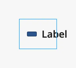
A Status Indicator with default properties has the status active and the
label Label. The blue frame is the component’s box; the label does not fit a
new component and runs out of it, so make the component wider (see
Label):
Status
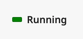
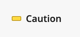
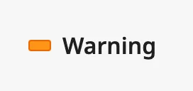
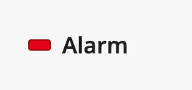
Section titled “Status”status sets the color of the lamp. With inactive the label is dimmed as
well.
| status | |
|---|---|
active (default) |
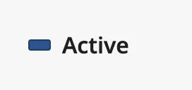 |
inactive |
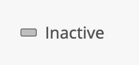 |
running |
 |
caution |
 |
warning |
 |
alarm |
 |
The lamp does not blink, and the component does not know about the alarms of
the gateway: bind status to show the state of a tag (see
Example 1).
Use one of the six values. With any other value the lamp is drawn as an empty outline.
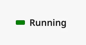
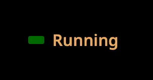
The colors follow the OpenBridge palette of the session. The running status
in the night palette:
Properties
Section titled “Properties”| Name | Description | Property Type |
|---|---|---|
| status | active, inactive, running, caution, warning or alarm. Default active. |
value |
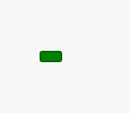
label is the text beside the lamp. Clear it to show the lamp alone:
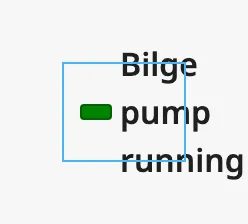
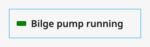
The indicator fills the component’s box. A label that is wider than the box is wrapped onto several lines and runs out of the box, so make the component wide enough for the longest label. A new component is 60 pixels wide, which is only enough for a very short label. The blue frame in the images is the component’s box:
| Box too narrow | Box wide enough |
|---|---|
 |
 |
Properties
Section titled “Properties”| Name | Description | Property Type |
|---|---|---|
| label | Text beside the lamp. Default Label. |
value |
Component Events
Section titled “Component Events”The Status Indicator has no component events.
Examples
Section titled “Examples”Example 1 — Status of a Pump
Section titled “Example 1 — Status of a Pump”-
Drop a Status Indicator into the view and make it 120 pixels wide.
-
Bind
statusto the expressionif({[default]Pump01/Alarm}, "alarm", if({[default]Pump01/Running}, "running", "inactive")) -
Bind
labelto the expressionif({[default]Pump01/Alarm}, "Alarm", if({[default]Pump01/Running}, "Running", "Stopped"))
Found an error or something unclear?
Tell us what is wrong, confusing or missing on this page.
Built on the OpenBridge Design System