Modal
The Modal is the window of a dialog: a title bar, a content area and a row of action buttons. It is a container: you place another component inside it. It is found in the App - OpenBridge section of the Perspective Component Palette as Modal.
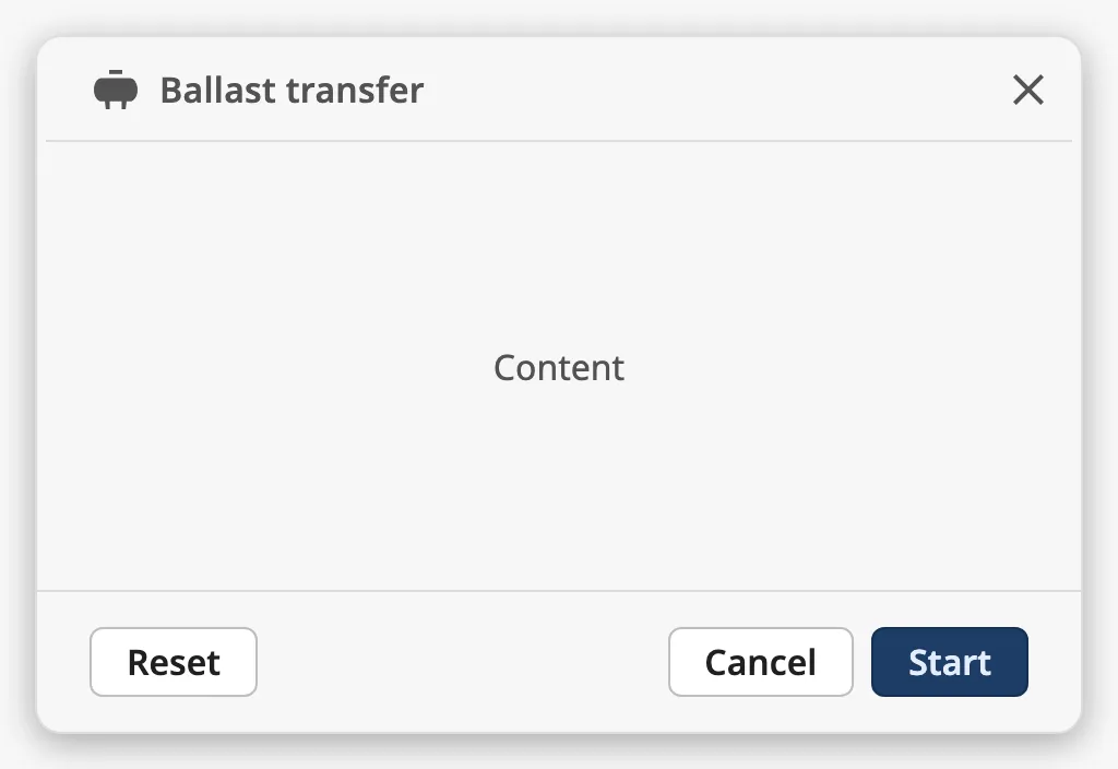
The parts of the modal:
- Header — the title, an optional icon before it and a close button. See Header.
- Content — the component you place in the modal. See Content.
- Actions — the Done button, and optionally a Cancel button and one more action. See Actions.
See App Components — Overview for how the app components fit together.
A Modal dropped from the palette has the title Title, a close button and the
Cancel and Done buttons:
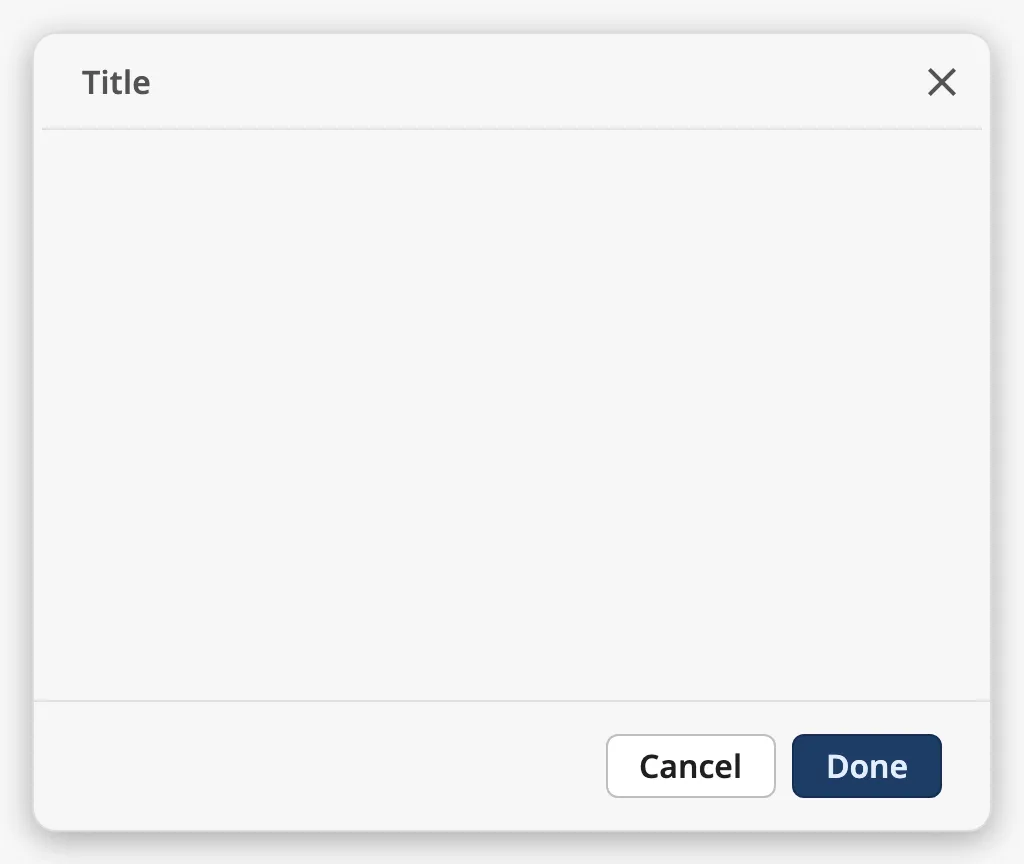
Note: The Modal is only the window. It does not open, close or cover the page by itself: it is drawn where you place it, and its buttons only fire component events. Show it in a Perspective popup or a docked view, and close that from the events. See Example 1.
Content
Section titled “Content”Drop a component onto the modal to place it inside. The modal shows one child, stretched to fill the area between the header and the actions:
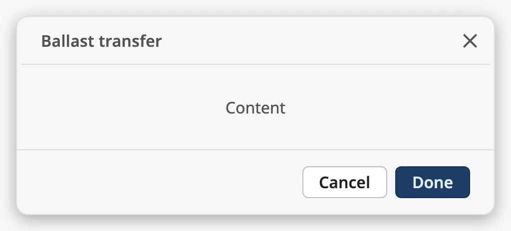
To show several components, make the child a container — a Flex Container or a Coordinate Container — and place the components in that.
The window is as tall as the component’s box (the blue frame), and the content area gets the height that is left:
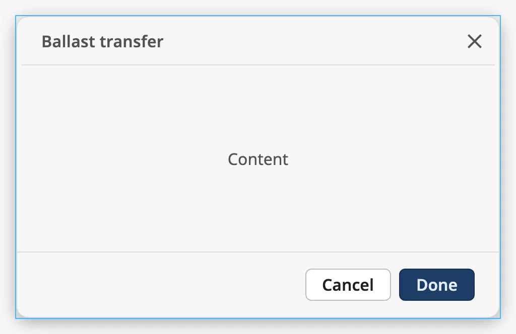
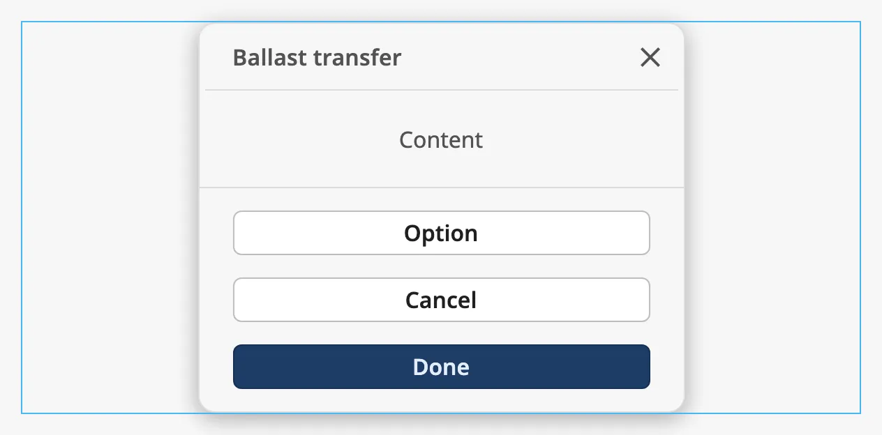
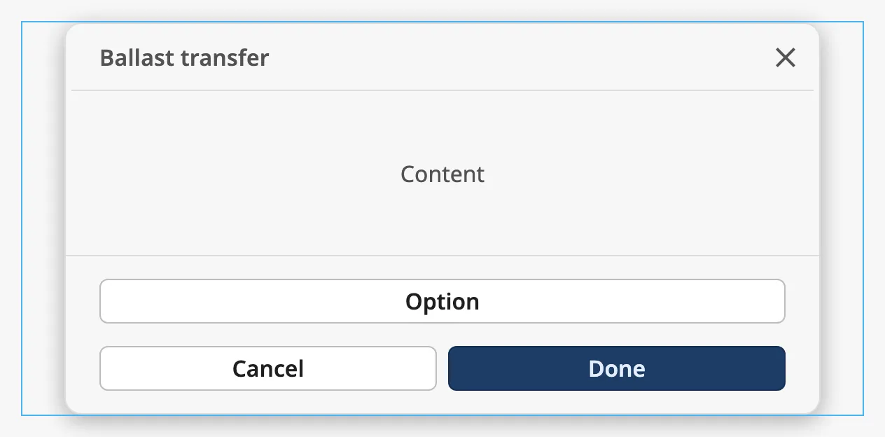
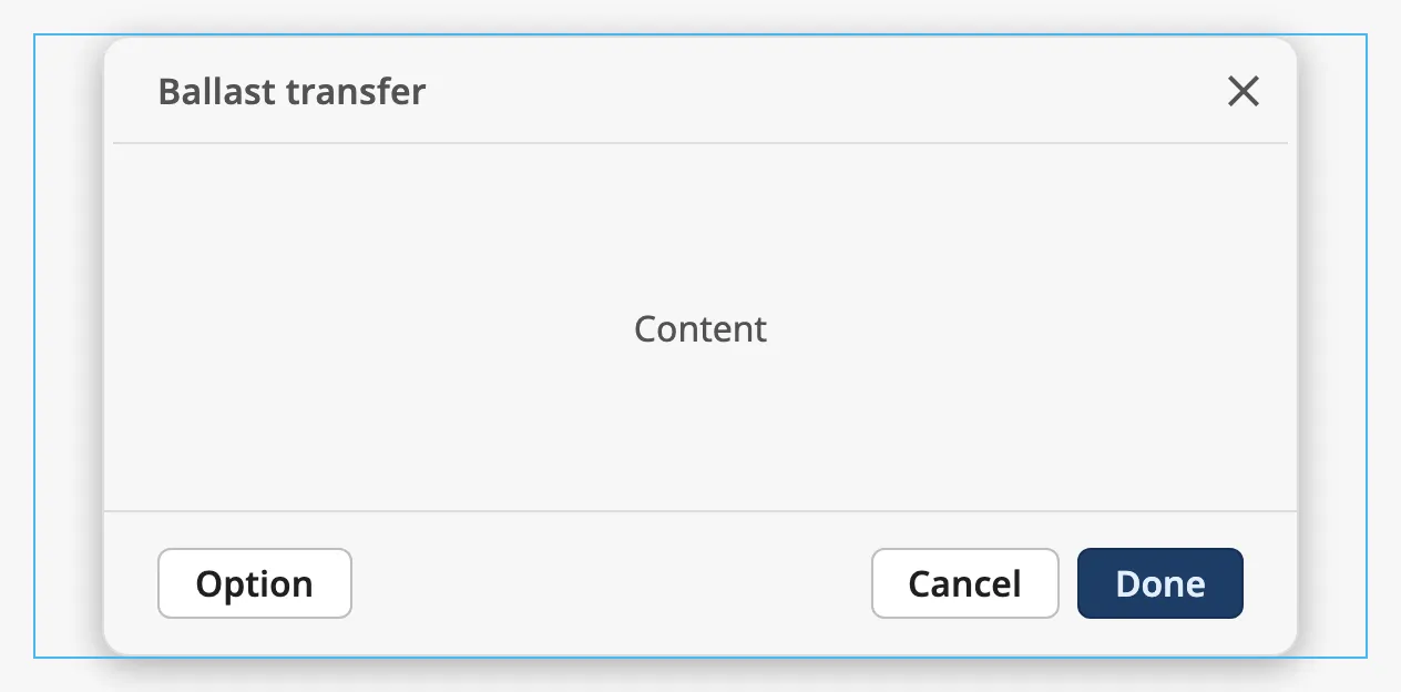
size sets the largest width of the window and how the action buttons are laid
out. The window is never wider than the component’s box; in a wider box it is
centred. The blue frame in the images is a box of 600 px.
| size | |
|---|---|
small |
At most 349 px wide. The actions are stacked, one per row. |
medium |
At most 540 px wide. The optional action has a row of its own above Cancel and Done. |
large (default) |
At most 540 px wide. All actions are on one row, the optional action to the left. |
Properties
Section titled “Properties”| Name | Description | Property Type |
|---|---|---|
| size | small, medium or large. Default large. |
value |
Header
Section titled “Header”title is the text of the header. Set hasLeadingIcon to true to show the
icon in icon before it:
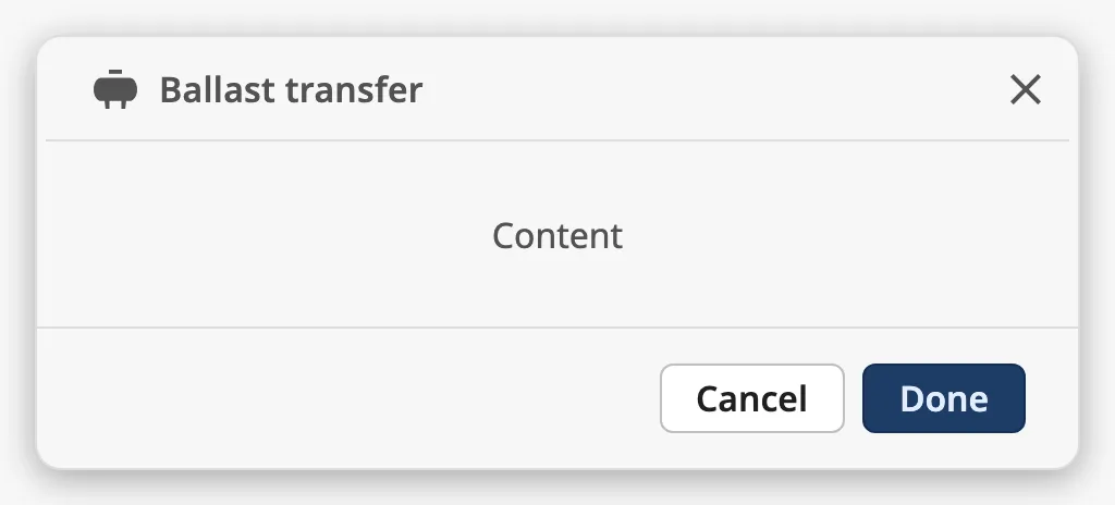
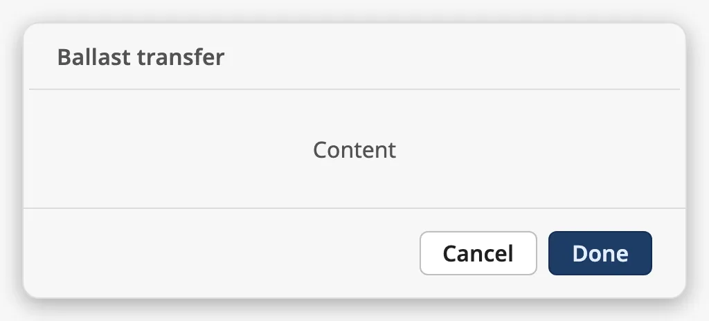
With hasCloseAction the header has a close button (✕). A click on it fires
onCloseClick. Set it to false for a dialog that must be answered with one of
the action buttons:
Properties
Section titled “Properties”| Name | Description | Property Type |
|---|---|---|
| title | Text of the header. Default Title. |
value |
| hasLeadingIcon | Show an icon before the title. Default false. |
value |
| icon | The icon, chosen with the icon picker. Only shown when hasLeadingIcon is true. |
object |
| hasCloseAction | Show the close button in the header. Default true. |
value |
Actions
Section titled “Actions”The Done button is always shown. It is the primary action of the dialog, and
doneLabel sets its text. The other two buttons are optional: hasCancelAction
shows the Cancel button, with the text in cancelLabel, and hasOptionalAction
adds a third button with the text in optionLabel.
| Default | |
| Own labels | 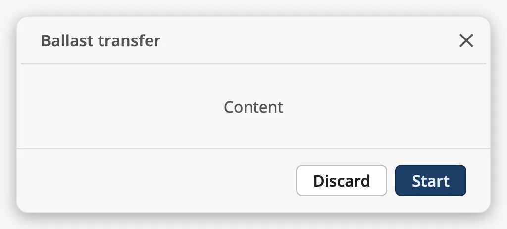 |
| No Cancel | 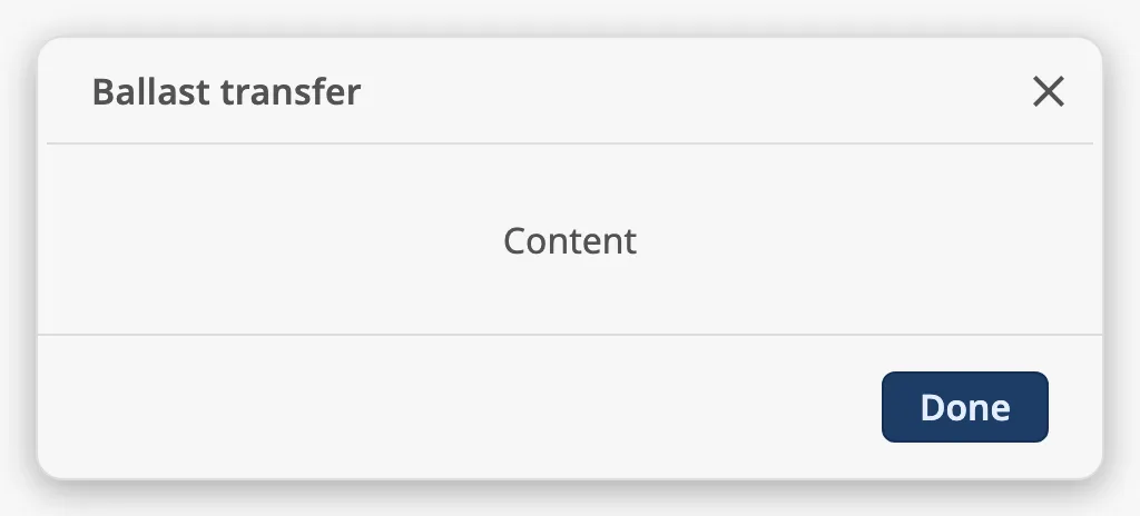 |
| Optional | 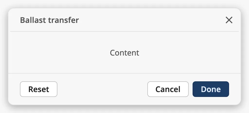 |
Each button fires its own event and does nothing else. The modal stays as it is until your script closes it.
Escape fires onCloseClick when the modal has a close button. Without a
close button it fires onCancelClick instead, and with neither a close nor a
Cancel button it does nothing: the dialog can then only be answered with Done
(or the optional action):
Properties
Section titled “Properties”| Name | Description | Property Type |
|---|---|---|
| doneLabel | Text of the Done button. Default Done. |
value |
| hasCancelAction | Show the Cancel button. Default true. |
value |
| cancelLabel | Text of the Cancel button. Default Cancel. Only shown when hasCancelAction is true. |
value |
| hasOptionalAction | Show a third action button. Default false. |
value |
| optionLabel | Text of the third button. Default Option. Only shown when hasOptionalAction is true. |
value |
Properties
Section titled “Properties”Properties not covered in the sections above:
| Name | Description | Property Type |
|---|---|---|
| style | Standard Perspective style object. | object |
Component Events
Section titled “Component Events”| Event | Description | Event Object |
|---|---|---|
| onCloseClick | Fired when the close button is clicked, or Escape is pressed while the close button is shown. | — |
| onCancelClick | Fired when the Cancel button is clicked, or Escape is pressed while there is no close button. | — |
| onDoneClick | Fired when the Done button is clicked. | — |
| onOptionClick | Fired when the optional action button is clicked. | — |
Examples
Section titled “Examples”Example 1 — Confirmation Dialog in a Popup
Section titled “Example 1 — Confirmation Dialog in a Popup”-
Create a view
Dialogs/StartTransfer, 480 × 300, with a Modal as its only component, filling the view. -
Set
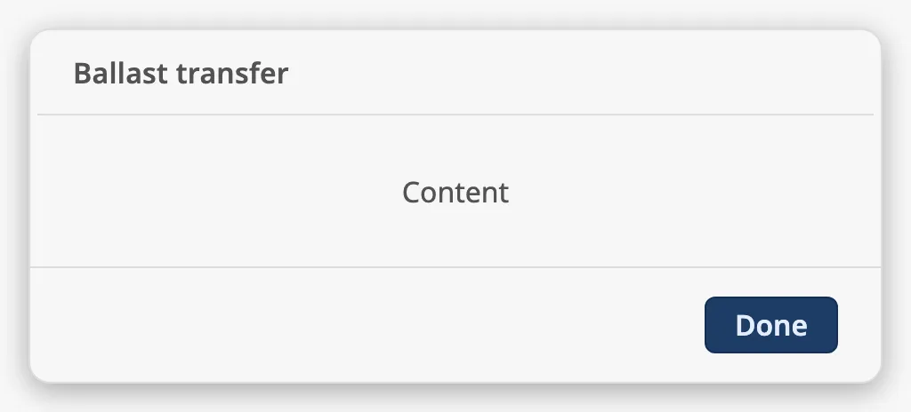
titletoBallast transfer,doneLabeltoStartandsizetolarge. -
Drop a Flex Container onto the modal and place the content of the dialog in it.
-
On the modal, add a script to
onDoneClickthat does the work and closes the popup:system.tag.writeBlocking(['[default]Ballast/Transfer/Start'], [True])system.perspective.closePopup('start-transfer') -
Add a script to both
onCancelClickandonCloseClick:system.perspective.closePopup('start-transfer') -
Open the dialog from a button on the page:
system.perspective.openPopup('start-transfer', 'Dialogs/StartTransfer',modal=True, showCloseIcon=False, draggable=False, resizable=False)
The popup is opened without its own title bar and close icon, because the Modal draws both.
Found an error or something unclear?
Tell us what is wrong, confusing or missing on this page.
Built on the OpenBridge Design System