Checkbox
The Checkbox lets the operator turn a single option on or off. It is found in the Input - OpenBridge section of the Perspective Component Palette as Checkbox.
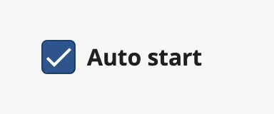
The Checkbox is one of the input components. How values are written back, events, disabling and the behavior in the Designer are shared by all of them and are described in Input Components — Common Features. This page covers what is specific to the Checkbox.
A Checkbox with default properties and label set to Checkbox:
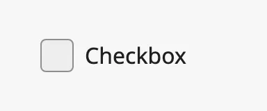
A Checkbox dropped from the palette is unchecked and has no label.
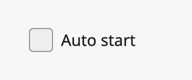
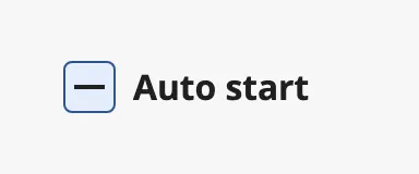
The checkbox has three states, set with checked and mixed:
| Unchecked | Checked | Mixed |
|---|---|---|
 |
|
 |
- Checked —
checkedistrue. - Mixed —
mixedistrueandcheckedisfalse. Use it for a checkbox that stands for a group of options of which only some are selected. - Unchecked — both are
false.
If both checked and mixed are true, the checkbox is shown as checked.
When the operator clicks the checkbox, it writes the new state to checked and
mixed and then fires onActionPerformed. A click on a mixed checkbox checks
it; after that, clicks alternate between unchecked and checked. The operator
cannot set the mixed state — set mixed from a binding or a script.
Bind checked bidirectionally to a tag to connect the checkbox to it. See
Values.
Properties
Section titled “Properties”| Name | Description | Property Type |
|---|---|---|
| checked | Whether the checkbox is checked. Written when the operator clicks. Default false. |
value |
| mixed | Whether the checkbox is in the mixed state. Written (to false) when the operator clicks. Default false. |
value |
| status | Deprecated. Use checked and mixed. Leave it empty. |
value |
label is the text next to the box. A click on the label toggles the checkbox.
Leave it empty for a checkbox without text, for instance in a table row.

Properties
Section titled “Properties”| Name | Description | Property Type |
|---|---|---|
| label | Text next to the box. Empty by default. | value |
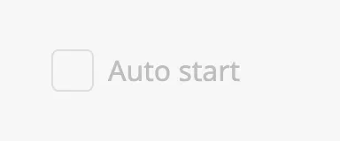
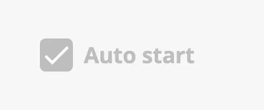
Disabled
Section titled “Disabled”| Unchecked | Checked | Mixed |
|---|---|---|
 |
 |
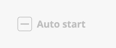 |
See Disabled.
Common Properties
Section titled “Common Properties”These work in the same way on every input component, and are described in Input Components — Common Features:
- Disabled —
disabled. - Appearance —
style.
Component Events
Section titled “Component Events”| Event | Description | Event Object |
|---|---|---|
| onActionPerformed | Fired when the operator clicks the checkbox, after checked and mixed are written. |
— |
See Events.
Examples
Section titled “Examples”Example 1 — Option Bound to a Tag
Section titled “Example 1 — Option Bound to a Tag”- Drop a Checkbox into the view and set
labeltoAuto start. - Bind
checkedto the tag[default]Pump01/AutoStartand enable Bidirectional.
The checkbox now shows the tag value, and a click writes the new value to the tag.
Found an error or something unclear?
Tell us what is wrong, confusing or missing on this page.
Built on the OpenBridge Design System