Toggle Button Horizontal
The Toggle Button Horizontal is a row of connected buttons of which one is selected: a compact alternative to radio buttons for choosing between a few modes or views. It is found in the Input - OpenBridge section of the Perspective Component Palette as Toggle Button Horizontal.
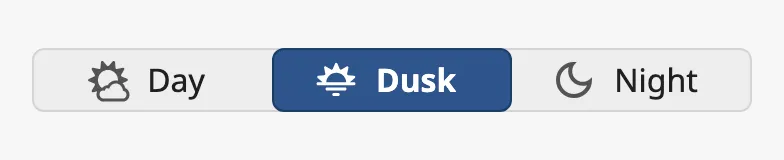
Each button is an option. The selected option is highlighted, and a click on another option selects that one instead.
The Toggle Button Horizontal is one of the input components. How values are written back, events, disabling and the behavior in the Designer are shared by all of them and are described in Input Components — Common Features. This page covers what is specific to the Toggle Button Horizontal. For options stacked in a column, use the Toggle Button Vertical.
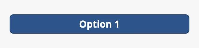
A Toggle Button Horizontal dropped from the palette has a single option,
Option 1:
Options
Section titled “Options”options is the list of buttons, from left to right. Use it for two to about
five options with short labels.
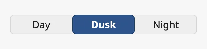
Each option is an object:
| Name | Description | Property Type |
|---|---|---|
| label | Text of the option. | value |
| value | What is written to value when the option is selected. A text, a number or a boolean; must be unique. |
value |
| icon | Icon of the option, chosen with the icon picker. Shown when type includes an icon. See Type. |
object |
| disabled | The operator cannot select this option. Default false. See Disabled. |
value |
The icon is an icon picker: it has a path, for example
openbridge/palette-day. See Icons.
Properties
Section titled “Properties”| Name | Description | Property Type |
|---|---|---|
| options | The options. One option, Option 1, by default. |
array |
Selection
Section titled “Selection”value holds the value of the selected option. When the operator clicks an
option that is not selected, the component writes that option’s value to value
and then fires onActionPerformed. A click on the option that is already
selected does nothing.
Bind value bidirectionally to a tag to connect the toggle button to it. See
Values. A number or a boolean is written as such: with the
option values 1 and 2, the number 2 is written, not the text.
If value does not match any option that can be selected — it is empty, for
instance, as on a new component — the first enabled option is shown as
selected. Nothing is written: value keeps what it had until the operator
clicks.
Set allowEmptySelection to true to show no selection in that case:
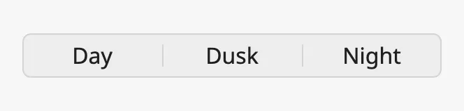
Use it when “not set” is a valid state, for instance while the tag has no value. The operator cannot clear the selection: a click always selects an option.
Note: With the keyboard focus on the toggle button, the arrow keys move the highlight to the next option, but this does not write
valueor fire the event. Only a click does.
Properties
Section titled “Properties”| Name | Description | Property Type |
|---|---|---|
| value | The value of the selected option. Written when the operator selects an option. Empty by default. |
value |
| allowEmptySelection | Show no selection when value matches no option, instead of the first option. Default false. |
value |
type sets what each option shows:
| type | ||
|---|---|---|
text (default) |
The label. | |
icon |
The icon. | 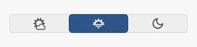 |
text-icon |
The icon and the label beside it. | 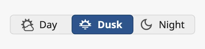 |
icon-text-under |
The icon, with the label below the button. | 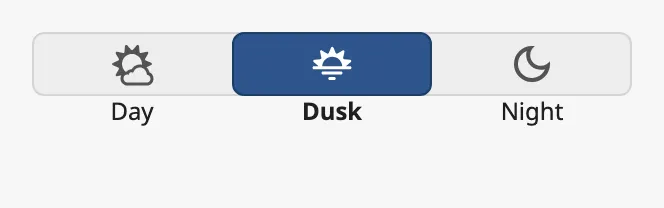 |
With icon-text-under the labels are drawn below the buttons, so the component
needs more height: about 72 px instead of 48.
Properties
Section titled “Properties”| Name | Description | Property Type |
|---|---|---|
| type | text, icon, text-icon or icon-text-under. Default text. |
value |
Variant
Section titled “Variant”| variant | ||
|---|---|---|
regular (default) |
A common background, the selected option filled. | |
flat |
No background; the selected option is lightly tinted. | 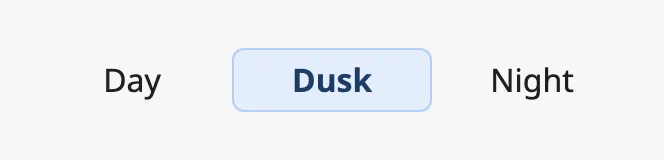 |
normal |
A common background, the selected option drawn raised. | 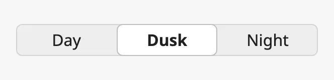 |
Properties
Section titled “Properties”| Name | Description | Property Type |
|---|---|---|
| variant | regular, flat or normal. Default regular. |
value |
The buttons are 48 px high. Set large to true for taller buttons, for
instance on a touch screen. Give the component more height to match.
| large | |
|---|---|
false (default) |
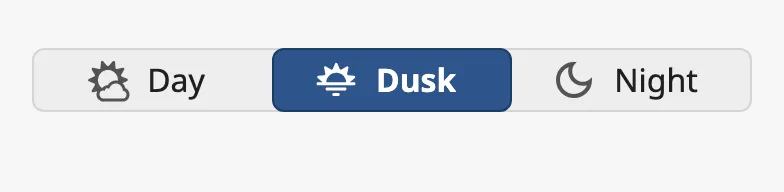 |
true |
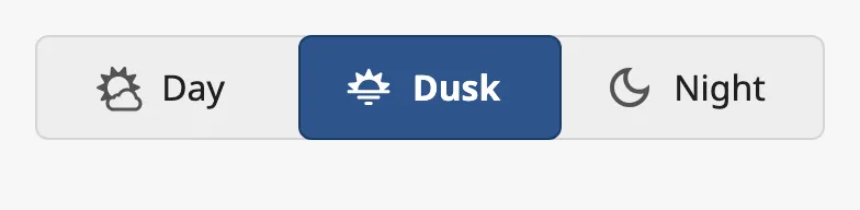 |
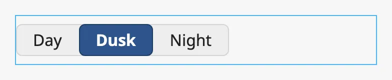
The options share the width of the component equally. Set hugText to true to
make each option only as wide as its content. The blue frame in the images is
the component’s box:
| hugText | |
|---|---|
false (default) |
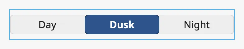 |
true |
 |
Properties
Section titled “Properties”| Name | Description | Property Type |
|---|---|---|
| large | Taller buttons. Default false. |
value |
| hugText | Make each option as wide as its content instead of filling the width. Default false. |
value |
Disabled
Section titled “Disabled”Set disabled to true to disable the whole toggle button, or disabled on an
option to disable only that one. A disabled option is dimmed and cannot be
selected; value is not written and the event does not fire.
| Disabled | |
|---|---|
| The component | 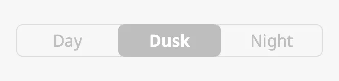 |
One option (Dusk) |
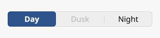 |
If value is the value of a disabled option, that option is not shown as
selected: the first enabled option is. With allowEmptySelection the disabled
option stays shown as selected.
See Disabled.
Common Properties
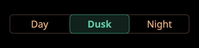
Section titled “Common Properties”These work in the same way on every input component, and are described in Input Components — Common Features:
- Disabled —
disabled. - Appearance —
style. The colours follow the palette of the session:
Component Events
Section titled “Component Events”| Event | Description | Event Object |
|---|---|---|
| onActionPerformed | Fired when the operator selects another option, after value is written. |
— |
The event object is empty; read the selection from self.props.value. See
Events.
Examples
Section titled “Examples”Example 1 — Mode Selector Bound to a Tag
Section titled “Example 1 — Mode Selector Bound to a Tag”-
Drop a Toggle Button Horizontal into the view and make it 300 px wide.
-
Set
options:[{"label": "Off", "value": 0},{"label": "Manual", "value": 1},{"label": "Auto", "value": 2}] -
Bind
valueto the tag[default]Pump01/Modeand enable Bidirectional. -
Set
allowEmptySelectiontotrue, so that no mode is highlighted if the tag holds a value outside 0–2.
The toggle button now shows the mode of the pump, and a click writes 0, 1 or
2 to the tag.
Example 2 — Icon-only View Switch
Section titled “Example 2 — Icon-only View Switch”-
Set
typetoiconandhugTexttotrue. -
Set
options:[{"label": "Table", "value": "table", "icon": {"path": "openbridge/table"}},{"label": "Chart", "value": "chart", "icon": {"path": "openbridge/chart"}}] -
Set
valuetotable. -
On the components to switch between, bind position.display (or
meta.visible) to an expression such as{../ToggleButtonHorizontal.props.value} = 'table'.
Found an error or something unclear?
Tell us what is wrong, confusing or missing on this page.
Built on the OpenBridge Design System