Progress Bar
The Progress Bar shows how far a task has come, as a horizontal bar or as a ring. It is found in the Input - OpenBridge section of the Perspective Component Palette as Progress Bar.
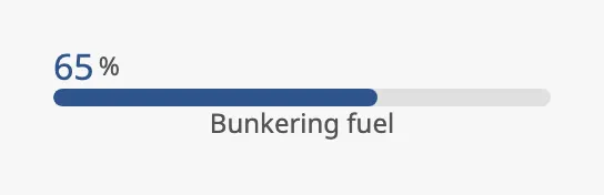
From top to bottom: the value with an optional state text, the bar, and the description.
The Progress Bar only shows something: it takes no input from the operator, writes no property back and has no component events.
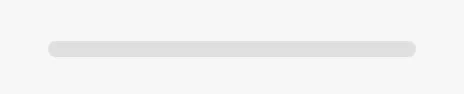
A Progress Bar with default properties is an empty bar:
| type | ||
|---|---|---|
linear (default) |
A horizontal bar. See Linear Progress Bar. |  |
circular |
A ring of 48 pixels. See Circular Progress Bar. | 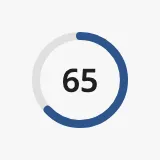 |
Properties
Section titled “Properties”| Name | Description | Property Type |
|---|---|---|
| type | linear or circular. Default linear. |
value |
value is the progress in percent, from 0 to 100.
value |
|
|---|---|
0 |
 |
35 |
 |
100 |
 |
The bar is never drawn past its ends, but the number that is shown is not
limited: with value at 150 the bar is full and the number reads 150. Keep
the value between 0 and 100. The number is rounded to a whole number.
Properties
Section titled “Properties”| Name | Description | Property Type |
|---|---|---|
| value | Progress in percent, 0 to 100. Default 0. |
value |
Linear Progress Bar
Section titled “Linear Progress Bar”The bar fills the width of the component and is placed at the top of its box. The blue frame in the image is the component’s box:
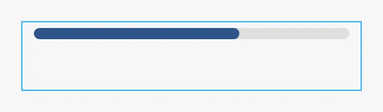
A new Progress Bar is 15 pixels high, which is enough for the bar alone. With the value or the description turned on, make the component higher: about 36 pixels for one of them, 56 for both.
mode selects between a bar that follows value and an animation for work of
unknown duration.
| mode | ||
|---|---|---|
determinate (default) |
The bar is filled to value. |
|
indeterminate |
A fill that moves along the bar over and over. value is not used. |
 |
mode applies to the linear type only. The circular type has its own property,
circularState.
Value Label
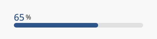
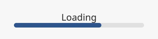
Section titled “Value Label”Set showValue to true to show the value above the bar. In the
indeterminate mode the text Loading is shown instead:
mode = determinate |
mode = indeterminate |
|---|---|
 |
 |
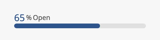
Set showState to true to show the text in stateLabel after the value. It
is only shown together with the value, in the determinate mode:
Description
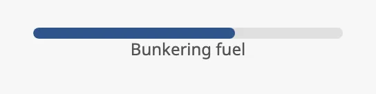
Section titled “Description”Set hasDescription to true to show the text in description below the bar:
Properties
Section titled “Properties”| Name | Description | Property Type |
|---|---|---|
| mode | determinate or indeterminate. Only has an effect when type is linear. Default determinate. |
value |
| showValue | Show the value above the bar. Only shown when type is linear. Default false. |
value |
| showState | Show stateLabel after the value. Needs showValue. Only shown when type is linear. Default false. |
value |
| stateLabel | Text shown after the value. Only shown when showState is true. Default Open. |
value |
| hasDescription | Show description below the bar. Only shown when type is linear. Default false. |
value |
| description | Text shown below the bar. Only shown when hasDescription is true. Default Description text. |
value |
Circular Progress Bar
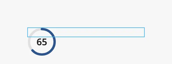
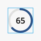
Section titled “Circular Progress Bar”With type set to circular the component is a ring of 48 pixels. The ring
does not follow the size of the component: it is always 48 pixels and is placed
at the top left of the box. A Progress Bar that is switched to circular still
has the wide, low box of the bar, and the ring runs out of it. Set the size of
the component to 48 × 48. The blue frame in the images is the component’s box:
| Box of a new Progress Bar | Box of 48 × 48 |
|---|---|
 |
 |
circularState selects what the ring shows:
| circularState | ||
|---|---|---|
determinate (default) |
The ring is filled to value, with the number in the center. |
|
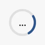
indeterminate |
A rotating arc, with three dots in the center. value is not used. |
 |
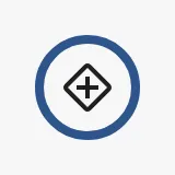
icon |
A full ring around the placeholder icon. value is not used. The icon cannot be changed. |
 |
Progressive Indeterminate
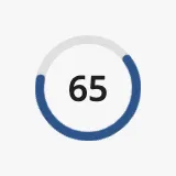
Section titled “Progressive Indeterminate”Set progressiveIndeterminate to true for a rotating arc that also grows with
value, with the number in the center. Use it when the progress is known but
the ring should also show that work is going on. It takes precedence over
circularState.
Properties
Section titled “Properties”| Name | Description | Property Type |
|---|---|---|
| circularState | determinate, indeterminate or icon. Only shown when type is circular. Default determinate. |
value |
| progressiveIndeterminate | Rotating arc that grows with value; overrides circularState. Only shown when type is circular. Default false. |
value |
Appearance
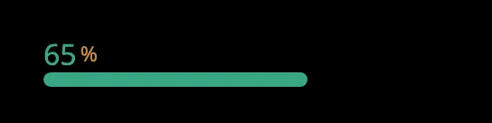
Section titled “Appearance”The colors follow the OpenBridge palette of the session (bright, day, dusk or night):
Component Events
Section titled “Component Events”The Progress Bar has no component events.
Examples
Section titled “Examples”Example 1 — Progress of a Transfer
Section titled “Example 1 — Progress of a Transfer”- Drop a Progress Bar into the view and make it 240 pixels wide and 56 pixels high.
- Bind
valueto a tag with the progress in percent, for example[default]Bunkering/Progress. - Set
showValuetotrue. - Set
hasDescriptiontotrueanddescriptiontoBunkering fuel.
Example 2 — Waiting for an Answer
Section titled “Example 2 — Waiting for an Answer”Show a ring while a command is being carried out, when it is not known how long it takes.
- Drop a Progress Bar into the view, set
typetocircularand the size of the component to 48 × 48. - Set
circularStatetoindeterminate. - Bind the
displayproperty of the component’s position to the tag that tells that the command is in progress, for example{[default]Pump01/Starting}, so that the ring is only shown meanwhile.
Found an error or something unclear?
Tell us what is wrong, confusing or missing on this page.
Built on the OpenBridge Design System