Slider
The Slider lets the operator set a number within a range by dragging a thumb along a track. It is found in the Input - OpenBridge section of the Perspective Component Palette as Slider.

The Slider is one of the input components. How values are written back, events, disabling, icons and the behavior in the Designer are shared by all of them and are described in Input Components — Common Features. This page covers what is specific to the Slider.
A Slider dropped from the palette goes from 0 to 100 and is set to 50:
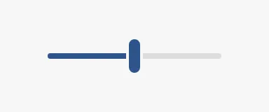
The slider is as wide as the component. Make the component wide enough for the precision the operator needs.
Value and Range
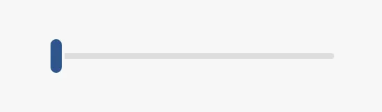
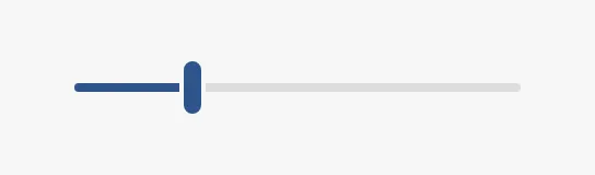
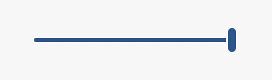
Section titled “Value and Range”value is the position of the thumb, between min and max. step is the
smallest change: with step = 1 the value is always a whole number, with
step = 0.1 it has one decimal.
| value | |
|---|---|
0 |
 |
25 |
 |
100 |
 |
The Slider writes value and fires onActionPerformed continuously while the
thumb moves, not only when the operator lets go. Bind value bidirectionally
to a tag to connect the slider to it (see Values). If every
intermediate value must not be written to the device, bind value to a custom
property and write to the tag from a script.
Properties
Section titled “Properties”| Name | Description | Property Type |
|---|---|---|
| value | Current value. Written while the operator moves the thumb. Default 50. |
value |
| min | Lowest value. Default 0. |
value |
| max | Highest value. Default 100. |
value |
| step | Smallest change of the value. Default 1. |
value |
Variant
Section titled “Variant”| variant | ||
|---|---|---|
normal (default) |
A slim track with a thumb. | 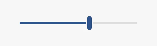 |
enhanced |
A tall, filled track that is easier to hit. Use it where the slider is the main control. | 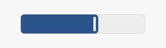 |
no-input |
Shows the value only; the operator cannot change it. Use it as an indicator. | 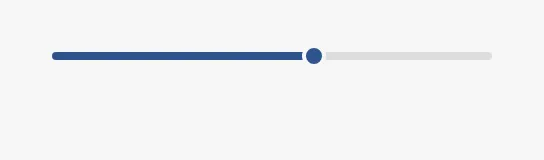 |
Properties
Section titled “Properties”| Name | Description | Property Type |
|---|---|---|
| variant | normal, enhanced or no-input. Default normal. |
value |
Step Buttons
Section titled “Step Buttons”Set hasLeftIcon and hasRightIcon to true to show a button at each end of
the track. A click on the left button lowers the value by stepClick, a click
on the right button raises it by stepClick.
leftIcon and rightIcon are chosen with the icon picker. See
Icons.
Properties
Section titled “Properties”| Name | Description | Property Type |
|---|---|---|
| hasLeftIcon | Show the button that lowers the value. Default false. |
value |
| leftIcon | Icon of the left button. Only shown when hasLeftIcon is true. |
object |
| hasRightIcon | Show the button that raises the value. Default false. |
value |
| rightIcon | Icon of the right button. Only shown when hasRightIcon is true. |
object |
| stepClick | How much a click on a button changes the value. Default 10. |
value |
Pressing on the Track
Section titled “Pressing on the Track”The operator can also press on the track, away from the thumb. allowSeaking
decides what happens:
false(default) — the thumb travels towards the pointer for as long as the track is held, and stops when it is released.seekingSpeedsets how fast: the thumb crosses the whole range in1 / seekingSpeedseconds, 3 seconds with the default0.333. The value is written all the way.true— the thumb jumps to the pressed position at once.
Properties
Section titled “Properties”| Name | Description | Property Type |
|---|---|---|
| allowSeaking | Jump to the pressed position instead of travelling towards it. Default false. |
value |
| seekingSpeed | Speed of the thumb when it travels, in ranges per second. Default 0.333. |
value |
Disabled
Section titled “Disabled”| Without buttons | With step buttons |
|---|---|
 |
 |
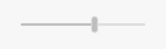
See Disabled. To show a value that the operator must
never change, use the no-input variant instead.
Common Properties
Section titled “Common Properties”These work in the same way on every input component, and are described in Input Components — Common Features:
- Disabled —
disabled. - Appearance —
style.
Component Events
Section titled “Component Events”| Event | Description | Event Object |
|---|---|---|
| onActionPerformed | Fired every time the operator changes the value, repeatedly while the thumb moves. | — |
See Events.
Examples
Section titled “Examples”Example 1 — Volume Control
Section titled “Example 1 — Volume Control”- Drop a Slider into the view and make it about 280 px wide.
- Set
hasLeftIconandhasRightIcontotrue, and chooseopenbridge/volume-offandopenbridge/volume-onasleftIconandrightIcon. - Set
stepClickto5. - Bind
valueto the tag[default]Audio/Volumeand enable Bidirectional.
Found an error or something unclear?
Tell us what is wrong, confusing or missing on this page.
Built on the OpenBridge Design System