Switch
The Switch is an automation symbol for a two-state electrical switching device, such as a switch, breaker or disconnector. It is found in the Automation - OpenBridge section of the Perspective Component Palette as Switch.
It is meant to be placed in a mimic or diagram, typically in a coordinate container, with its properties bound to the state of the device. The Switch shows the state it is given; it does not change it, and clicking it does nothing unless you configure an event.
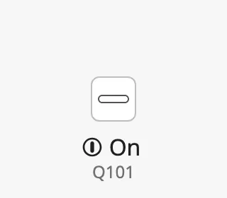
The Switch is one of the automation buttons. The readout and tag, the alert frame, the progress ring, the badges, the size and the positioning are shared by all of them and are described in Automation Buttons — Common Features. This page covers what is specific to the Switch.
A Switch dropped from the palette with default properties:
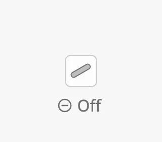
Bind on to the tag or property that holds the state of the device. The symbol
is drawn filled and grey when on is false, and as an outline when it is
true. The status row of the readout shows Off or
On.
| Off | On |
|---|---|
 |
 |
Alternative Icons
Section titled “Alternative Icons”alternativeIcon selects which symbol is drawn. There are 4 icons. The table
shows every icon off and on, for both values of variant:
| alternativeIcon | square, off |
square, on |
flat, off |
flat, on |
|---|---|---|---|---|
regular (default) |
|
|
 |
 |
s1 |
 |
 |
 |
 |
s2 |
 |
 |
 |
 |
s3 |
 |
 |
 |
 |
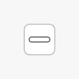
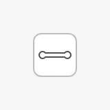
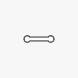
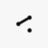
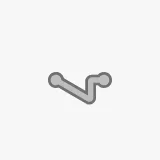
regular— A plain bar; slanted when off, level when on.s1— A blade with a contact point; the blade is lifted off the contact when off.s2— A blade between two terminals; open when off.s3— A changeover switch with two outgoing paths.
Use the same icon for the same kind of device throughout a project.
Variant
Section titled “Variant”variant selects whether the icon is drawn on a button or directly on the
background:
square(default) — the icon sits on a square button with a border.flat— only the icon is drawn, larger and without a button. Use it where the symbol is part of a line diagram.
square |
flat |
|---|---|
|
|
Orientation
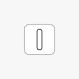
Section titled “Orientation”orientation rotates the icon so that it follows the line it is part of. The
readout is not rotated. verticalRight rotates the icon 90° clockwise,
verticalLeft 90° counter-clockwise.
horizontal |
verticalRight |
verticalLeft |
|---|---|---|
|
 |
|
Properties
Section titled “Properties”| Name | Description | Property Type |
|---|---|---|
| on | Whether the device is on. Selects the on icon and the On status row. Default false. |
value |
| alternativeIcon | Which icon to draw: regular, s1, s2, s3. Default regular. |
value |
| variant | square draws the icon on a button, flat draws only the icon. Default square. |
value |
| orientation | Rotation of the icon: horizontal, verticalRight or verticalLeft. Default horizontal. |
value |
Common Properties
Section titled “Common Properties”The Switch is an automation button. The properties below work in the same way on every automation button, and are described in Automation Buttons — Common Features:
- Readout — The readout next to the symbol: the status row and the tag name. Properties:
showReadoutStack,readoutPosition,readoutSize,showStatus,hasTag,tag. - Positioning — Which part of the button is aligned to the component’s box. Properties:
positioning. - Size — Size of the whole component. Properties:
componentSize. - Activated — Highlighted background that marks the symbol as selected. Properties:
activated. - Alert Frame — Alert frame around the symbol. Properties:
alert,alertFrameType,alertFrameStatus,alertFrameMode,alertFrameThickness,showAlertCategoryIcon,showAlertIcon. - Progress — Progress ring while a command is carried out. Properties:
progress,progressMode,progressValue. - Badges — Badges in the corners of the symbol. Properties:
badgeControl,badgeAlert,badgeInterlock,badgeCommandLocked. - Style — Standard Perspective style object.
Component Events
Section titled “Component Events”The Switch has no component events of its own. The standard Perspective events,
such as onClick, are available in the component’s event configuration. See
Operating a Device.
Examples
Section titled “Examples”Example 1 — Breaker in a Single-Line Diagram
Section titled “Example 1 — Breaker in a Single-Line Diagram”-
Drop a Switch into a coordinate container, on the line it belongs to.
-
Set:
Property Value alternativeIcon s1variant flatorientation verticalRightreadoutPosition righthasTag truetag Q101 -
Bind
onto the tag that holds the state of the breaker, for example[default]Switchboard/Q101/Closed.
Found an error or something unclear?
Tell us what is wrong, confusing or missing on this page.
Built on the OpenBridge Design System